


Wear colours as if they were things and contained emotion as well as expressing it, or, ‘if I were a fairy queen, I’d wear red and green’.

There is some contention about whether the only personality who is allowed to be seen in ‘red and green’ is a ‘fairy queen’ or an ‘Irish queen’. Unfortunately my links to Ireland, apart from the emotional ones, start only with my great-grandmother, Annie Lowe, who used to tell stories of travelling County Clare in a ‘jaunty cart’. The one above wears bright red wheels and you sense the inhabitants have so darkened their green attire so that the main colour clash, if you see one is between the greens of the plain grass and that assertive wheel.
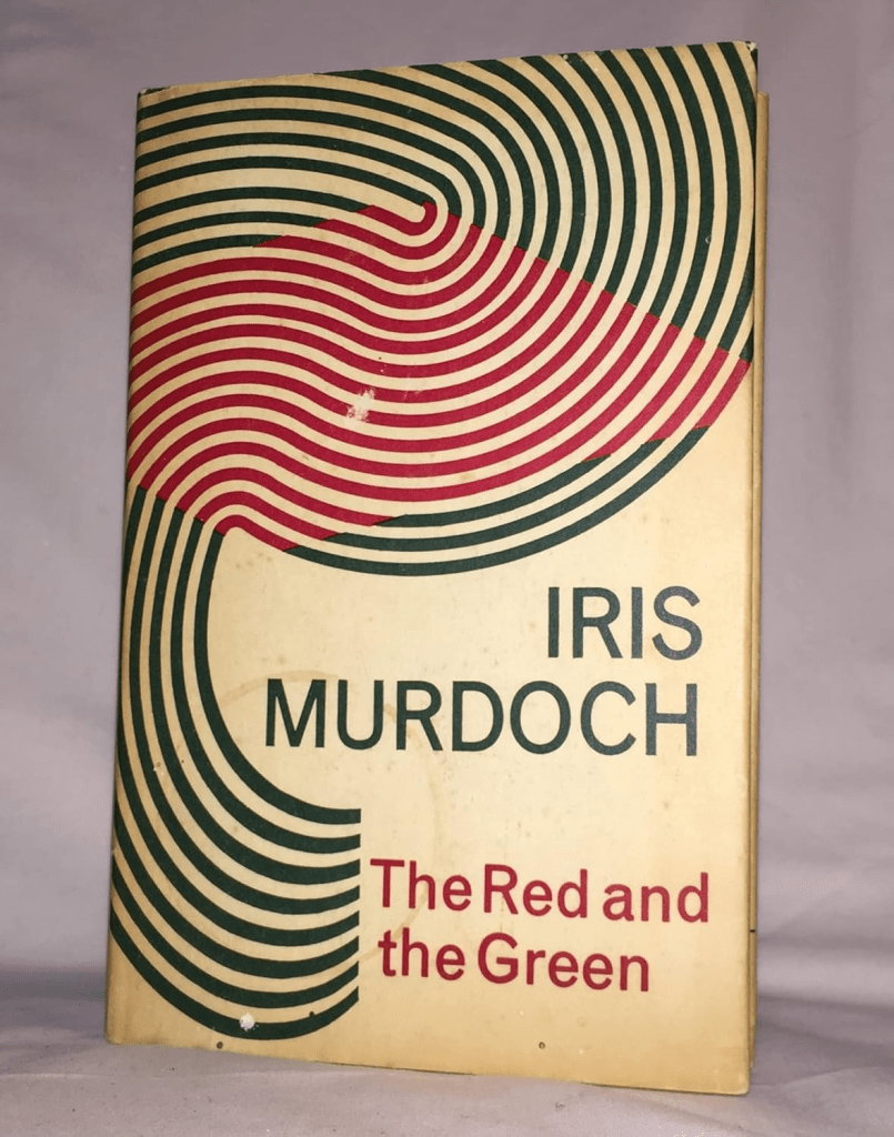
Iris Murdoch tried to sum up her terribly complicated feelings about her Anglo-Catholic heritage (she never lived there after her infancy in Dublin) in the most muddled (but ‘muddle’ is, as in E.M. Forster her forte) The Red and The Green, where ‘red‘ represents the socialist leanings, or perhaps merely the bloodiness, of the 1916 Easter Rising and the First World War, ‘green’ Ireland (or perhaps Catholic Ireland).
You never can eradicate symbolism from colours that refuse to blend, or in the case of red and green are forbidden being in company with each other. But a ‘fairy queen’, Irish or otherwise although Ireland has many fairy or mythical queens in its folktales (my mother was named after Medh) has every right to emphasise conflicting ideas.

There are fascinating red and green contrast in details in this picture of Maeve (the later version of the name) by Joseph Christian Leyendecker (1874 – 1951) – T. W. Rolleston, Myths and Legends of the Celtic Race, Public Domain, https://commons.wikimedia.org/w/index.php?curid=3485557
But I don’t understand, nor am I helped by silly websites on colour symbolism which tell me, as if on authority, that red is the colour of passion, green of fertility (Oh! And envy too). Colour, like most things, acquires meaning through context as well as passage through avenues of tradition and byways from it.
But some people knew about colour and expressed it without trying to tie each colour down to a single meaning, with a grudged alternative. Take the master of colour, Van Gogh, writing to brother Theo in 1888, about the ‘ugliest’ painting he has created, as he describes it, since The Potato Eaters, the painting known as The Night Café.

Red and green express’, says Van Gogh, ‘the terrible passions of humanity’ and work to that affect by virtue of ‘clash and contrast’ between elemental things that are ‘most alien to each other’.
I have tried to express the terrible passions of humanity by means of red and green.
The room is blood red and dark yellow with a green billiard table in the middle; there are four lemon-yellow lamps with a glow of orange and green. Everywhere there is a clash and contrast of the most alien reds and greens, in the figures of little sleeping hooligans, in the empty dreary room, in violet and blue. The blood-red and the yellow-green of the billiard table, for instance, contrast with the soft tender Louis XV green of the counter, on which there is a rose nosegay. The white clothes of the landlord, watchful in a corner of that furnace, turn lemon-yellow, or pale luminous green.
I am making a drawing of it with the tones in watercolour to send to you tomorrow, to give you some idea of it.
The coloured drawing, however, hardly bears out the notion of there being something essential to the picture or its draft that lies in the idea of red and green in sole conflict, whatever their meanings are and associations.
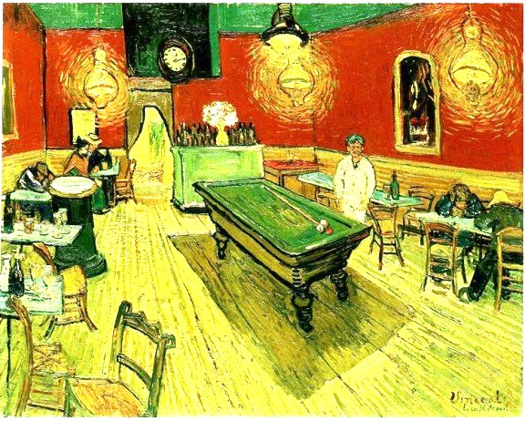
If anything, that drawing is so dominated by yellow (and not a dark’ yellow as he rightly identifies in the oil painting) but a bright and heightened lemon yellow, that asserts a rather omnipresent light, washing out every green but the differing greens and reds. Violet is missing mostly from the drawing.
But violet comes into force in tne oil version and the dark yellow us variegated creating the illusion of shadow and even delimiting a kind of ghost, whose head and shoulders is the door portal in the far wall, its body trailing along the right side of the gaming table and flattening tje perspectival depth you see more clearly in the drawing.
But let’s me return to what colours I might want to see in by way of looking at the figures in this painting, especially that one in its near focal centre, a standing figure clothed and covered over in his flesh, if it is flesh, by a sickly lemon yellow so pale in hue, it is almost drained of that colour.
Van Gogh tells us that one can ‘express the terrible passions of humanity by means of red and green’, and yet he confines that expression ,( almost why it is better go see him and Gauguin as ‘expressionist’ painters, in tne visible environment in which figures are seen to attempt to live, not in themselves, in tje colours that they wear.
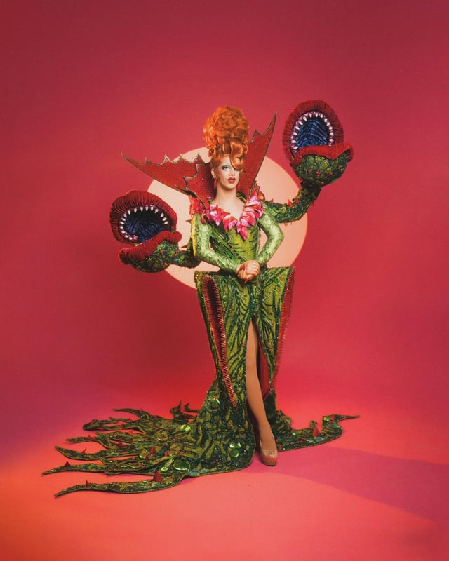
No wonder we confined red and green to fairy, Irish, or ‘outrageous’, as we say in the queer community, queens.
That Van Gogh drained his figures, even the dyes in what he paints them wearing and causes the environment, exterior or interior, to wear the colours of passions in conflict and boldness to expose them is that this is the world that drained him, making even his paintings inappropriate decor for a bourgeois home, such as constituted the art market, to say nothing of more personal attire.
At the ripe age of 71, I am unlikely to ever don red and green, especially not in a Christmas jumper (mine reads Bah! Humbug’ anyway) . For I am in truth no fairy queen, anymore than sufficiently Irish or as beautifully outrageous as Suzy Toots, the drag queen. But washed-out lemon yellow ain’t my choice either.colours that lose their boundaries in each other suit me best, perhaps do inwoven into something that allows them to hide any forcefulness in their expression is even more accurate of me.
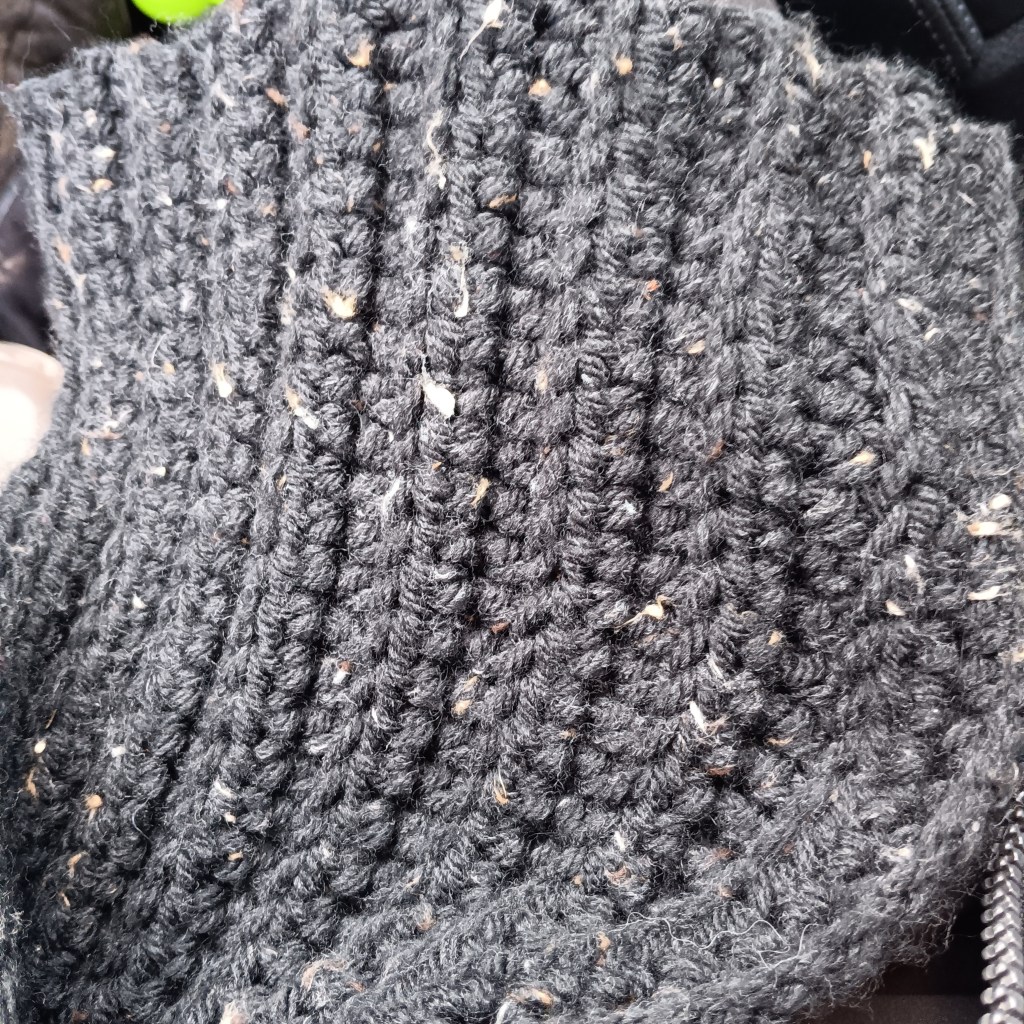
A very dear friend knitted me this scarf last Christmas. I love it.
With love
Steven xxxxxxx
