Retrospecting on Edward Burra: This blog reflects on visiting the wonderful exhibition at Tate Britain, London Millbank, on 9th July 2025.
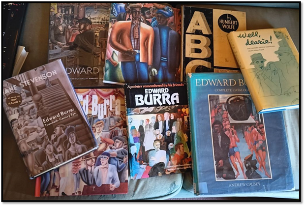
I am building a large Edward Burra library. Though some items are rather shabby reading copies such as the Andrew Causey Edward Burra: Complete Catalogue and the Jane Stevenson biography of the artist, the content of both books deserving better copies to represent them. However, I now have another – the jolly-font-bearing catalogue for this year’s retrospective of the artist, the biggest I believe ever and certainly the most comprehensive of the major themes of the periods of his development, often interpreted as changing as a result of the Spanish Civil War with this exhibition plumping for that interpretation too, though less ready to write his politics up as the equivalent of General Franco’s fascist and Spanish Catholic ideologies and practices.
Nice as this book is, its text is still not the one that will deliver the answer to why Edward Burra’s art is so special and yet so problematic. The exhibition, and the catalogue in tandem, has chosen to create sections of his development that sometimes reflect themes, and at other times periods in which his work changed, either because of opportunities in different art forms or because of more hard-to-chart changes in his ideas, feelings and values. They are hard to chart because he chose not to ‘interpret’ his own art, even o the extent of finding himself self-marginalised from the groups he joined, like Paul Nash’s Unit One, which might best be described by a label I have never seen used of it: ‘magic circus surrealism’ on a kind of analogy with the use of the term ‘magic realism’ to describe Expressionist European painters. We need the term ‘circus’ because there is in Burra’s art sometimes an element of the clown-in-action, a humour that seems used whether appropriate or not and sometimes taking itself too seriously, at least in my view.
As this blog will show to those who know, I one had little empathy for Burra’s politico-religious-comic figures, like his red Beelzebub. Hence I took few photographs of these paintings. However, now home – and not related to the catalogue I am finding the nearest analogue to him is, I think, the tyro as depicted by Wyndham Lewis as a sneer at what he interpreted as the art for art’s sake ideologies of Roger Fry, Duncan Grant and Bloomsbury generally. The ‘tyro’ is both knowing and a little corrupt in the very ways of the world he knows so well and which alone is the basis of his education and development. The National Galleries of Scotland express the idea thus:
‘Tyro’ means a novice or beginner, but Lewis expanded on this definition, calling him ‘a new type of human animal like Harlequin or Punchinello…The Tyro is raw and underdeveloped; his vitality is immense, but purposeless, and hence sometimes malignant.’ Lewis was often critical of his artistic contemporaries. He described the ‘Tyros’ series of paintings as a challenge to the ‘Arts-for-Arts-sake dilettantism’ that he saw in French painting and in the work of the English Bloomsbury group, such as Duncan Grant.[1]
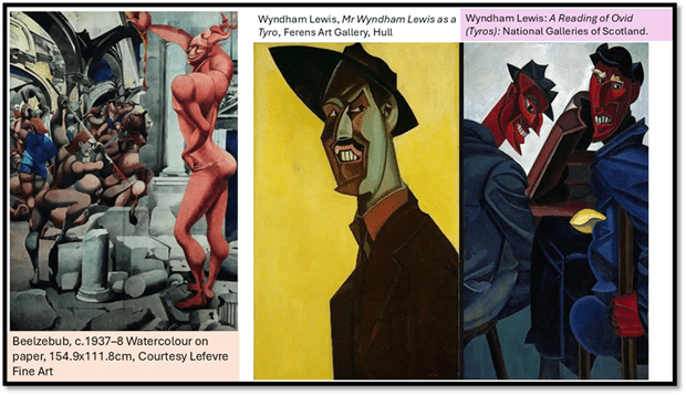
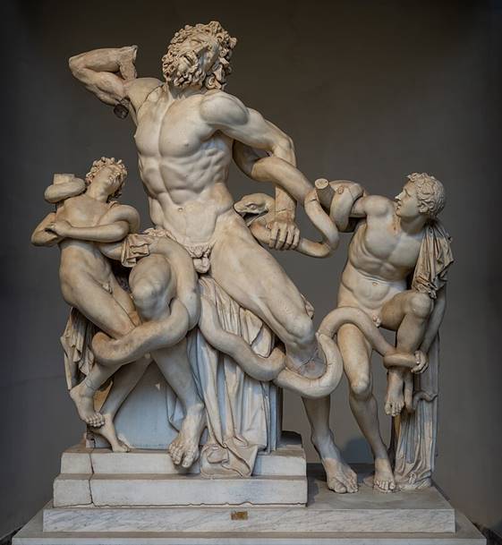
The type of the tyro may well be the same knowing type favoured for representation by George Bernard Shaw of people whose importance in the economy, politics, social and artistic life was only just being felt and from a different basis of class interest and ideology, though not that of the ‘masses’ or the community but purely of and for their singular self-interest There is the same singular observational distance in Beelzebub as he watches the spearing of other humans by models of fine human physique , very much in the manner with which Burra painted matadors going in for the final stroke that will take the life of a bull.
His own letters see his glee complemented by the fact that bloody death is seen in a pretty costume-drama appealing mainly to him (as a set and costume designer) for its camp costumery:
I went to a bull fight last sunday (sic.) my dear its gorgeous all the bulls gore everybody and do the bulls bleed yes sir and do the audience roar with laughter the costumes are lovely my favourite costume was vermilion trimmed with black lace.[2]
Burra’s Beelzebub has only one weapon – irony. He pouts and points and stands with his bum sticking out in a pose that cares little for its effect, so sure is Beelzebub that he is attractively presented and posed, and beyond comparison to others more ordinary than he. There is something quite distasteful about Burra’s splurge of unpunctuated words, I think that is akin to Beelzebub: distaste for the common liking for spilled blood but also a kind of hankering liking for it, while clearly not laughing with that audience – just transfixed, Beelzebub might say, by the fashions of the soldiers exotic clothing and the moving spectacle of the proxemics of their mutual violence. Is there something of this always in Burra. Eliza Spindel says that Beelzebub is a ‘malevolent force’ that seems ‘to be orchestrating or revelling in the chaos’.[3] But that would make Burra too easily to be seen to make a socio-political point about the nature of social violence beyond finding in it something beautiful at one level, ironically funny at another and neither Spindel nor Simon Martin, before her on whose judgement this essay seems to rely, never quite say this.
In fact they say very little about what to me feels an almost entirely unmoved take on the spilling of blood – animal or human by human or animal, which reduces it to child plays – a circus performance, and sometimes played with child’s toys rather than serious . It is as if Burra had no way of understanding the emotions (or insisting that this is not the point) he presents as spectacle, nor of sharing them except as playful fantasy with a nasty edge. I loved Burra’s art but I find this removal from empathy with the subject in pain very hard to take. Spindel cites Osbert Lancaster saying that strangely it is not that Burra is illustrating violence done to things once considered of value, but as in bullfighting trying to find an aesthetic of it in which it need only ever be beautiful and never needs to evoke human emotion for individual suffering:
“what Burra is trying to do … is not to select and record some single aspect of the modern tragedy … but to digest it whole and transform it into something of permanent aesthetic significance”.[4]
In order to do so he often generalises the pain as something insignificant – in his 1933 painting Bullfight, where the bull, bleeding profusely from the mouth, seems ready to await death as transfixed by the lovely costumes of his killers as the viewer of the art is, even if their attitude is NOT the same as the vulgar audience at its background. The point is that the picture is about having your eye engaged as all the main characters engage their eyes and have them engaged by us as an aesthetic audience. This is not ‘art for art’s sake’ but it is art that will not look away. The bull may be static but had the bull been made to look motivated to flee or fight back again – show any kind of passion – we would not be able to understand what it means to make art out of what we see, and try to understand.

Detail from Bullfight (1933)
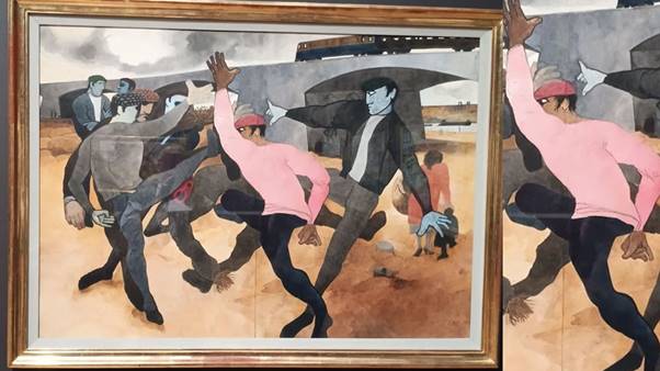
Bullfight is not a great painting but The Straw Man (1963) is. This concerns an attack by young youths on a scarecrow – a straw man – but it seems to me that it is a picture of violence against queer men. We look though not lace in the costume of the purveyors of violence, as in matadors, but to the harmonic dance that links the violent men, focused around the pink sweater of the central character. But this is not only a beautiful one it has greater ethical reach than Bullfight. A mother pulls her son away from the spectacle on the right of the painting even though other males look on the fight passively on the left. The rail bridge in the distance with its arch tunnel underpass provides a proscenium for the scene, the legs and arms of the thugs are balletic and held in beautiful gestures and poses, except that we know time has been stilled. The point is not that we feel for a victim but are forced to look on and cannot run away – this is the most serious of art not for art’s sake but to ensure we gauge what is occurring by some scale of evaluation of our own not someone else’s. What we must not be is passers-by on a train.
I think people always call enigmatic because they want him to declare human emotion whilst he refuses to do so. Rather he forces us to look and in looking, find meanings we have no certainty of being there. I like to think Burra was a bit like that himself when captured on camera, as in this portrait:

One reason I love this photograph (on show at the opening of the exhibition) is that it shows Burra sitting next to a feature of his painting Rye, Landscape with Figures (1947) which Rosemary Shirley in the catalogue calls ‘one of Burra’s enigmatic figures’ that she recounts is ‘said to be based on the gamekeeper at Springfield, the Burra’s family house in Playden’, just outside Rye’. [5]
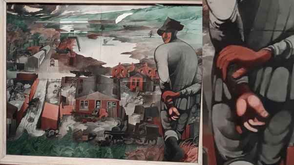
Shirley seems keen to draw a kind of political allegory from the figure. She links the picture not to the usual theme chosen by critics of rural abandonment but to the housebuilding programme of the first Labour Government, as one of many pictures that mourn industrial processes like the extraction of raw building materials and their transport to building sites. It shows, she says the building of six new council houses near Rye, about which the figure is meant to comment. Here is Shirley’s reading [6]:
The backward gaze on the viewer is not unlike that of Beelzebub in an earlier painting we looked at, but here as there, I do not think the character is absorbed into creating an attitude to what we might be asked to share his gaze at, but merely to raise the function of the gaze as an invited element of this painting. It is not only that the ‘figure’s expression is hard to read’ but that it is kept obscured under the shadow of his hat brim, that also emphasises his facial features whilst distorting them. As we look, we see not only what he will see when his gaze returns to the frontal and turns downwards and inwards to the landscape below him but we also scrutinise him. I think the idea of him ‘burning the green grass’ certainly does not work for me, neither do I see his ‘ merely walking through the landscape. After all there may be no walkable continuity between the place on which the man stands with one foot curled round to stabilise his stance -0 there may indeed be a steep decline. There is something of precarity in his stance.
And when we gaze back some source of light touches his hands and the configuration of his fingers differently on each of his crossed over hands. As we shall see as we progress, Burra was fascinated by hands, a fact often attributed to the arthritis in his own which made oil painting difficult and caused him endless pain./ Yet even the Key-Seymer photograph portrait of him above shows how hangs – how they hang and how they fan and how they clench are part of the mystery of character we need to read: whether that be the character of a person, or a painted figure – real or imagined – or even an iconic or type- (even stereotype- in his black, queer and working class figures) -based figures in the European port and Harlem pictures. The figure in Rye expresses himself through hands and finger, except we cannot read what he says in this strange language or code. Burra often looked to already coded use of hands in queer cultures, where open communication was sometimes dangerous – if read by the wrong person – and coded communication (as in Polari) sometimes fun – see my blog that discusses it, amongst other things, here. I am not asserting however that we look for queer code here – though I do in some later examples discussed – but not, as Shirley does translate it into some abstract theme – in her case by ignoring or not seeing it.
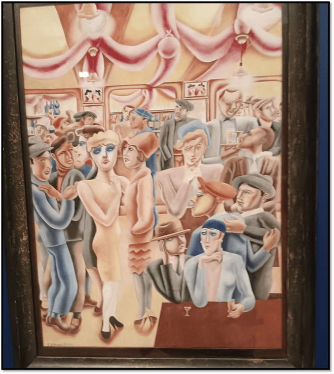
Yet the theme of silently talking hands is there for all to see throughout the oeuvre if better dealt with in some central paintings. Take those wonderful paintings, Café (1930) and The Hand (1931), seen in the flesh by me in this exhibition for the first time:
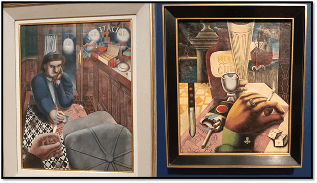
If the first is usually praised for its point of view on the characters and the compression of the visual field, so that it concentrates on ‘combinations of clashing patterns of and textures’, ’[7] it seems much more reluctant to show that anything readable in this scene, apart from the inverted café title on the window, and the newspaper on which one man leans his arm, for his pupils are not that way directed and are meant to disguise their object of gaze, only pretending to read it. What communicates is the language of the hands, particularly in the way cigarettes are held, offered or lit – yet one sees so little written about this now. Of course much of this is natural body language but it feels as if it takes patters relating to desire here – the man who is seen being accepting of a passive self-definition – being as it is said now, a ‘bottom’, not a ‘top’, which explains everything dominant about the man whom we only see from raised hand, cigarette firmly inside the hand and projected outward.
The editors of the catalogue describe The Hand as ‘a surrealist rendition of the same scene’, although the symbolism all seems wrong to fully support that view. The unseen man has more manicured hands here and the context seems that of a restaurant not a café. The man is alone playing a game of chance and the symbols pointing towards him are of imminent danger, the prow of the boat about to slice him, the knife pointing straight at him, even Slapsy Magee, the boxer pictured in the newspaper. This man wears finer clothes bearing symbols of gambling and next to dice. A richer man looking for ‘rough trade’ with cigarettes available for any taker and no aggressive thrusting of the cigarette might play this game once too often.
Yet my favourite painting of silent communion remains Izzy Orts. My husband Geoff and I once arranged to see this painting in the fortress-like archive of The National Galleries of Scotland. To see it here was another thrill for I had to sit on the floor to see it in the archive (sored on the bottom level of the paint store sliding holders as it was.
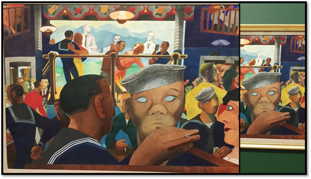
Catherine Tackey, in the catalogue essay on Burra’s musical tastes, says the club in Boston, Izzy Orts on which the painting is based, was actually a place Burra liked to observe ‘fellow audience members’.[8] His friend the poet, Conrad Aiken’s wife, Mary remembered that ‘he liked visiting the ‘most unusual’ bar.[9] People often think Burra unsexed by his bodily disability but they neglect the sexual nature of observation and the manner of crossing distances between the body (hand or any other member) and the eye. It reduces that sexual nature to call it ‘voyeurism’, for in Burra’s case it was about the desire for an open and acknowledged sexual variance that he saw in codes alone. In Izzy Orts (1937), eyes cross each other – the sailor at the centre has no visible eyes, in contrast to the mobile eyes of the men in civilian dress behind him to our right (top left in the collage below). But eyes are much less voluble than hands. See the sailor with his hand cupped to his anus blow bottom left in the collage, the ambiguous hand and cigarette of the man in civilian clothing between two sailors (centre in the collage). The language of silent language is so voluble – and it speaks a community who desired (the only word that will do) to know each other – read each other right.
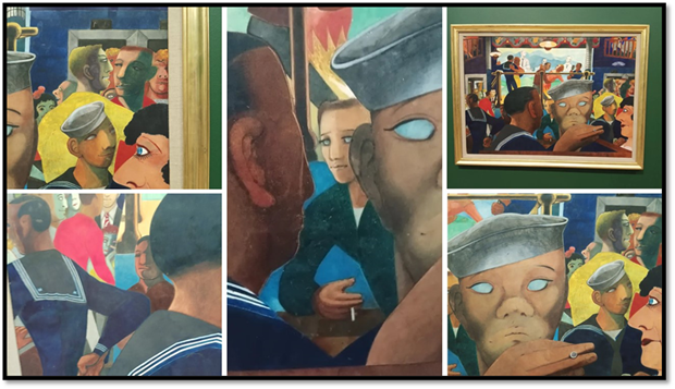
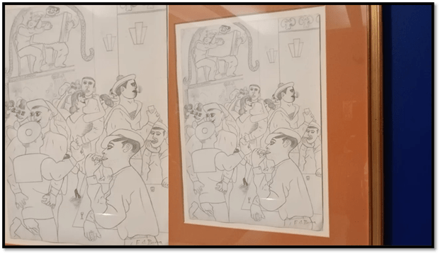
Burra’s drawings on show at the exhibition show the communal silent chat of male-only bodies better, like the one below:
However, it is surely the Dockside Café, Marseilles (1929 – right in the collage below) where we see eyes averted and cigarettes and hands working their versions oftalk, even when men have their backs (almost) to each other. Of course the language is different in Three Sailors at the Bar (1930) but no less telling. How wonderful to see all these pictures together. Andrew Stephenson captures this brilliantly as the encapsulation of a whole ‘social fantastic’ in his – the best essay in the catalogue, although I think he misses how the fluidity lives in body, hand, cigarette, and proxemics.

‘Burra and his friends thrived within these circles of French and expatriate creatives, enjoying a liberated social environment marked by fluid gender roles and relaxed sexual protocols. As Chappell’ (William or Billy Chappell, the dancer and Burra’s closest queer friend – his most common ‘Dearie’) ‘recognised, “almost everyone in Ashton’s group was either androgynous or bisexual. If you weren’t, you made an effort to be”’.[10]
Moreover, the language of hands was based on versions of androgyny (or non-binary) identity too. His letters (often to ‘Dearie’ Chappell or Barbara Ker-Seymour, a lesbian school friend and photographer) are full of this language – as common as his inversion of pronouns or gendered subjects:

The drawings are an ideal vehicle for cross-identification. The heavily defined upper-lip (perhaps indicating heavy lipstick) could also be a moustache on the person signed as ‘female’ next to the most extreme ‘macho’ ever.:
In The Two Sisters (1929) too often the painting is as just satiric reportage of the very real vaudeville sisters represented, but surely the point is not they but the capture of familial terms like ‘sisters’ to represent the queer ‘social fantastic’, the hero of the piece being the androgynous server of wine, more feminine that the sisters despite the sexual markers of the breasts they grimly and greenly display.
Compare that person too to the groom in the fabulous Marriage à la Mode (1928-9) where the groom is transcendent – flying upwards balletically at a glance from the vicar and the two officiating alter-boys, whilst the bride’s mother grimaces. Even the puttos are androgynous.

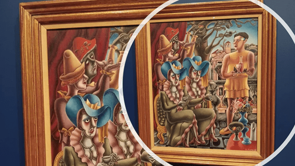
Best of all though is Le Bal (1928) where the ceiling wears non-binary genitalia, clothese and shoes are transposed and sex/gender is no longer the fact conservatives of the worst kind want to make it. There is a lesbian couple in the one picture hanging twice on the wall above the bar (or is it a mirror).
Before I moved on I intended to deal with the stereotypical black figures of Burra but I find myself still unable to do so, though I admire the painting and the intention to eradicate the kind of racism they represented in them, But I still feel too divided about them. I see beauty here but not persons. Others would say that is true of his women and queer people too, and they have a point, but the case around race is even more fundamental, so I will stay silent for now until I find a way to reconcile myself to them. The issues seem the same as for that other queer white supposedly non-racist Carl Van Vechten from The Harlem Renaissance who still saw no problem in summarising the Harlem revolution in a book he called Nigger Heaven. If you think some people are made unreadable – like the queer Black population Burra celebrated, it is still possible that you may over-assert your right to read that phenomenon correctly without any significant experience of the oppression behind it.
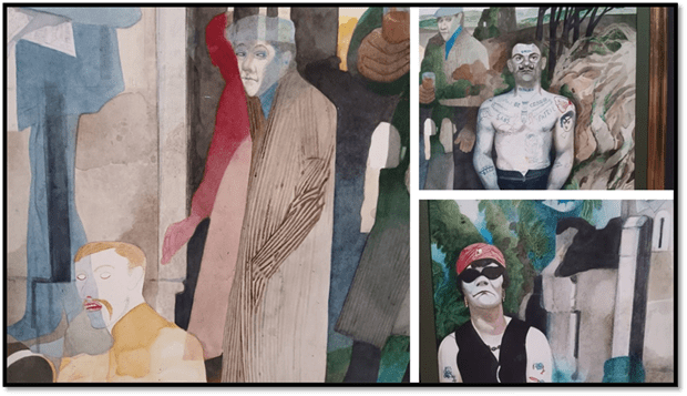
The last painting we think Burra did is par excellence a painting about how some people are readable – in a more obvious sense than Roland Barthes’ – and some are not. Landscape, Cornwall, with Figures and Tin Mine (1975) is often read in terms of Burra’s interest in the occult, although it feels to me to say more about people who make themselves visibly readable and those who do not. As this exhibition underlines, the two boldest and most uncomplicated visible characters here were both copied from photographs of tattooed figure, with readable signs on their body, to say nothing of the self-fashioning created by clothes and body language – the books are on display at the museum – the one particularly of the female-coded tattooed person : the book being Les Tatouages du “Milieu” (1950) by Jaques Delarue and Robert Giraud (and Robert Doisneau).
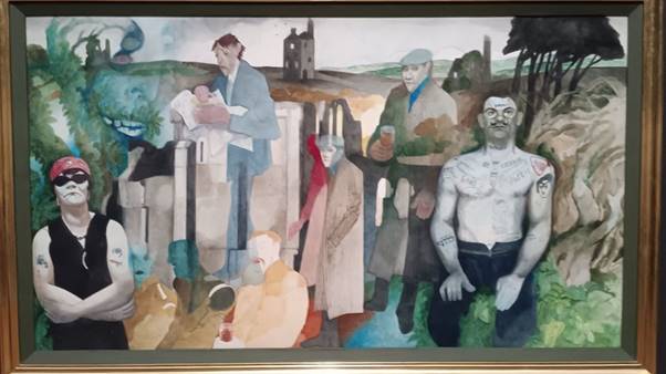
But why are the other characters less readable. The text in the exhibition remarks that these characters are fading to represent the ghostly – that which is forgotten after the loss of the body, but is it possible that these figures are fading out of life as men did, who could not face the response of homophobic homonormative society. One man – already concealed in hat and coat looks out of us to be recognised – read as who he is – but has already faded into the scene. The moustached man below him has even lost the pupils of his eyes – a thing we see most hauntingly in the earlier painting Izzy Orts.
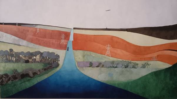
Burra’s later landscapes are very great paintings in my view but cannot either be ‘easily read’. Shirley yet again wants the enigmatically entitled Cornish Clay Mines (1970) to be a picture about her chosen interpretive theme – the increasing reliance of England, to the expense of its countryside, of mineral oil extraction.
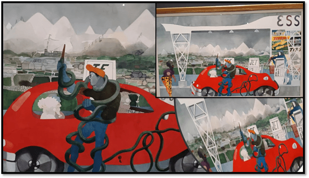
The theme is there and Shirley’s essay is the best read to learn how to read its presence but she reads the central figure of the garage mechanic who fills the car up with petrol as merely a spiff on what it is to be ‘entangled in the coils of a snake-like petrol hose’ without seeing the visual pun on the Laocoön, the priest who warned Troy of the perfidy of the Greeks in bearing the gift of a wooden horse only to be punished by the God who wanted things to go the way the Greeks wanted. My own feeling is that the mechanic represents the man tied up in the commands of the phallic – the hose pipe winds through his legs to emerge blow his crotch. He is another man who goes the way the Godsds pretend they have the right not to intend, only the Gods of this man – presumably once a clay miner – sees some phalluses have a will of their own.
Of course to some the unreadability of the late landscapes has become a trope. Witness the brilliant critic and artist, Christopher Neve, about whose response to Burra I have blogged elsewhere (see the whole blog at this link). I quote there the description of ‘one of my great favourites, the queer artist, Edward Burra, described under the heading of Hysteria ‘, thus, evoking Burra’s:
… fascinated disenchantment with the places themselves? He seemed to dread them. They swell, stretch. curve, crease. Bruised clouds stack over them and break open. Floods and fields make their puddles of watercolour. … Rock outcrops are swollen with disease. Chasms dwarf. Bile yellow and a punishing green can hardly contain themselves. …. But what gives the pictures their emotional potency is their raking depth to the horizon, their roller-coaster perspective.(ibid:151)
Then I argued:
It is my personal belief that this is the landscape of the homophobia that increasingly must have surrounded Burra and poisoned his earlier vivacious love of his painted sailors and drag queens in French navy towns or later in the Harlem of the 1920s, that mecca of artists, black and gay and more importantly black gay artists.
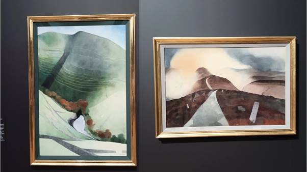
I resist seeing the constant evocation of disease as a reference to Burra’s bodily features, although I am certain his culture would have yoked this to his open articulation of a sexual self he felt unable to feed. But face it. It also describes fairly, if not in my own favoured way, even paintings not referred to by Neve, such as Near Whitby, Yorkshire (1972).
Near Whitby, Yorkshire (1972).[11]

I still have some belief in the certainty I tried to express there about the landscapes – about the queerness, and I certainly feel they are not merely the frustrated hatred of the modern of an old man who knew death was much nearer than heretofore. However, I know think that in the past I was as dogmatic about these painting unreadable qualities – the menace they threaten. No doubt the enemy may for Burra have been an amalgam of modernity, continuing homophobia after 1967 but it is also the fact that everything he valued was no longer recognisably itself – that the coded behaviour of his past queer figures was now suppressed the more effectively by being represented in terms of a distinct minority, only acceptable when it followed the norms of the rest of society – the real lesson of Wolfenden.

If we can’t be readable, we must be buried in the land we do not understand: setting off to tame it without seeing that it needs expression. I see this in his backdrop of Don Quixote, the fantastical knight (as anormative as one might be) bearing behind him Sancho Panza fat arse behind which that mini-hero makes familiar but unreadable hand-gestures. Thate Burra modern landscapes are queered in the threatening way Neve suggests but what makes them threatening is that we think that roads that cut through them tame – made readable by the texts of commodification we carry through them. For Burra it was healthy that these examples of fullness of life would threaten the petit bourgeoisie he so didn’t want to accommodate as the norm:

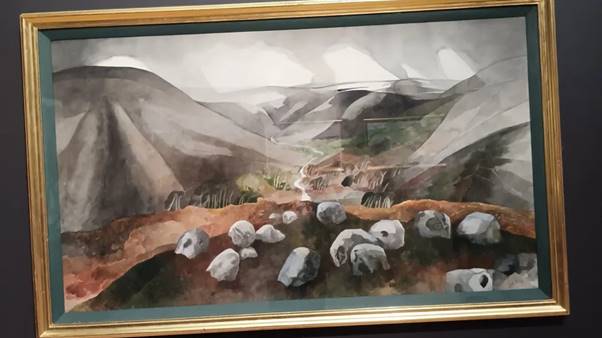
I will end then with that flock of sheep on the edge of something that is less beautiful than, in the eighteenth century meaning ‘sublime’ – the unreadable fact of nature that only people who want to cheer themselves up think represents order and harmony.
Would love to engage with anyone who wishes to take up anything in this piece, but that’s all for now.
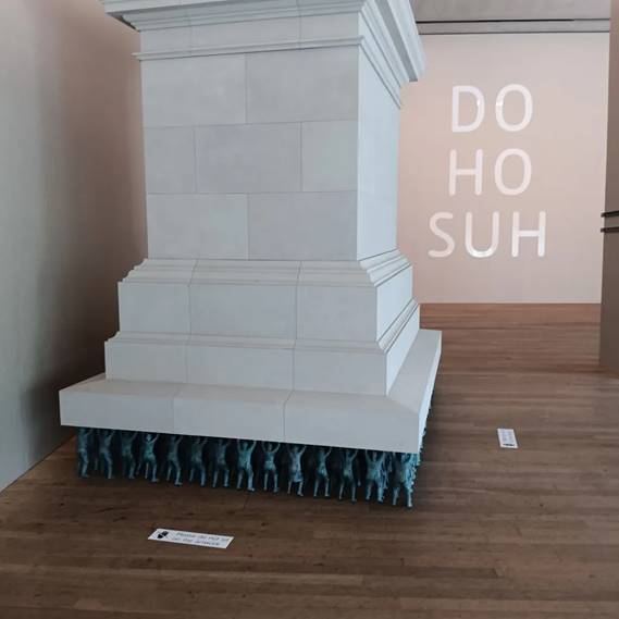
The next blog on my London visit will shorter and on the art of Do Ho Suh at the exhibition currently at Tate Modern.
With love
Steven xxxxxxxxxxxxxxx
[1] From webpage on A Reading of Ovid (Tyros) by Wyndham Lewis | National Galleries of Scotland https://www.nationalgalleries.org/art-and-artists/661
[2] Thomas Kennedy with Eliza Spindel [Eds])(2025: 114) Edward Burra London, Tate Publishing.
[3] Eliza Spindel (2025: 112) ‘Culture and Conflict: Edward Burra and Spain’ in ibid: 105 – 113.
[4] Osbert Lancaster (1942) in The Observer cited Eliza Spindel op.cit: 113.
[5] Rosemary Shirley (2025: 186) in ibid: 185 – 191.
[6] Ibid: 186
[7] Ibid: 57
[8] Catherine Tackey (2025: 75) ‘The Art of Sound: The Influence of Music on Edward Burra’ in ibid: 73 – 80.
[9] Ibid: 90
[10] Andrew Stephenson (2025: 29f.) ‘Edward Burra and The “Social Fantastic” in France’ in ibid: 29 – 41.
[11] From the blog available at: https://livesteven.com/2020/01/23/reflecting-on-christopher-neves-unquiet-landscape-2020-revision-of-1990-work-london-thames-hudson-doubles-a-novel-2015-kindle-ed-reading-the-unquie/
