


A variation on a prompt: New notes sounded in revisiting ‘The Mining Art Gallery’ and ‘The Spanish Gallery’: With thoughts on why influential teaching is not always good teaching.
_______________________________________________________________
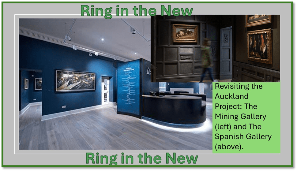
The 17th March was a very wet and rather depressing day in Bishop Auckland but walk Daisy we must and, given that she will walk without cowering in very places, we thought we would try the public park to the west of the town. It worked – instead of cowering she did endless ‘roly-polies’ in the grass, that we felt rather light-hearted, Geoff and I, and tried extending our day by revisiting the Auckland Projects Mining Artists Gallery and The Spanish Gallery and perhaps take lunch in town.
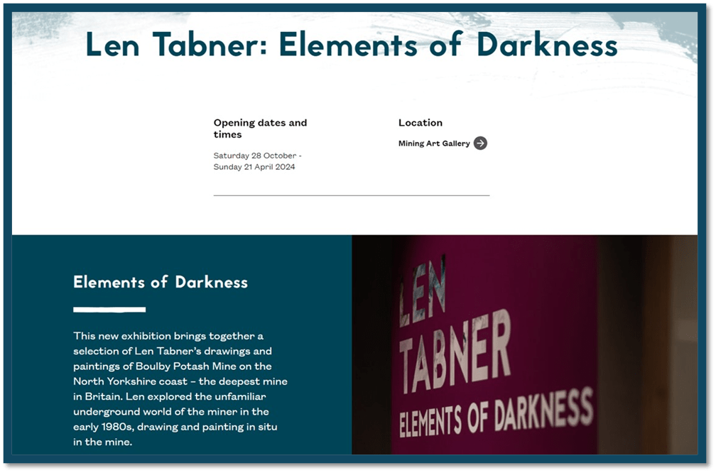
We visited The Mining Art Gallery first for I has heard of a new exhibition (by Len Tabner) whose work I dis not know. I feel trepidation with new art, even though this was planned as quick look round for a later return with a more leisurely examination if my hunch that here might be a considerable artist of high quality. To calm these I look around the gallery on the first floor, ready to refresh myself with old favourites, of which Tom McGuinnes must be my favourite. I think the nerves too related to why I want to make this an answer to the question about influential teaching, for influence is not always for the best and can regress and stultify as much as it can, when skilful and based in real interest in learners rather than an imago of what learning means to its teacher, develop learning and stimulate it as a autonomous desire in the learner, regardless of learners.
But how and why is any of my day related to this prompt? I think it is because I first found myself attracted to McGuinness’s work when I rather foolishly thought I needed an academic course in Art History to sharpen up my perception and give me more confidence. Thus I took up an MA with The Open University, deciding to do my end of year I project, which had to be on innovative curation and its rationale in some way, on The Mining Art Gallery In Bishop Auckland. Now the piece did well – I got an 1st class mark for the year 1 course – but I was dismayed by the commentary I received back for that high-achieving essay (for accruing marks are the least of my prompts to ambition in a quest for lifelong learning). The commentary seemed aimed at the assertion of institutional power of the teacher over what must have felt to them like the words of an unscholarly but keen reader of works of art regardless of the conventions that usually guided people in looking at this art. They might be correct there but it was clear that my enthusiasm grated on them.
I tried to write a blog in the University’s blog domain. You can see it at this link. Of course, the reference to teaching outcomes was marginal – it was an attempt to pursue a line of thinking actually suggested to me at the Museum, that to look at these paintings as if they not only were not, but could not, reach issues aspired to the grand traditions of European painting. That seemed to me an issue of elitism inscribed into art history as an institution. I had left out pieces of writing that followed up this thinking because I suspected the university could not think beyond social realism or commentary when thinking about working class art. One part of the writing I left out exists in part as a blog at this link. But the thinking was the same and is expressed in this short paragraph from the first mentioned blog:
My aim was to suggest (just that in so short an essay) how Bauhaus features in painting technique – the use of triangles in particular picked up in Kandinsky – had been potentially imported from the Bauhaus from people who influenced McGuinness in the working-class movements where, in part, he learned painting, especially Jos Thain who experienced the Bauhaus.
https://livesteven.com/2019/10/31/social-class-classifying-and-descriptions-in-art-paul-klee-to-start-with/
Seeing The Hewer again was a joy, but as I was here to find novelty, I was even more pleased that accompanying it were paintings from the once Gemini collection that I had never seen in the flesh before. One new painting to me was next to The Hewer and raised issues for me about the use of colour by McGuinness.
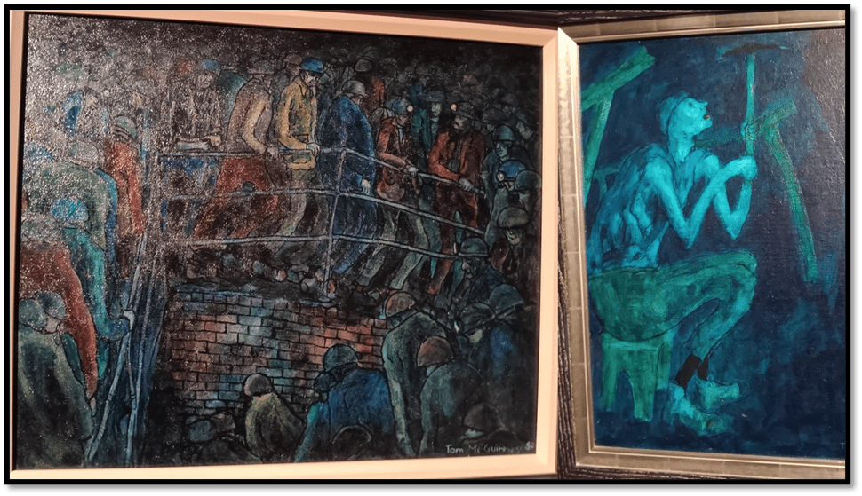
Examining this pair of paintings revealed a painter who truly explored working class lives, like his own in the mines, but as a painter as fired by innovative technique in form design and colour to create new meanings- why I think McGuinness always only sketched at work (for unlike Norman Cornish he remained in mining – even claimed to like the underground world of the mines). One could say a great deal about the painting on the left as I once said a great deal about The Hewer (right), but the variation in palette, with the maintenance of a background supernaturally dark is what strikes first.
Whilst the use of distortion in his figures can make his miners seem homogenised, it is clear that colours is used in this painting (I neglected to get the title and it does not appear in my books on McGuinness) are intent on forcing on one’s attention, that (freed from the pit) – even in descent into that particular Inferno, his working-class characters are not patronised or even de-individuated by the stress of their working conditions and working conditions that produces the distortions he also emphasises. That dark is infernal because the circumstances of the lives of these miners, and their wives in other paintings for women had long been forbidden from Durham pits, were infernal as they do not always seem in Cornish, who was nevertheless the one who escaped the pit.
Now compare that Dantean descent painting with one where colour equates not only with individuation but communal gathering for a freer less oppressed life, the painting being Miners Gala 1976 that once hang in the Durham Market Place branch of Barclays Bank until the Bank reneged entirely on its commitment to Durham, for they seem, having closed that amongst many other branches to have given it the Mining Art Gallery.[1]
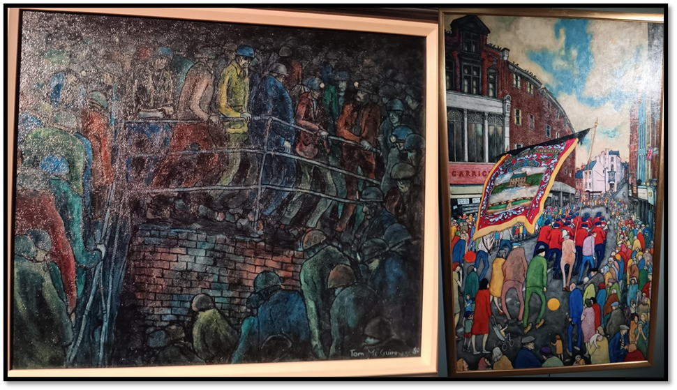
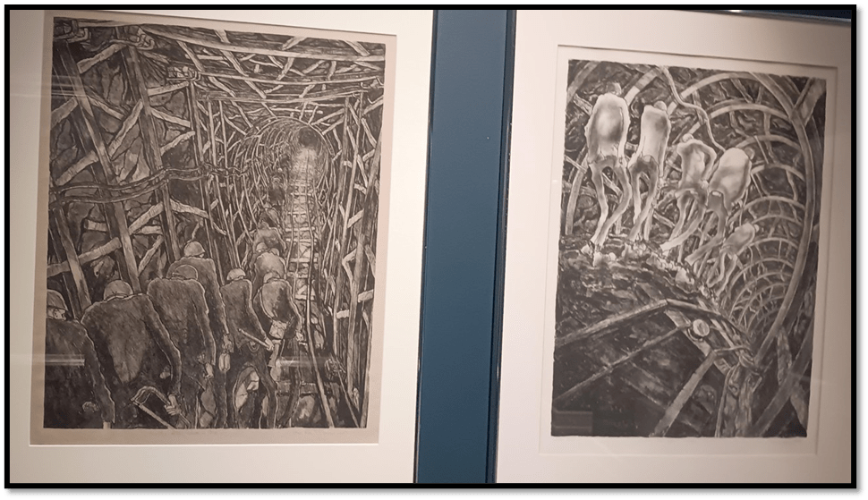
I hope the politics of these paintings is clearer in these paintings, though mediated as it was by Guinness’ Catholicism. This was a fine pick-me-up to see these new Guinneses, as ones I have seen in book reproduction, though never in flesh as even part of the limited set of lithographs, like the stunning Busty Men Going Inbye (1982) – inbye is a return to the shaft and therefore has a rising hope – and the even more painful Dantean descent in Harveymen Going Outbye – deeper into the pit. The use of pit architecture as an organiser of form is as interesting in the people known as the great German Expressionists, with whom Guinness identified (Busty and Harvey, by the way, were both specific Durham pits).
But I suppose the draw to the exhibition was the look of some of the pictures in the Len Tabner exhibition as reported in The Northern Echo, though I was equally put off by the way the curators spoke of why this art mattered, in terms of social and local history alone. I don’t deny this matters but the tendency is to absorb it into the politicised discourse of ‘Heritage Britain’, a tradition that, in my view, patronises and does not celebrate the working class. The curators are no doubt good people, but they are constantly turning this into a Gallery where art does not count and the artist is turned into a socio-historical recorder, even if this includes the recording of subjective response. Qua artists these people matter less.
I perhaps should have been less suspicious had I known another new painting on show, not by a miner but by a miner’s son, Alistair Brookes, Miner’s Going to the Pit (2006). The commentary is about the subjective reconstruction of a father’s memories – ones Alistair could not have seen himself – but with a kind of subjective mysticism that does indeed seem to be in the painting for the ‘distant colliery’ is distant in time as well as physical space for Alistair and thus, the curator thinks ‘a mystery, shrouded in the morning light’. That is beautiful but if I were Alastair Brookes I might feel the technique of my painting was being lost in subjective content that is colonising my memory, turning it into a depoliticised and fairly unreal motif. My own feeling is that this painter works hard to create both form and tone in a design that dirties an attempt to merely romanticise these hard lives.

Anne Sutherland the curator of the Tabner exhibition emphasises that the ‘history and ongoing legacy of mining in North Yorkshire and the North East is an important task’, but seeing this alone as a justification for working class artists must belittle them, if not as people but, as artists. She is quoted thus:
“It is interesting to have the gallery showing mining art whilst it is still very much alive – Boulby Potash mine is still open to this day.
“But, in terms of the heritage of the area, we see people who visit who have a real connection to mining in the region. They have relatives who worked in these pits”.[2]
Sutherland’s point though is about that slippery concept ‘folk history’ (so easily taken over as a containment of radical history by the mores and interests f dominant classes in society). It is not, I think, history in which lives were hard, individuals suffered but where also resistance to that individual suffering was created in communities. The title of the Tabner exhibition Elements of Darkness was one however that was open to tougher interpretation.
Detail from the webpage
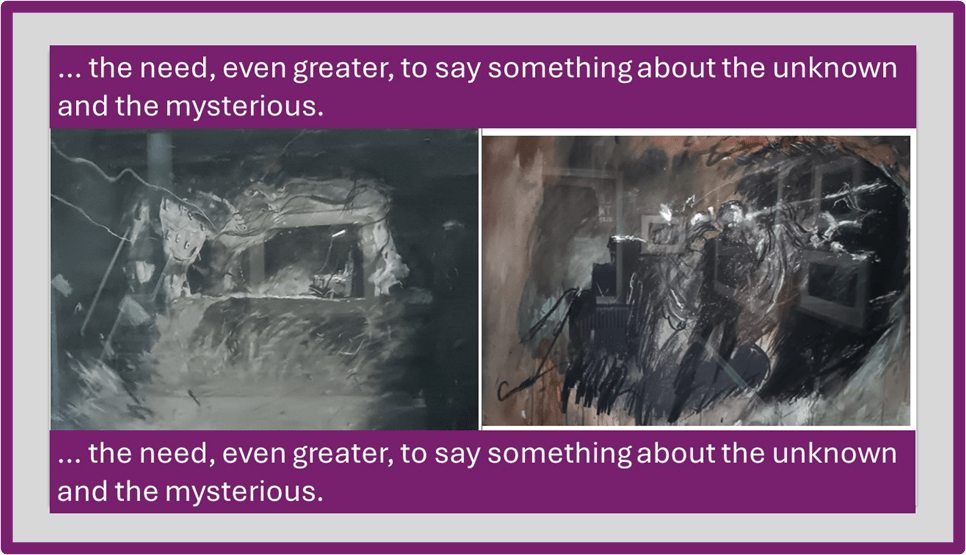
And this is reflected in both the paintings and the publicity within the gallery. A pleasant volunteer explained to us that the painting depicted on the publicity poster was the companion of a site (The Shaft Bottom) in the Boulby Potash mine which Tabner had painted before it was clear of debris and health and safety danger like hanging wires and dangerous clutter. Hence the before and after pictures as I captured them show the comparison. Of course the reflective glass is a problem on the painting, we see too much of the room, but I think the comparison of both formally shows much more than just a before and after scene illustrating an accidental moment or two in industrial and social history. I need and want to do more work on Tabner before I commit myself for here I think is an artist of extremely high calibre, whose use of multiple technical means is about visual art realising what only visual art can and photographs alone would conceal (although Tabner’s wonderful photographs also appear in this exhibition).
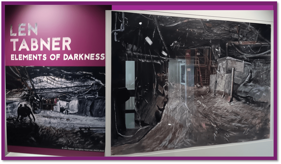
The issue in the art has much to do with uses of light and dark and tonal contrasts of greys, brown and orange in constructing the architectural illusion and the surface design which are truly conflictual in both, but especially the tremendously torn landscape and underscape of the ‘Before’ picture. Here is the Northern Echo record of it, in which the interest in biomorphic form (found in a McGuinnes lithograph we own) and the instability of structure and grounding (of any kind including foregrounding and backgrounding) of the scene are called into question. You literally feel unstable looking at it, like the history of the lives it sustains:
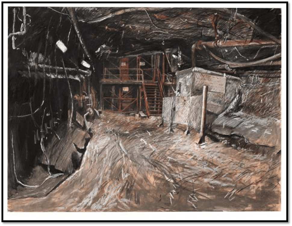
There is much in the texture of such a painting – in fact both paintings. The one of the Shaft Bottom AFTER is huge and overwhelming.
The curators do talk in a curatorial plaque about the @exploration of a Subterranean Landscape’ but I wonder how savvy that title is to the fact that this painter has things to say about landscape as a genre, form and subject that goes beyond some conventional thinking. Again I need to do some work. There is an invocation in the plague text to the unknown and the mysterious but I wonder if this doing something with the contrast of non-objective or abstract art genres with this most mimetic of forms (except in the hands of an Expressionist like Kandinsky or Klee).
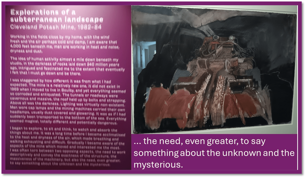
The machinery that informs subterranean landscape is both references it mechanical hugeness and fearful operation but it makes points I think about underscapes as landscapes are formed in the imagination of a socially aware artist too. As I saw more works, I was more and more convinced that this way my study of Tabner to come must begin querying the work.
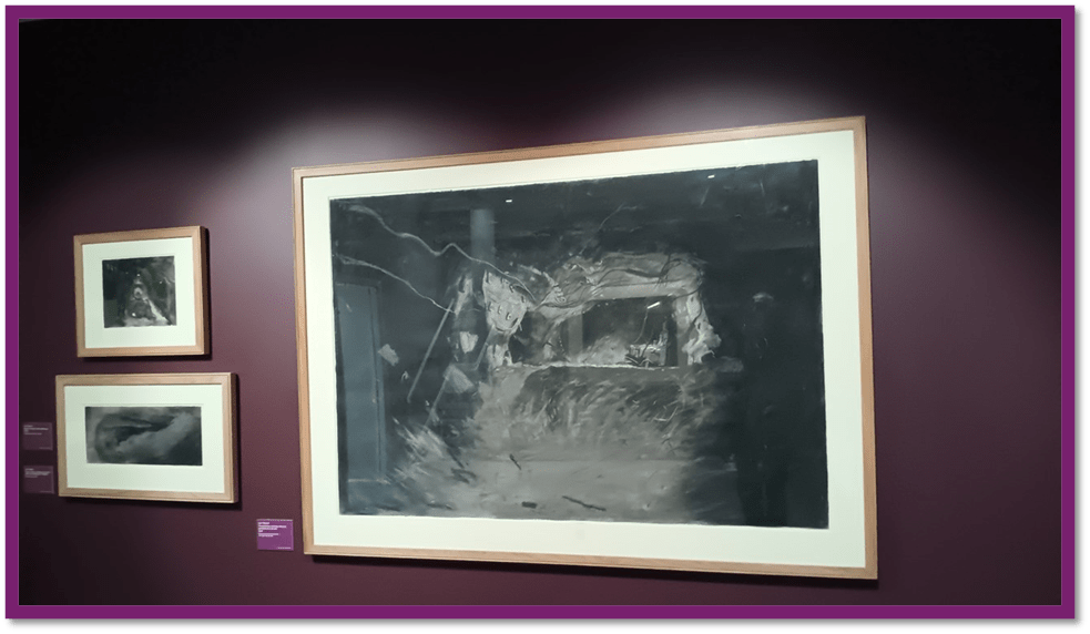
I can’t praise the curatorial aesthetics of this exhibition again. For one reason I need to go again soon is the haunting effect of the purple-painted walls, which help draw us into resistant paintings that hide, and almost smother their subjects, whether figurative or of landscapes or still life (or dynamic machinery). This does remind me somewhat Of Henry Moore’s mining drawings, to which I summarised a reaction in the blog at this link. But again I need time and study to contemplate the issues. There is so much to think about. But here’s a photograph in praise of curation:
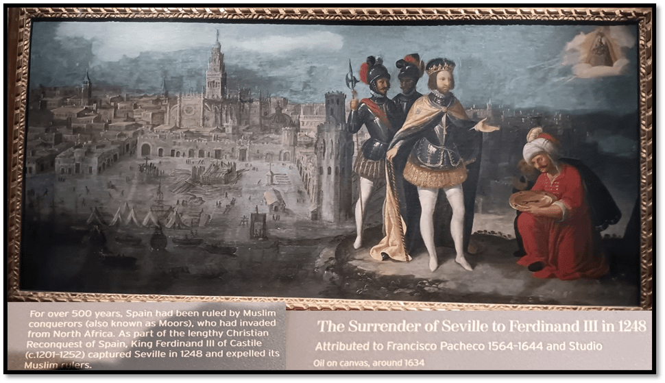
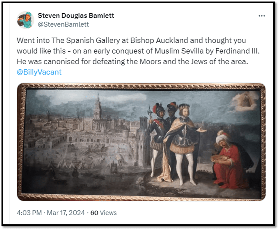
There was still time before we wanted lunch so we revisited The Spanish Gallery. One reason was a tad trivial. I was keen to photograph and tweet to a person I knew, very remotely a picture of historical Seville for he has recently moved there and seems engaged with its culture. Here it is and following it the tweet. Mission accomplished!
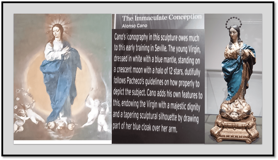
But I could not help but see that the Spanish Gallery had benefited from its rehang over the Winter. In particular, it was doing much more in showing the wonders of Spanish polychrome statutory which I wrote about when I used to volunteer there. You can see that blog at this link.Much more could be said now, but I don’t intend to do it, just to show some of the wonders, and not all, of the clever curation around this rehang. For instance, though Cano and his rather conventional Immaculate Conception Counter-Reformation may not be your cup of tea, it works so much better where the painter-sculptors work in 3D and 2D are directly comparable, as in the Main Hall of the Gallery.
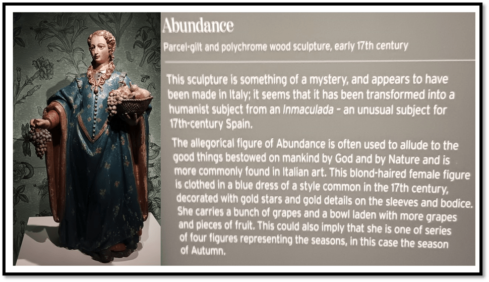
To see a problem piece of polychrome statuary like Abundance moreover is a pure joy. At last something else in the intrigue of Spanish seventeenth century art to get my teeth into:
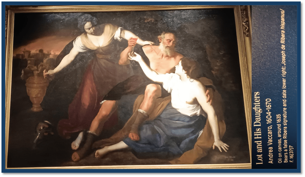
And, in the place where they once had the Dali Crucifixion, borrowed from Kelvingrove Museum in Glasgow, now is a painting that fascinates me though not perhaps for its artistic fascination. Instead it seems an important work in the deepening of our understanding of Baroque sexual-familial sensibilities, which puts a new complexion on Lot’s offering of his daughters to the rapists of Sodom and Gomorrah, who actually lusted after his male guests, the disguised angels. The plague points out that such a painting could not be produced in Bourbon Spain but it could, under the same King in the Bourbon Kingdom of the Two Sicilies at Naples. There is such power in the foot of Lot holding down one of his daughters as he offers her blandishments whilst offered wine by his other daughter. Indeed as a study of feet alone it is a foot fetishist’s delight. But is it art? Heavens know. I can quite get my head around the attribution once to Ribera, but there you go.
And then we went to lunch and back home. This will go online on Monday. The one on Kaveh Akbar will have to wait. If I try to almost finish it tomorrow (notes all ready), it can go online on Tuesday hopefully.
But I need to conclude that teaching even if a negative experience, can also launch you into autonomy if only in resistance to its disempowering mode and method. For if the Open University was like that it an Art History M.A., it very much wasn’t in teaching Open and Distance education which produced this statement of intent:
PEAR: A Possible Fictional Education Company for H817 TMA04

All my love
Steven xxx
[1] Robert McManners & Gillian Wales (2006: 66) McGuinness: Interpreting The Art Of Tom McGuinness Bishop Auckland, Gemini Productions. The authors wrote whilst the painting was still hanging at Barclays.
[2] Kayleigh Fraser (2023) ‘Mining Art Gallery unveils Len Tabner’s work’ in The Northern Echo (October 2023) available at: https://www.thenorthernecho.co.uk/news/23882608.mining-art-gallery-bishop-auckland-unveils-len-tabners-work/
