Homes of space and light at either end of Hope Street, Liverpool. This is a blog of un-academic and possibly unintelligent comments on visit to the cathedrals of Liverpool. This blog is about a visit to homes of space and light at either end of Hope Street, Liverpool. This is a blog of un-academic and possibly unintelligent comments on visit to the cathedrals of Liverpool on Wednesday 29th September, with return to see interior of Metropolitan catholic Cathedral on Friday 1st October because it was hosting University Award Ceremonies on the first visit.
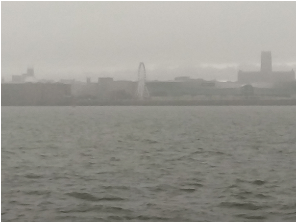
Through the mist and rain from a ferry cruise on the Mersey we could see the street on which we were staying in Liverpool since at each end of it stands a cathedral
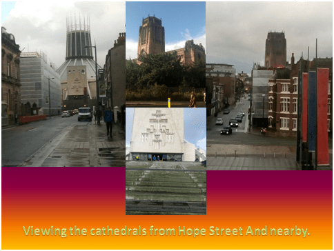
The street is Hope Street and it is the home of bistros, the Everyman Theatre, parts of two universities campuses, the Liverpool Philharmonic and the Liverpool Institute of Performing Arts (LIPA) and its two schools. Outside the latter and across the closed end of Mount Street which descends briskly into the city is an art work of stone trunks and packing cases. We stayed across the road from it in a small street called Blackburne Place.
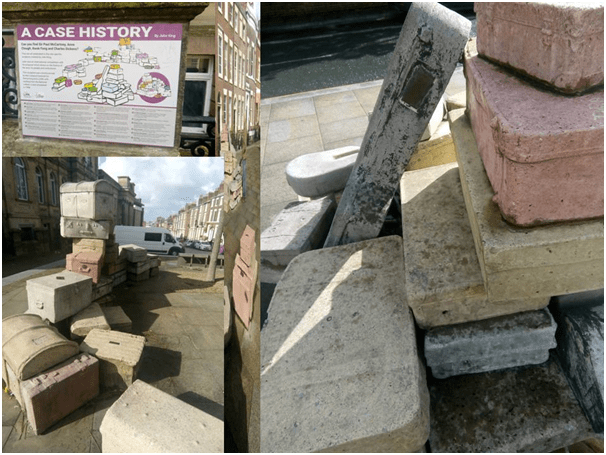
To the left of the ‘case history’ LIPA artwork (see photograph below) is a kind of portal made of two standing stones with a relief statue on one side of each of the one-time bishops of Liverpool, Catholic and Protestant. Maybe that is meant to make Hope Street now emblematic of ‘HOPE’ of Christian Unity, at least between these two institutions of very mixed history in Britain.
The cathedrals were both built in the twentieth century, the Anglican one right through that century from 1910. I still remember the controversy over the Anglican cathedral from the time I was at primary school in Yorkshire in the 1960s which circulated around the winning design by Giles Gilbert Scott. It was still controversial, especially in the light of the favour for modern architectural and art form (still described as ‘Gothic revival’) by Frank Gibberd and Sir Edward Lutyens of the Catholic Metropolitan Cathedral (‘Paddy’s Wigwam’ I believe it is called in the area but I balk at the possible – I would certified – anti-Irish racism possible in that term).
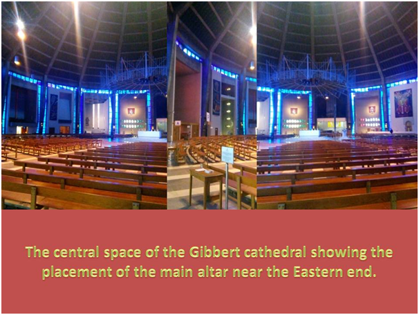
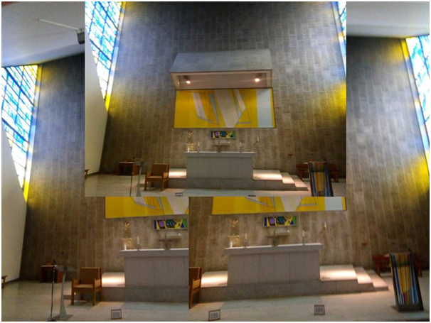
Although I could only see the interior of the Metropolitan on the second day of visiting and because of time constraints missed the supposedly superior Lutyens crypt, for which alone there is an entrance fee, I’ll start with this because my central theme for comparing impressions of the utilisation of naturally and artificially created light to carve up and enhance space. And the Metropolitan is, apart from the chapels on its circumference, simply a circular space that mounts upwards to a corona of small spires. The corona has stained glass in it; thus:
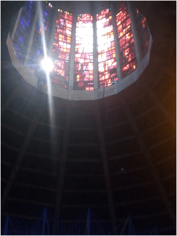
This photograph might have been improved by cropping and some attention to the focus but I wanted to indicate the positioning of a corona, presumably representing a crown of thorns that is suspended immediately below this spire structure. Even at nine in the morning, when this photograph was taken, the light is fierce and it and the lighting from blue stained glass in vertical panels around the main circumference of the central space define and carve it to the eye, and this process must change in different lighting, but I was unable to check that out by returning another day because the Cathedral was in use for degree ceremonies.
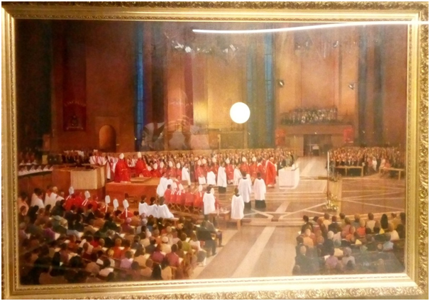
To some this effect appears a kind of damning kitsch in the architecture of a cathedral and I revolted against somewhat the dominance of Marian blue, as if in response to the church’s latest identification with the Virgin Mother but it has more dignity when you are actually standing with space or walking around it. Nevertheless, in a painting on show in a side-space ( I did not take the painter’s name and it is a fairly undistinguished piece, there some to be an effort to embrace the flatness painting surfaces offer and lose the sense of an innovative space in favour of the bishops in their red and white vestments there gathered. You could not understand the space and how it feels from this painting:
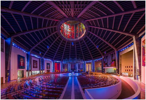
Yet for us light defines not only the space but the placement of sculpted artefacts – natural in the case of the statue but artificial in the severe representations of the Stations of the Cross around the ambulatory. The shape is only really visible if the perspective is rounded as in this beautiful image from the Wikipedia entry:
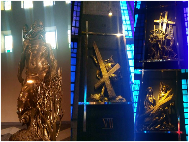
Light though is handled so beautifully in the distribution of art in the cathedral, though the art itself – though innovative in its formal revival of Gothic and Baroque Catholic themes – is stereotyped in its meanings if not in its delivery through a context of lighted space. The Stations in the Cross in the ambulatory are conventional but deeply gruesome, with some icons I found it hard to interpret. I needed a Catholic friend here. How about you, Justin? The lighting of a gilded sacrifice of Isaac by Abraham at the moment God provides a sacrificial substitute for the Son of Man though is amazingly beautiful, almost Byzantine in its recall of the typology of that incident in the giving of the Child for Sacrifice.
The chapel behind the main altar however and in contrast retains simplicity and box-like conventional structure but how gorgeous in the confluence of blues and yellows from the art work, artificially lit in part and the stained glass at either side. It reminds one of the Matisse chapel if with less stress on a God of nature rather than of abstract Grace.
The former contrasted with the presentation of Space & Light in the Anglican cathedral
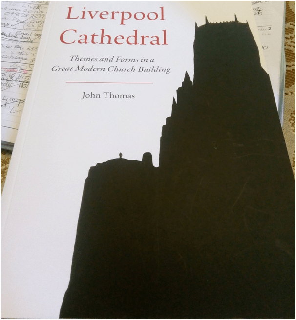
But whatever our feelings and loyalties the handling of light and space in the Metropolitan Cathedral the Anglican cathedral is a much more complex space and defined, or at least it was for me, by a much more open and tradition defying space despite being presented to me at school in the 1970s as precisely the opposite of this. The difference to middle-ages Gothic is clear to the eye but i was hard pressed to understand this till i read (a dull text with, as Alice says, no pictures – there are drawn designs of Gothic architectural detail to be fair – or conversation, a brief book published in 2018 for sale in the cathedral bookshop by the unfortunately named (given the treatment of that name in Lady Chatterley’s Lover, John Thomas, Liverpool Cathedral: Themes and Forms in a Great Modern Church Building.[1]
[1] John Thomas, Liverpool Cathedral: Themes and Forms in a Great Modern Church Building
I think perhaps a major difference is the lack of a central entrance, but there is no such in the Romanesque Durham Cathedral either, that mounts to the nave, as there is in the Metropolitan, at least under ordinary use as Thomas too confirms. Instead we pass into smaller porch doors to the left and right of the centre on the West wall of the Cathedral. Indeed, as if to call attention to this, the central doors are topped by an Elizabeth Frink statue, with a kind of Epstein feel to it, of the ‘Risen Christ’, but we are welcomed, or at least we were, through a narrow not a broad entrance to which its hands point to each of its sides. It is a lovely work.
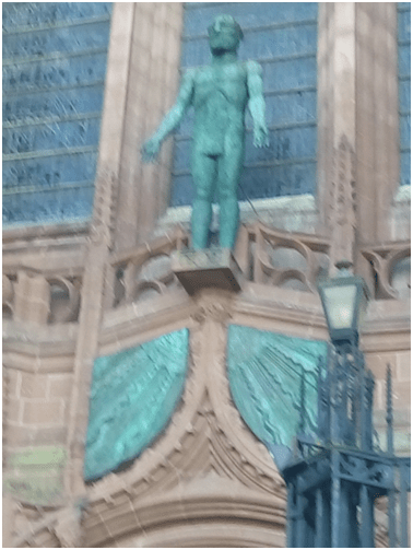
I will return later to an example of art in the cathedral that surprise much more than this by Frink or anything within the Metropolitan.
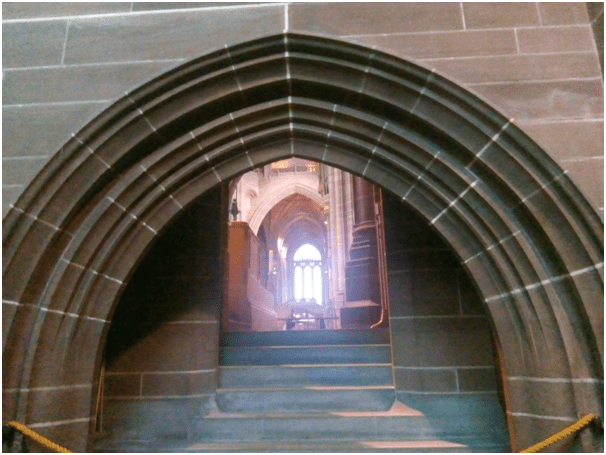
John Thomas tells us, and explains the odd feelings I had on entry, that the central space of the cathedral at the West is particularly strange, not least because it lies below the level of our entry, almost as if it were a pit countersunk by the weight of the empty tower walls that stand above it. We look down into the nave then and the progression of our eyes towards the main altar is surprisingly, for other cathedrals I know, end-stopped. Thomas brilliantly puts the context in which we will understand these feelings thus:
… this cathedral is not like other cathedrals. Most Gothic cathedrals, whether of the middle ages, or some later time, produce a sense of progression, in that the larger public parts (those were traditionally the domain of the laity) naturally lead one to the smaller (but more decorative perhaps) parts which were the domains of musicians and clergy of minor orders, and onwards to the principal altar (the domain of priests and, perhaps, sacred remains), at the liturgical “eastern end”.
…./…./[2] Thomas (2018: 12) in the chapter ‘Space and Form’
The nave, like all else, is inviting; it is clearly original, different from other naves – but the pull of the central space-to-Choir progression is perhaps greater. Thus if we do Pass down the South Nave Aisle, to look at this different space (which is not so much in front of us, but below us, down the steps) it will be at the realised cost, possibly, that we have renounced greater, more inviting, pleasures to the East. The nave, as a separate space, must be understood by way of Scott’s original idea to build an organ on the nave bridge, the Dulverton Bridge, which completes the process (seen in the all-important steps) of screening the nave from the rest of the building … the further reaches of the main space are still visible, but not completely. As usual, Scott is playing the game of teasing us with half-hidden, half-revealed spaces, spaces with good promise, exciting prospect. …[3] ibid: 14
Thomas brilliantly describes here spaces and spatial games by an architect not easy to describe but in a way that explains any viewer’s perplexity in this space.
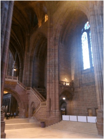
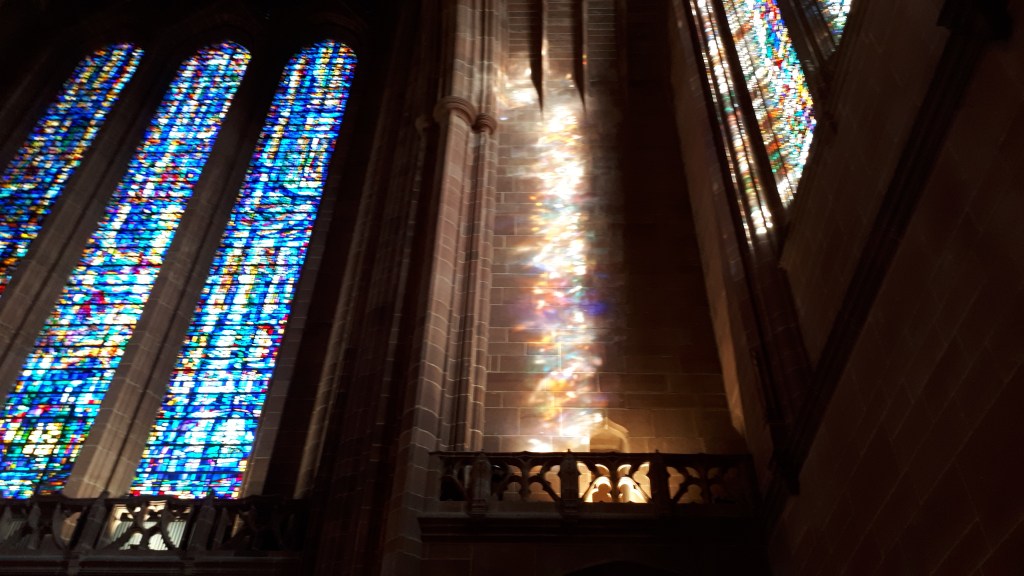
Another feature of this main space constituting the nave at the West End is that it extend upwards because the Tower has in fact no built interior but is rather ‘higher, empty space’ affording views from the raised piece half-way up views down and above into emptiness – or more truly spaces surrounded by walls suffused with the light projected by the sun shining through stained glass. It is worth going then when, as on the day we were there, the light is strong.
Thomas is equally interesting about another spatial trick in the architecture when the West End is viewed from an ambulatory behind and below the main altar wall or reredos.
At the south-west (and also north east) aisle, there is a ninety-degree turn that leads to the Ambulatory passage; the high altar and reredos tower above us, to our west. Two archways, either side of the reredos, allow a breath-taking view of the Choir, the Central Space, and beyond. This ascendant view feels deeply meaningful in terms of the story of salvation ecclesiastical buildings are meant to tell.
[4] ibid: 17
There is much more in John Thomas’s brief book on the special nature of the Gothic decoration but I was blown away by the modern art here, of which there is so little information. For instance, if you approach on the either aisle of the building that leads to the ambulatory behind the principal alter and reredos, and appear on the walls as you reach the ninety degree turn described by Thomas above. The paintings face each other across the space holding the main altar and are best seen from there. The first painting, on the South Aisle, is a painting i already knew about and which is by one of the most interesting queer perspective painters of our day, the Glasgow born and Roman Catholic, Adrian Wiszniewski. The name of both paintings are respectively The Good Samaritan of 1995 (South Aisle) was gifted to the Cathedral by the Jerusalem Trust and A House Built Upon Rock of 1995/6 (North Aisle). The author of the best monograph on Wiszniewski’s, Alex Kidson, says that it was non-sectarian brief of the cathedral’s art-commissioning that attracted Wiszniewski. The Church Times called them in 1996 ‘one of the most important church commissions ever made’.
[5] Cited Alex Kidson (2014: 82) Adrian Wiszniewski Bristol, Sansom & Co. Ltd.
These paintings are determinedly family paintings, although they acknowledge (especially The Good Samaritan) queer and chosen families. They tell stories of social and family fracture (a wall resembles a bolt of lightning) and blood-letting (by a pen-knife) and of redemption through care and love. Adrian Wiszniewski believed that the colour scheme of the painting design was in honour of stained glass lighting effects throughout the cathedral and has an autobiographical theme with the painter and his wife appearing twice – the second time where she looks on as he makes a secret sexual assignation with a man.. Ands is not the naked Samaritan an appearance as a hermaphrodite, carrying the sexual organs of a woman in a body that is clearly male. The painter wants this work to be confessional and redemptive and to make clear the role of Christ in the redemption of Adam – hence the anachronisms in the painting and geographical collages (torrid deserts and Liverpool style housing for instance). In the other painting the family is united though a serpent-cum-Jonah’s whale appears to attempt a fracture between man and wife. The aim is to type the house built on Rock, carried by the artist’s daughter as the meaning of the cathedral. And the beach location is appropriate given that this cathedral is built on sandstone.
There are other artworks of great beauty here but go and discover them for yourself. It is ironic that the Cathedral has made a permanent home for these modern allegories of a modern take on faith since art institutions such as the Goma café (in the Gallery of Modern Art at Glasgow) has actually banned ‘general access to the public’ of its major Wiszniewski commission. But then art history has made no case for its tolerance, even a case that, like Christian Churches, often broke. It is a great achievement for an Anglican multi-denominationally committed institution and important for Liverpool where hatred of Catholics and the Irish have alike a significant sectarian history.

Of course I have to end this piece with thanks again to Catherine who accompanied Geoff and me on this holiday and made it better than it would have been. Had she not been there it is unlikely that we, an ungodly pair in truth, would have visited these two cathedrals. We would have been wrong. Thank you Cate!
All the best
Steve

3 thoughts on “LIVERPOOL VISIT 3: Homes of space and light at either end of Hope Street, Liverpool. This is a blog of un-academic and possibly unintelligent comments on visit to the cathedrals of Liverpool.”