Reflecting on Edward Hopper Edited by Carter E. Foster (2009) New York, Rizzoli International Publications Limited.
My local bookshop in Bishop Auckland (Bondgate Books, Fore Bondgate) recently purchased a collectors library containing a number of very beautiful art books. This week I purchased this lovely catalogue with scholarly essays on Edward Hopper. I’ve spent some time reading the essays but mainly gazing at Hopper Paintings, including ones I didn’t previously know.
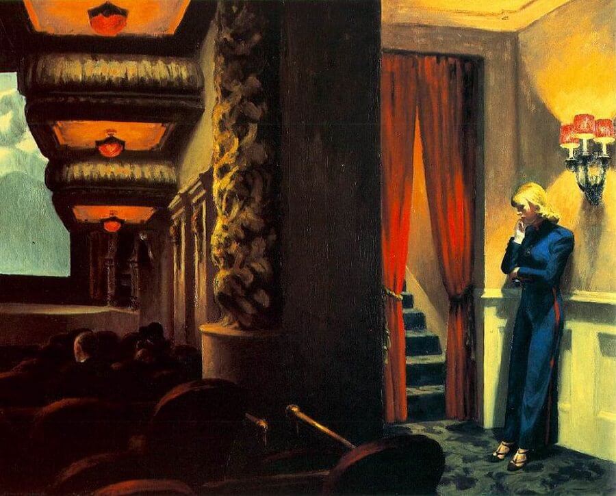
To mark my enjoyment, I thought I’d blog about a painting I didn’t know, though it seems famous enough. The one that moved me most was New York Movie (1939). The digital reproduction is much brighter than the one in the book (p.27) and I can’t say, having never seen the original, which most conveys the effect of this very large painting (81.9 x 101.9 cm). Here it is. But I’ll return to it in the end.
I thought that, being an absolute beginner, I would try to show some of what I learned from this book that seemed to make him a painter I like so inordinately. And what attracts me I think is the constant play in all the paintings between surface pattern and illusions of depth (and in particular layers of depth). These don’t seem to me merely technical issues but to point to how visual, emotional and cognitive interests in a painting interact for me to create a sense of the whole.

The tensions between surface pattern and depth or layering illusions are clearer in Hopper’s most famous painting Nighthawks (1942). They are described in Carter Foster’s essay in this book as:
…a calculated, subtle and striking composition, with a series of diagonals defined by architecture which slice up the space back into depth, and which overlaps one another, creating layers of planes.
p.29
The adequacy of any description of artistic effects can nearly always be called into question but when dealing with the effect of planar depth we are often thrown off by descriptions which utilise the representational effects of the picture. Is it, for instance, strictly true to say that in the picture there occurs; ‘ a series of diagonals defined by architecture’? There is a whole debate here that hangs upon whether this ought not to read, ‘a series of diagonals which aim to define the architecture represented by the scene’. By architecture what we mean is the effect of represented streets, buildings, interiors and interior architecture (counters in a café for instance) but are such mimetic effects what defines geometric pattern or the other way round. The same might be said of layers at variable depths. These layers are an effect, they do not define the geometry.
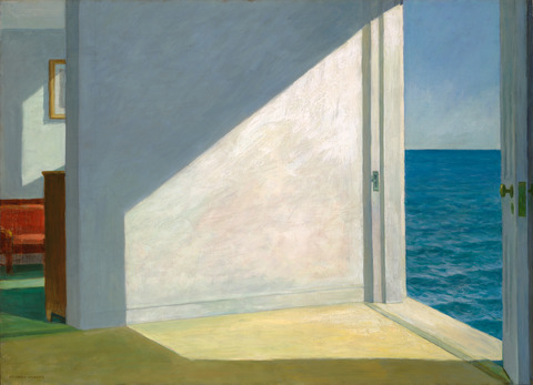
Whilst I am sure Foster knows this, it still matters how we describe them in Hopper. When I look at Nighthawks I see some pretty well-defined surface geometry and illusory depth. Perception of a Hopper picture plane often veers between pattern and illusion and this is part of the affect and meaning of the painting that dominates the figural elements and interprets them. Layering effects, for instance is what turns into meanings about the distance between figures, and perceiving these distances calls up emotional as well as physical issues of distance. Sometimes these effects break the mimetic role of the painting such that layers intrude on each other in a threatening way as does the sea through the door in an otherwise empty room in Room by the Sea (1951). We do not know how in this picture to place effects of vertical or horizontal distance in ‘placing’ the sea. To me, it becomes an affect that threatens.
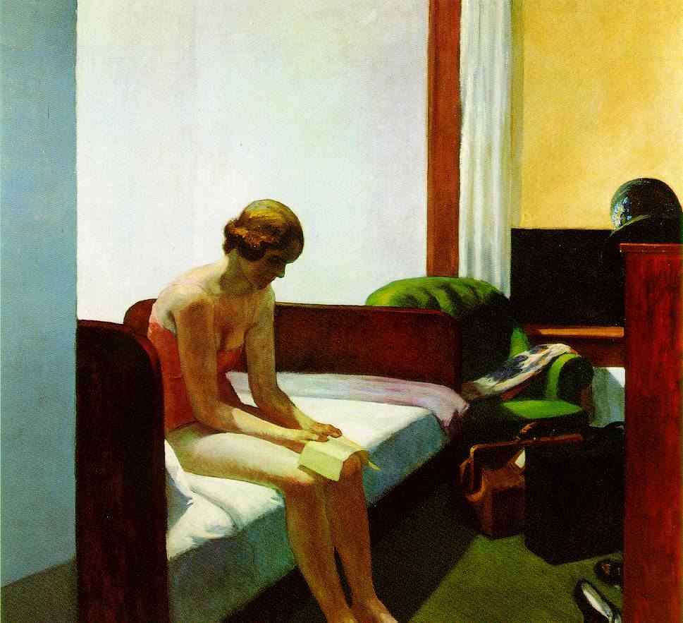
Similarly, highly lit white space in which vertical lines struggle to be noticed, as in the faint thin shadow above the figure’s head in Hotel Room (1931) makes me feel the space is failing to mime depth and becomes to my eye, one and off as I look, a kind of blank square. Yet even here the board at the bed’s foot asserts planarity as we scan down the picture. The effect causes you to go in and out of the possible affect suggested by this lonely reader.
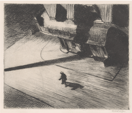
These effects are rightly called cinematic in the essay by Goffredi Fofi in this book and one could even see in them something of the technique of the graphic novel in conveying emotion by difficult relations of depth and height, as in Hopper’s most famous print (below), Night Shadows (1921). Here space and depth are complemented by a kind of vertigo related to the imagined perspective from high above in which ‘threat’ is encapsulated, notably by the humanoid shadow cast onto the supposedly Baroque surfaces of a building. The affect is appropriate to film noir genres.
There are so many great Hopper paintings, drawings and prints that it is difficult to stop looking at instances. However, this is time to do what I said I would and return to New York Movie (1939).
It is not alone in picturing a central female figure in a film or vaudeville theatre and many other such Baroque interiors attest to interest in the effects of ‘depth’ effects that are rendered into potential emotion from the uncertainties involved in the act of looking at them and working out a relationship to them and their focal, if often off-side, figure. I’d suggest The Sheridan Theatre (1937: p.181) is an even richer one.
But lets look again at the painting that has fascinated me.

The photo realism of the female figure strikes us immediately but this becomes more and more disturbing, to me at least, when contrasted with the fuzzy edges of the objects elsewhere in the painting, not least on the visible surface of the film screen and its projected images. The latter never quite define and, although we do recognise the subdued red roof lighting that both appears to recede from us and that presumably reflects back from a relief shape in the roof of the theatre, we would be hard pressed to define an ‘architecture’ precisely here. We are in perceptual doubt and this doubt keeps drawing us back to the isolated female.
The theatre is empty. The essays in Foster’s catalogue show was an unlikely event at the time where they in fact cinemas overflowed: Hopper has clearly decided to reduce the number of people for narrative and/or reasons of desired affect. The confusions of perceptual loss which might because of depth illusions help to register emotion that we can attribute to the figure. She is clearly well dressed (the shoes are definitive) and either waiting for someone or taking time out from a difficult interaction from some ‘other’ in the theatre. (These narratives tend to generate out of the uncertainties.)
What strikes us on the surface are the verticals dividing blocks and how they define surface space. This especially true of the central column which not only cuts the picture in two but allows space and perspective to be defined differently on each side of it. It is as if the viewing eye were looking back and forth between the halves, finding from that a focal disturbance. In turn that physical effect at the eye is so easily readable as disturbance of affect.
I think so much goes on in this painting. However, never having seem the original, I want to stop there. For me, Hopper is a kind of giant in figurative art but that is because he plays with the knowledge that the kind of abstract patterns we perceive for a moment on his picture plane are in tense relationship with the desire to identify so essential to dramatic and spatial depth mimesis. But I’d be interested in other views. I’m very much still learning.
Steve

Greatly admire Hopper, his characters look like they are in another world or a different dimension…or they are in the right dimension but the rest of the scenery is from another world. Most certainly a great artist. Great post and great analysis and information. Greetings from Spain,
FBC
LikeLike