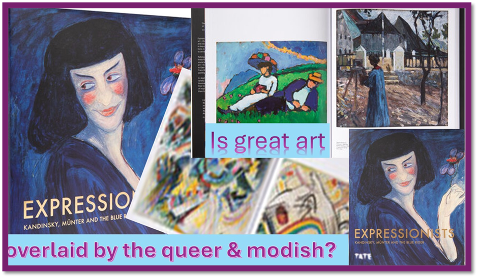
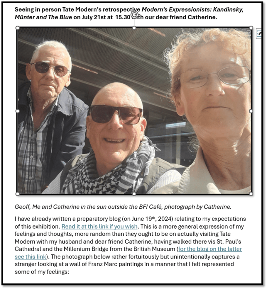
Seeing in person Tate Modern’s retrospective Modern’s Expressionists: Kandinsky, Münter and The Blue Rider on July 21st at 15.30, with our dear friend Catherine.
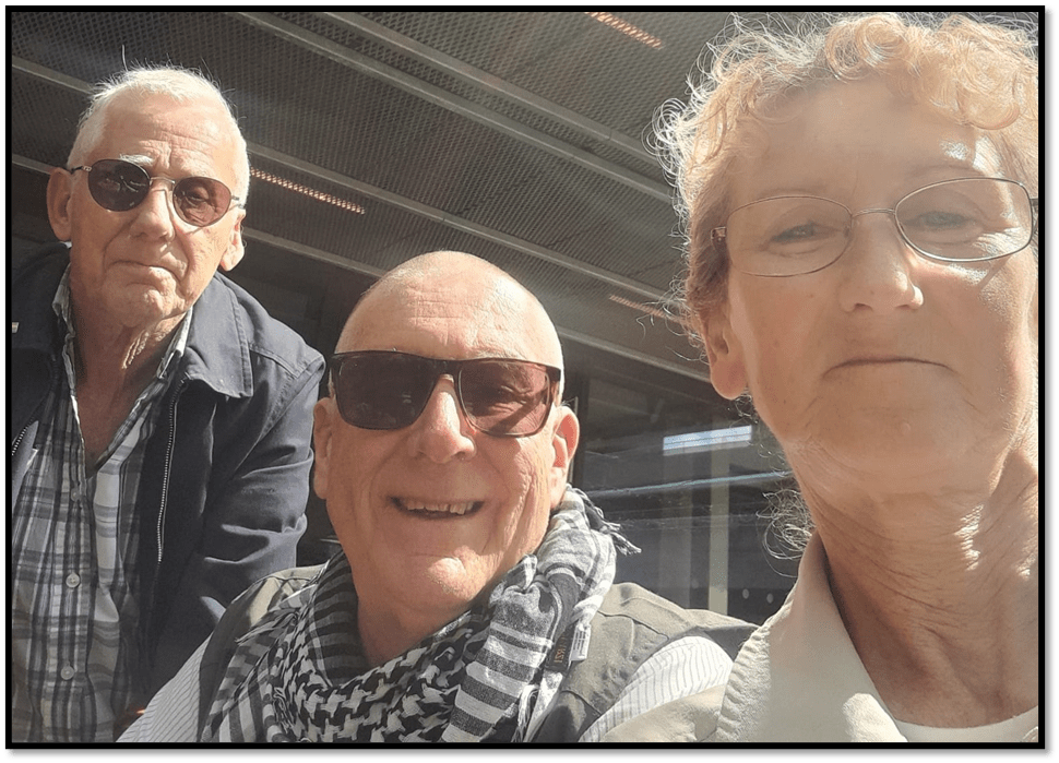
Geoff, Me and Catherine in the sun outside the BFI Café, photograph by Catherine.
I have already written a preparatory blog (on June 19th, 2024) relating to my expectations of this exhibition. Read it at this link if you wish. This is a more general expression of my feelings and thoughts, more random than they ought to be, on actually visiting Tate Modern with my husband and dear friend Catherine, having walked there vis St. Paul’s Cathedral and the Millennium Bridge from the British Museum exhibition on Michelangelo (for the blog on the latter see this link). The photograph below rather fortuitously but unintentionally captures a stranger looking at a wall of Franz Marc paintings in a manner that I felt represented some of my feelings:
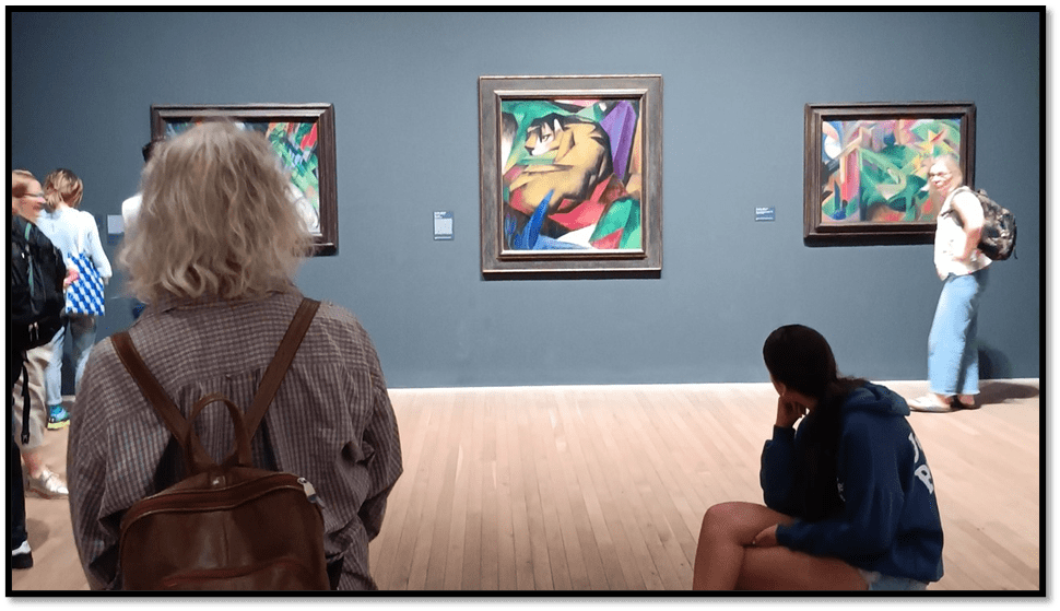
Whilst the many walk past paintings of such high colour values that they startle as a first response, one person here sits in a mode reminiscent of Rodin’s The Thinker and absorbs the painting in a way that precedes a more direct and proximate approach to it To get near the paintings is to see the densities of paint in certain brush strokes and to feel the intention of these works but they need an absorption of their effects as a whole first for they constitute an imaginative journey. Perhaps ‘transport’ is a better word than ‘journey’ for there is something that causes turbulence on the fringes of various modes of the outside and inside of these paintings and their congress with us inside as felt thought or outside as compositions of colour.
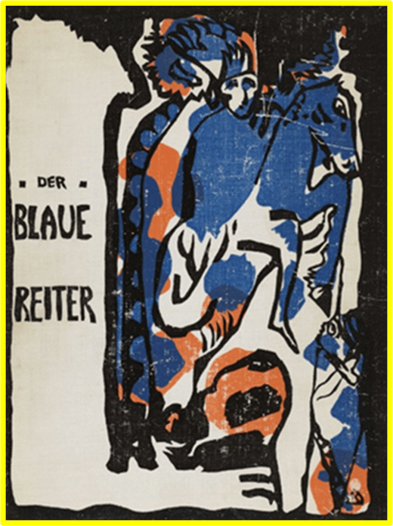
And the idea of a journey that is a transport meets us at the portal of the exhibition in Kandinsky’s Riding Couple, painted between 1906 and 1907, and yet with the feel of late nineteenth-century century Medieval revivalism, but in a Russian context of the onion domes of Moscow, and a bow to pointillist transcription of an impression of the realisation of what is still fantasy. We could, I suppose, say that the first group motif of the artists we see here, though covering paintings outside the orbit of that label, Der Blaue Reiter (The Blue Rider) is emblematic of their very personalised and hard to place iconography. It signifies perhaps being carried semi-involuntarily by our emotions into a new space, into which we have to cross all kinds of boundaries to get there.
As you enter the exhibition you are immediately faced by Riding Couple, that earliest of the Wassily Kandinsky paintings there: full of passion indeed, but heavily grounded in a narrative to be imagined and with clearly recognisable representations of a Russian city (I guess Moscow), a river in a landscape, and trees that in part screen the skyscape behind them. Only later will you see another ‘blue rider’ in his very different Impressions IV (Gendarme).The hint of a subject in the title does not guide us to a narrative of romance as Riding Couple does. The latter is caught between love and adventure (for these lovers seem to be those of a medieval romantic love tradition and therefore shunning the connection it has with social forms like marriage) in the earlier picture. One can suppose in Impressions IV this is the gendarme of the title, a policeman riding a horse in the city but there is little to justify that opinion.
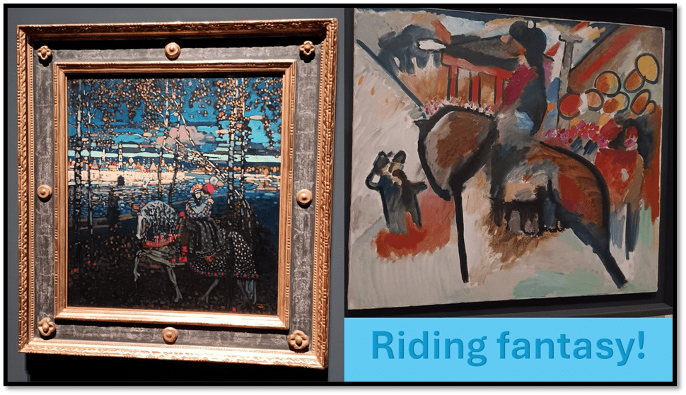
Wassily Kandinsky, Left: ‘Riding Couple’, 1906-1907 Right: ‘Impressions IV (Gendarme)’ 1911.
The horse in the painting is composed of and partly stands astride very thick regular boundary lines and in front of a scene that could imply either carnival or a scene of other, more politically fragmenting disorder. It is difficult not to see the splash of reds on the street as blood. However, any narrative reading remains as fantastical in story or other signification as the early painting, refusing the viewer any attempt of closure of its meanings. As a result, it is an exemplum of the kind of disturbance we see grow in the paintings of Kandinsky in the exhibition, where the dissonant and the consonant (the harmonic perhaps) are often brought together in the same painting as a ‘composition’ (a word he frequently uses). It is composition that doesn’t fear to discompose its viewer, however, too. And in this it is like the Schoenberg pieces played in the exhibition. Words like ‘composition’, ‘theme’ and ‘improvisation’ often evoke musical (and theatrical, operatic or dance) performance as well as the making of whole pieces of art from materials that feel at points of our scansion of them not to be going to cohere.
For instance, take a detail from the Gendarme ‘Impression’, like that selected out below:
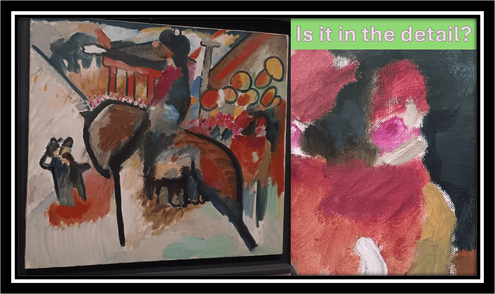
Wassily Kandinsky, ‘Impressions IV (Gendarme)’ 1911, with detail on right.
What are we make of that detail which still suggests the representation of figures under the composition of shapes (fuzzily defined ones with varying thickness of paint application). We could see, if we persuaded ourselves thus, two figures here, who may be in conflict as two figures to the left of the canvas certainly seem to be – in some moods I saw an arrest going on there. We feel through the moods that wash over objects and that evoke strong feeling. The mouth and eyes I see in this figure seem angry. But there is joy here. It is a painting on the playfulness implicit in misrule this painting.
The way I read the above will give some hint of why I favoured Kandinsky’s work in the exhibition and why it still haunts me. Geoff favoured Franz Marc pieces and I can see why that might happen to anyone, for these works seems to live in their covert play with notions of both the wild and tamed in the circumstances in which animals live – but more of that later. Catherine had an eye for Delaunay’s later colourist abstractions I think and for some Werefkin. But before looking at some of the general themes, it seems appropriate to say that the exhibition did not aim to create a sense that you could draw a unified approach to art from the whole group displayed, and my account here is very selective. For instance two paintings of cities (in the collage below) stuck out to me as quite unlike the majority in form, composition and meaning. Both examine the idea of a city in a way that Kandinsky may be doing in his Gendarme Impressions painting but without the dynamism or conflict between the forms. Even taken together they are very different conceptions of the art of the metropolis.
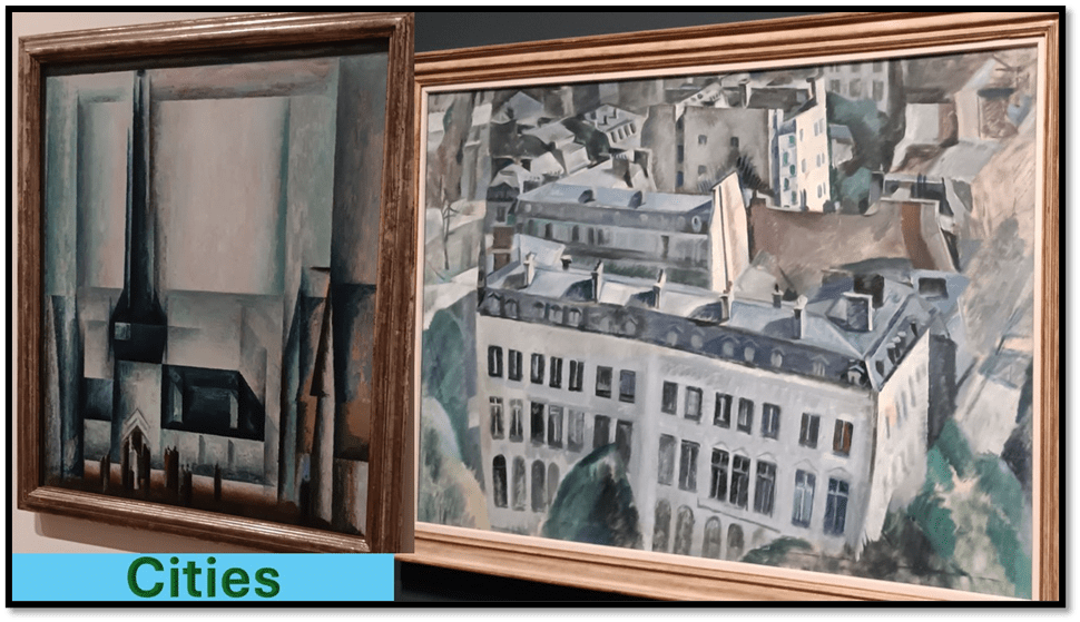
Left: Lyonel Feininger (1913) ‘Gelmeroda III’. Right: Robert Delaunay (1909-10) ‘Study for “The City”.
Feininger’s work reminds me of Italian Futurist visions whilst Delaunay, in an early work where colour and abstraction do not seem to be the point as in his later work as much as, in both cases, the point definitely is the distortion of common (or ideological) perceptions of reality. Delaunay’s ‘city’ seems self-protectively to lean in on itself so that every shape – in vertical or horizontal real space seems o be cramping inwards. Both have obvious influence from expressive or decorative cubism, not as a means of guiding perception to the three dimensional rendered on a frankly flat surface but as a means of passing comment on the regularities imposed by modernity in urban forms.
Both painters both defy regulation but Feininger does it by emphasising regularity’s coldness, Delaunay in contrast shows that what we think we see is odder in itself than it pretends to be. This art is conceptual in ways I think most other art in the exhibition is not, but it seems right that he movement should have such fuzzy defining boundaries. Of course Gelmeroda is a real city (near Weimar) and the painting like others of his points out the anomaly in the city of the Gothic spire that it features but sets this against cubes and futurist symbols of progressive mechanisation.
To get a sense of the contrast with other expressionism I have labelled two wonderful Kandinskys ‘City-Dwellers’ to attempt to capture the difference in the conception of artistic purpose allowed.
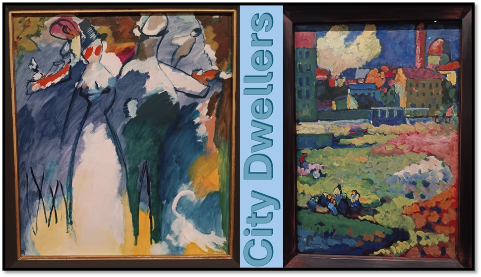
Wassily Kandinsky: Left ‘Impressions VI (Sunday)’ 1911, Right: ‘Munich – Before the City’ (1908)
The earlier painting of Munich certainly gives sway to a contrast of pastoral and urban form on the hinterland of a city, but the whole composition makes no simple comparisons, allowing the colour patterns to spread between the representations of both, such that the colour of a factory chimney chimes with the foreground patch of light pink flora. The point is not just to contrast but disturb our contrast, taking us beyond binary distinctions to ones that nuance our experience with hard to categorise pleasures and pains, dark and light, multiple contrasting colour and the shading of them into more uniformity. It is a most beautiful painting. Impressions VI (Sunday) is on the other hand much more disturbing. These city dwelling figures (or so I take them to be) are difficult to categorise as male or female, monster or human, or numinous or solid in density. They make patterns which cohere only to be then sharply disintegrated from each other as in themselves, such as the figure I think I see sitting on the floor to the bottom left, they could equally be merely a lump of clashingly coloured abstract shapes that are ill defined at their boundaries.
This is not a conceptual art and it is why I favour Kandinsky. Let’s stay with him as we start to examine certain themes and genres, if genre is an appropriate word, and I think it is not. Take the cityscape, townscape or landscape. The very small piece of 1909 Murnau – View with Railway and Castle still appears to take a traditional approach to landscape art, at least from the evidence of its title, though the painting consciously defies realism whilst suggesting it.
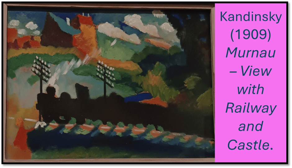
Where are the cables, for instance, that join the cables posts and their branched appurtenances? They are avoided, just as the railway line itself is allowed to fade away in the train’s attempt to progress from right to left, across a landscape that seems to be suddenly invaded by represented water from the lake behind the train. There is no way that the levels and perspectives of traditional ‘realistic’ landscape can work here and our consciousness of that is forced upon us. In fact the blue water here seems to resist signification that would too easily stabilise the scene, and insists on being what it is, a patch of paint on the surface of a canvas that does not pretend to be at a deeper level or further away from other representations of things. And this is the case too with the shadow of the railway train, which bears the green of the train’s wheels as if it were equally substantial as it. Colours reflect on each other compositionally, as with the oranges and greens ‘in front of’ (as it were) as well as (also as it were) ‘behind’ the train. There is looming danger as well as beauty here in the unbalance created by the shadowed trees on the left and the colour on one building wall leaks or is pushed into another. Likewise, look at two other ‘landscapes’ in the collage below:
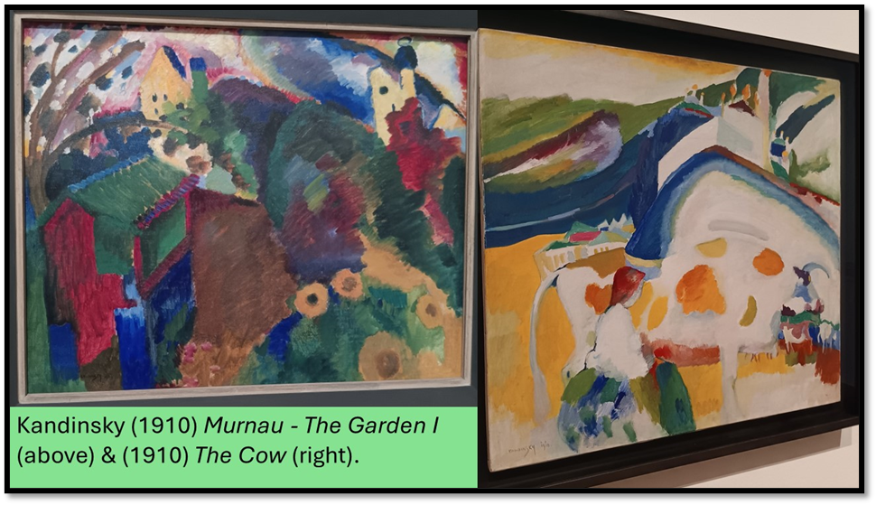
These paintings both approach nearer to abstraction, though the Murnau church and the castle are both iconically clearly distinguishable in Murnau – The Garden I, both rendered with the same colour coding to compare the built with the natural landscape. However, otherwise the relationship between sky and ground is deliberately disrupted as are perspective effects of vertical or horizontal depths. The purpose of colour seems to be to rhyme with its appearance elsewhere in the composition like a theme. Objects get defined, though in child-like form – like the train in the painting already discussed.
Note the flowering bush for instance and the size of those flowers compared to the garden shed, that cannot really be explained as a perspective effect, though we try to read such an ordered effect into it. In The Cow, the boundaries of the animal and landscape features too dissipate or fade into mutual patterning effects. We struggle to maintain the vision of the cow as a defined shape, aided only as our vision scans the head and horns on the left (or the tail on the right) and then saccades back to fill out the animal’s body. Flow, pattern, and invitations to complete meanings only partially present otherwise seems to be everything in this wonderful painting.
I think Geoff and I differed most of this painting in relation to Franz Marc’s animal paintings, which I also love but see as entirely different in method to Kandinsky. Let’s take for comparison, Marc’s 1911 Cows, Red, Green, Yellow. Shape and colour here again defy their categorisation. The title prompts us to seek out three cows of contrasting colour. However, progressively as the cows stand in depth sequence apparently (since they cover up each other appropriately to that scenario) they become more difficult to define – the green cow being merely suggested by a formed back leg and over-thick tail. We see the yellow cow easily, and with a little more effort the defined features of the red calf. I say calf but cannot press this reading, just as I can’t my notion that the thick neck of the green ‘cow’ turning away from us is a bull, although the yellow cow is clearly female for she has a defined udder. These age and sex/gender distinctions are merely part of the way the flowing shapes attempt to facilitate representational meaning to us without validating any meaning we might arrive at.
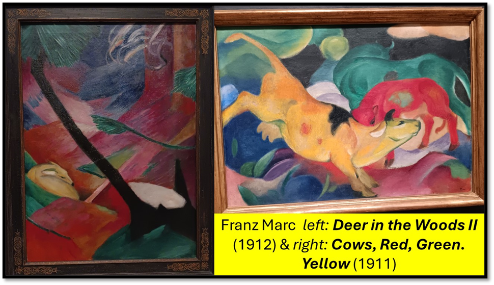
The difference to Kandinsky lies in the relative regularity and definition of shape and texture. Everything flows in curves and rounds in Cows and we are inclined I believe sometimes to let the background to the Yellow Cow absorb the other cows such that the title suggests merely an abstraction focusing on these three colours but still defining fully one cow, who never fades away. She sets the mood of flow as pertaining to happiness and wholes where foreground and background matter not at all, almost as if we are on ur way to the method of the late Delaunays (Robert and Sonia). But the effect is as far from the colour smudges of Kandinsky as you can get. There is an intent and purpose to the separation of colour patches to this, that creates mood. Cows is a happy picture, unlike the reserved and hiding fear of Deer in the Woods II which we see in the same collage. There curves are supplanted by defined crossed diagonals that help to camouflage the sleeping deer, even though its colour is distinct and features defined. For me Marc is the expert of animal mood that draws the empathy and identification of the human eye but it does not seek to confuse us, though it may trick us with certain trompe l’oeil effects.
The latter are more likely when the emotion of the painting mirrors the iconic associations of the animal as retiring or nervous. The most obvious contrast is a tiger and a doe, as below:
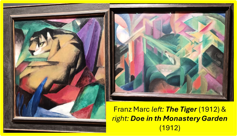
The use of heavily defined shapes as in decorative cubism does not obscure the tiger at all, though it is represented entirely in iconically and as composed of geometrical shapes as its background. The doe, once we see it lies separate from the Monastery Garden by virtue of its more irregular curvature in contrast to the very angular shapes that blend the built monastery features with the organic ones – through the curves in each of these become more apparent once we notice the doe.
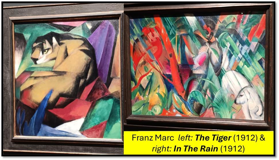
The differentiation of tiger and bear is not as problematic in the contrasting Marc picture from the exhibition below, but I think the prominence of the bear in In The Rain becomes another trick together with the iconic representation of the rain, so like Hiroshige, as it well might be from such a painter influenced by continuing and contemporary Japonisme trends, of the young woman (reminiscent of a Japanese geisha figure) represented on the left but tending to merge with the colouring of the trees around her. Even the rain is disguised by the shapes by which its like definitions force it to ape.
Those effects are not like those in Kandinsky’s The Cow I think, but I am open to persuasion. However we have deflected onto animals whilst looking at ‘landscapes and I don’t want to leave those before looking at some I loved by Marianne Werefkin. In my earlier blog, it somewhat grated on my ear that that that nice chap from Time Out, Eddy Frankel, reviewing the exhibition, said that he’d ‘like to never see another ugly, schlocky, dark, poorly composed Marianne Werefkin ever again’.[1] For I think, in the two landscapes (and of course her portraits too in my eyes) in the collage below I saw great beauty and nothing I would like to call ‘schlocky’, whatever that means. They are, of course, not like Kandinsky. They use defined shapes of recognisably represented things, if wonderfully distorted.
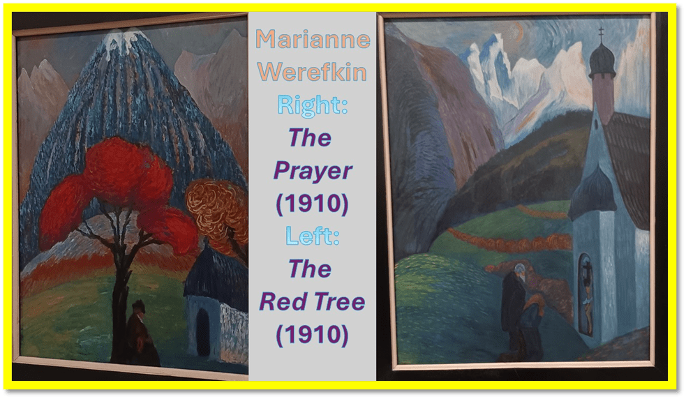
The aim is, in much more obvious ways than those used by Kandinsky to define the ‘spiritual’ in art, though, like him, she uses the accidental contingency of religious buildings (a full chapel or in The Red Tree what I take to be a remote shrine) to help in the endeavour. Those features define the right side of her paintings. In Prayer, the iconic crucifix on the dome of the spire almost reaches the top of the painting but only just, and is dwarfed by the representation of a spiritualised Alpine landscape and distant lighted peaks aspiring beyond the top edge of the composition. In both paintings, the eye continually moves upwards and aspires, in The Red Tree consciously borrowing from elements in Japanese art, both the mountain and tree. Her figures are grounded but their emotions are not. The works are composed to contrast the jagged and the rounded forms of aspiration. Werefkin does this too in order to play games with sex / gender binaries, I think. The Japonisme mountain in The Red Tree has a kind of feminised top, the whole presenting a ‘good breast’ of itself to a jagged world, that partakes in its colouring of the vegetative fruitfulness of the red and passionate tree. In that it is not unlike the non-binary intentions of her portraits.
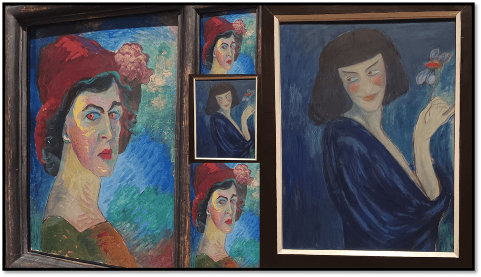
Marianne von Werefkin, Left: Self-portrait I, c.1910 & Right: ‘The Dancer’, Alexander Sacharoff, 1909.
About the portraits I think I said enough in the last blog except to say my expectations of joy in them was fulfilled. You need to see the brush work and the layered densities of their surfaces to rally appreciate them. However, another contrast caught my eye between two pictures of dancers – those in the collage below:
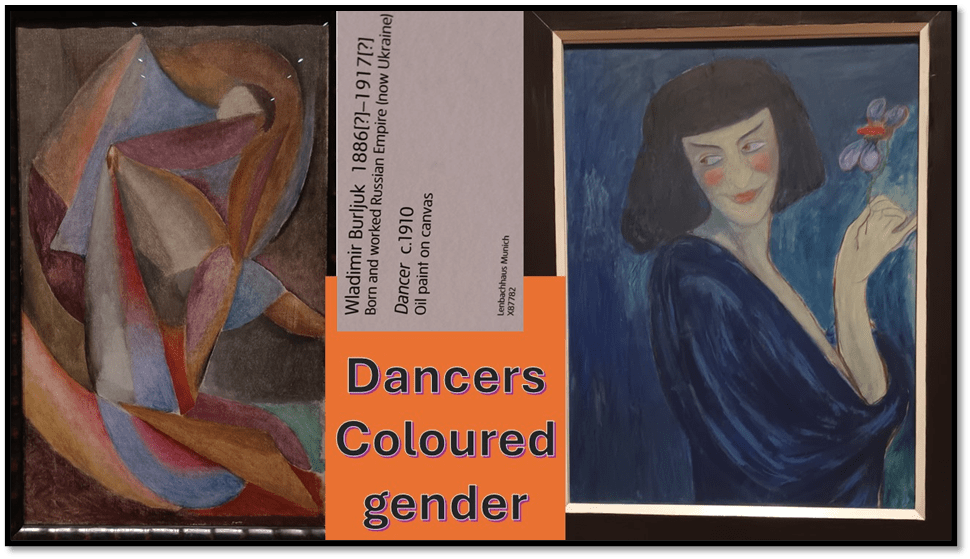
Burlujk was a new name to me and when I saw this picture on approaching from a distance I was expecting a Delaunay. The ideas are similar to those already explored. Identifying the dancer only happens when we notice the dancer’s head presented rather by use of a coded shape, Then the flow of the clothes begin to take on the Loie Fuller painted by Toulouse Lautrec and pictured in verse by W.B. Yeats, although much later than his painting:
Labour is blossoming or dancing where
The body is not bruised to pleasure soul,
Nor beauty born out of its own despair,
Nor blear-eyed wisdom out of midnight oil.
O chestnut tree, great rooted blossomer,
Are you the leaf, the blossom or the bole?
O body swayed to music, O brightening glance,
How can we know the dancer from the dance?
Clearly the analogy in poem and picture are similar. The dance in Burlujk’s picture is a dance of colours and forms that fill out the composition fully and suggest depths in order to then distract from them. There is a dance of the gaze here and the body of the dancer is turned into the dance itself, aided by the flow of forms that are transient as flow of veils over the body in the time-space of the dance. Sex / gender is no more distinguishable than the dancer from the dance but it is not an open question as in Werefkin’s portrait of an identified non-binary dancer. However, I will only quote what I already said of this in my last piece for I still believe in that reading (correcting as I do a silly reliance on predictive text where artifice got printed as ‘article’):
In performance what is artifice and what is nature is an unnecessary binary distinction, as indeed here is the binary of male and female. The painting vibrates across its fuzzy boundaries that demarcate figure and background, the natural and painted, especially in the ambiguous possibilities of a made-up face becoming a blush of self-consciousness at being seen by a lover or by an audience. This is not a clothed figure but one that is in the process of either clothing or unclothing, the proc ess by which it happens in the rhythmic vibration of the tonal blues. The right side of the Dancer’s costume dissolves into its surrounding space despite its obvious presence as delineated in the neckline of the garment. As boundaries of things dissolve so does the sex/gender relationship formulations of groups across boundaries of time and space, as in the musical harmonies and discords of Arnold Schönberg’s music.
I will end with more on Kandinsky in the exhibition but other noticeable beauties still need a mention. The nearest in style being Auguste Macke. Two paintings represent him but they seem to be at opposite ends of the exhibition and need seeing together as in my collage below. Both from 1913 and despite the difference in title they both show a similar (perhaps the same) scene in space but at, I think different times and under different conditions of human business.
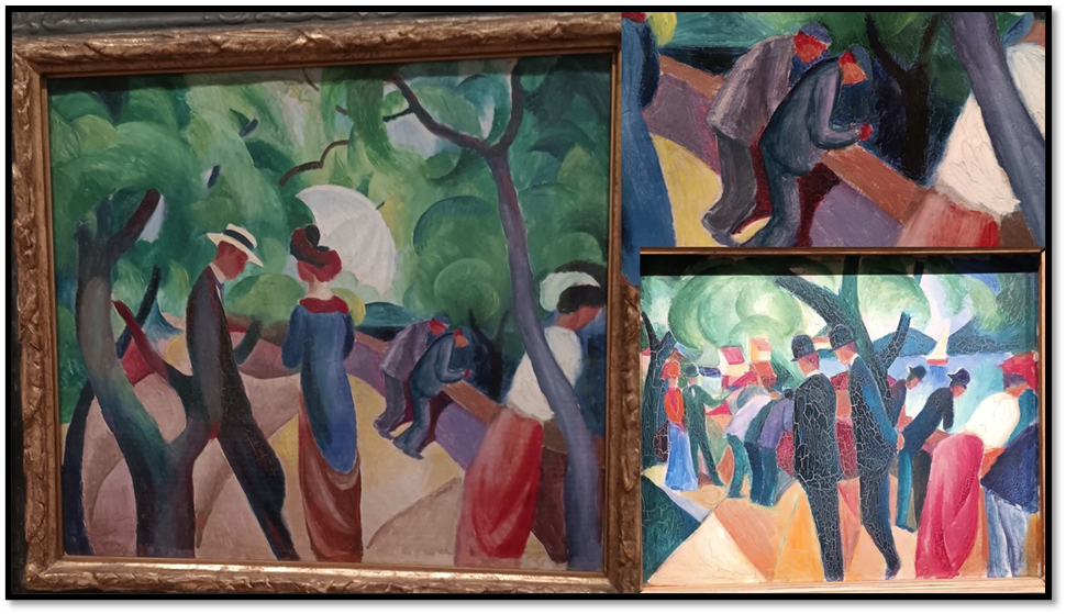
August Macke – Left: ‘Promenade’ (1913). With a detail pf latter (top right) & ‘Walk on the bridge’ (1913) – bottom right
Walk on the Bridge has more motion in it as its title might lead one to expect and the angle of viewing is different, the effect of the foliage contrasting. The circling patterns that represent foliage in Promenade, seem to take over the surface of the painting and to constitute the little it has of confused depth of distance. If we examine them too closely, their relation to the figures at different perspectives is difficult to judge. The depth of different levels in the scene is lost except by the gaze over the side of the wall, presumably at events on the river of two resting working class-men in the distance and a lady with a parasol near to us with her gaze turned downwards, The centre of the painting is dominated by a couple who have met whilst promenading.
In Walk, we have a similar lady gazing at the water – perhaps the same ones but the working class men are replaced by less crouched and more angular gentlemen, who would never bend at the knees. The area near the wall is more crowded but the bowler-hatted gents walking seem absorbed in conversation and ignore the bustle to come in their onward path. These contrasts open up class and gender perspectives but not to analysis. More disturbing in the contrast are the different balance of distance (we see the river under the bridge in Walk), and the geometric patterns of ground and foliage background both. Walk is sparer in every way, the patterns are irregular triangles on the ground rather than the curved irregular shapes in Promenade. I cannot interpret these elements and think they probably aren’t for interpretation but to give the varying feel f urban sociality. They work for me.
Moving on, I think that if Feininger and Delaunay cityscapes seem singled out, this is the more so in two pieces by Albert Bloch, which feel unlike anything else in the exhibition. It is easier to rationalise that for his painting called The Entombment, for this is clearly a commentary and adaptation for modern themes of an ancient Christian motif, often called The Deposition and displaying Christ’s funerary arrangement. But examining Bloch’s 1914 treatment, redolent of the war to come, raises all the issues that make this painting an expression of an impression, rather than a representation or indeed an allegory or symbol.
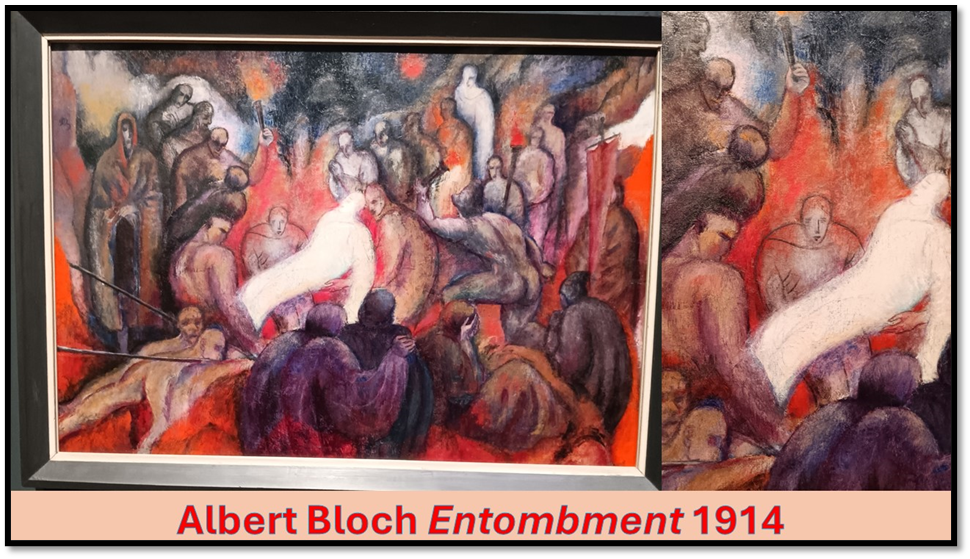
The laying of the holy body is haunted by the spectral nature of that body, reduced to a few faint lines in empty space, as it seems, and with another such spectral figure at the back of the crowd on the right. Many people dressed like working men mill around without intent and perhaps awareness and seem to be walking away from the event in process. Those involved in the Entombment are either, if in the background in spectral hooded clothing like those of monks, whilst the workers have the idealised figures of Michelangelo nudes, though with unmistakably modern buzz haircuts in same cases. The scene is suffused with blood red and scarlets, though white glows penetrate at the edges. There is however total clarity in the spacing and contra-definition of the figures quite unlike either Kandinsky or Marc. If at all appropriate to the Exhibition it is in he expression of mood – sombre and dark.
The other Bloch painting is called The Prize Fight and is set in the interior of a hall with a prize-fighting ring, focused upon by virtue of a spotlight spanning the fight ring. Two muscular nudes take pieces out of each other presided over by a gentleman in top hat and tails. Again the piece may be allegoric of the build-up to war, not least in the perspective that the rich are taking both their leisure and command from endangering the bodies of younger working men. But whether that is so or not I do not know. The piece matters because it is overlayed with a mesh of intersecting lines, not all representative of things in the scene, like the ropes around the prize ring and because of its highly distorted angle of vision. It remains an intriguing puzzle to me.

Albert Bloch (1912-3) ‘Prize Fight’ with detail.
As an interior Prize Fight denies dimensionality even though it has a roof. Yet in that it has some distant similarity with early Kandinsky interiors which bowled me over. Here are two in a collage.

Left: 1909 ‘Interior (My Dining Room)’ & Right: 1909 ‘Bedroom in Ainmillerstrasse’
For most, these works disappoint because though bearing significant distortions of the form of an interior setting and its contents, they never approach abstraction, except in the use of very unreal looking colour contrasts. Nevertheless the fruit is coloured as one might expect. The way forward for Kandinsky into abstraction probably came from the suggestion of malleable space that comes from the framed portals in these works: window and door frames and prospects therefrom offered or obscured. Likewise thick energetic brush strokes (which may represent light falling through the window) in the Bedroom piece seem to begin to dissolve the interior and obscure it like the colored glass in the windows. These are just beautiful paintings I have yet to understand, but they cannot take the place of the later abstractions, which utilise musical and theatrical terminology to indicate that they desire a temporal existence as well as spatial and will get that from the saccading of the eyes over time across obscure details that they command.
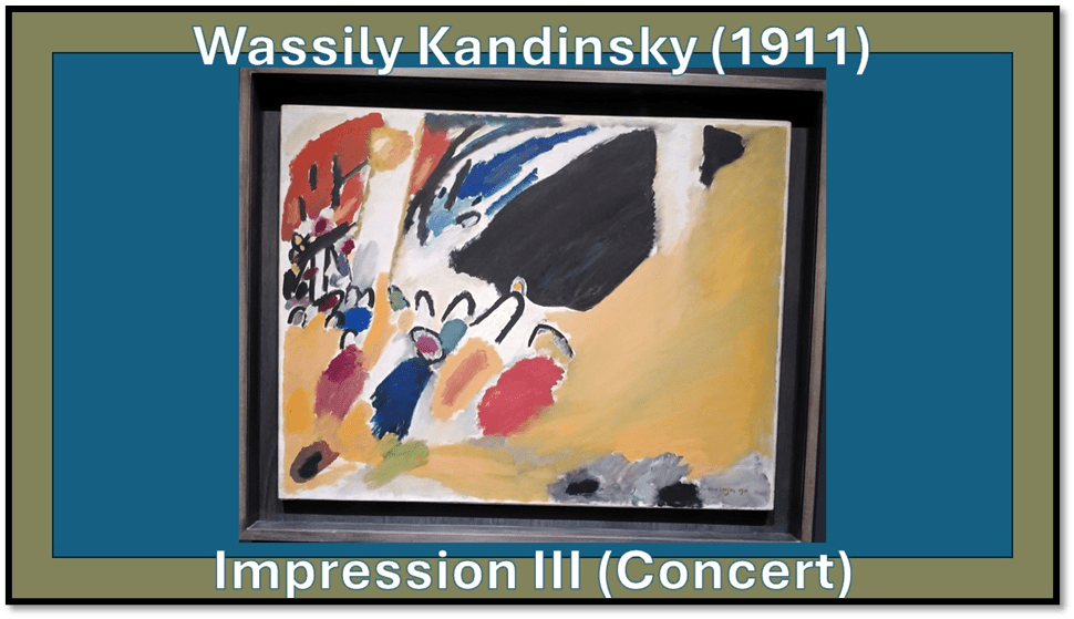
Impression III (Concert) of 1911 is like Impression IV (Gendarme) still representational of figures though in a basic way and I sense that it too is political, even though we know it represented a particular concert Kandinsky audited. There are militant gestures here – playing against of dissonance and harmonies in the whole. Music takes on the relation of composition / decomposition, engineering wholes and fragmenting them and renders the feelings of this nuanced state to us. He diagonal of what looks to me a raised fist or hand leads the orientation of the brush strokes and emergent shaping of things diagonally from bottom left to top right. Yet other lines and patches intersect and barrier this motion and try to contain it. It is a powerful painting.
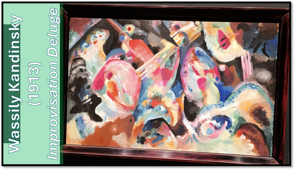
Later paintings take on apocalyptic imagery that is also musical like the stunning Improvisation Deluge. There are figures here to my eye who may be singers or players in an orchestra, whose voices form and disrupt shapings on the surface of the canvas. There are iconic bands of what look like the strings on instrument, perhaps a cello. The flow of sound and paint resembles a flood that covers up significant known figures and shapes nut suggests them, even down to weirdly distorted faces on the left. Colour harmonises and forms dissonant clashes with other colour. Some shapes appear to be about to be contained in other shapes or resist such containment. There is no easy meaning but there is a thing from which it’s difficult to draw away your eyes. It fascinates and compels and sometimes repels – in that like the dialectic of desire and repulsion in life.
On The Theme of the Deluge is like another movement of the same concert although here no violincello tries to dominate the taking up of the theme by the whole orchestra. Here all sound explodes into recurrent and multiple waves and washes. We can never know whether shapes are emerging or submerging in this flood of colour in motion. Seeing the motion of the brush of the surface is important.

I ought to say more but I won’t and will instead rest on the tremendous Improvisation Gorge, where colour and form take life to harmonize and fight each other at various points of contact but with such beauteous fullness and multiplicity. Depth and surface fight off too, as if debating the ‘gorge’ promised to be represented in the title. With forms that can look like either ladders or scripts of music. This is amazing painting. I wish I could articulate more the feelings it facilitates in me.
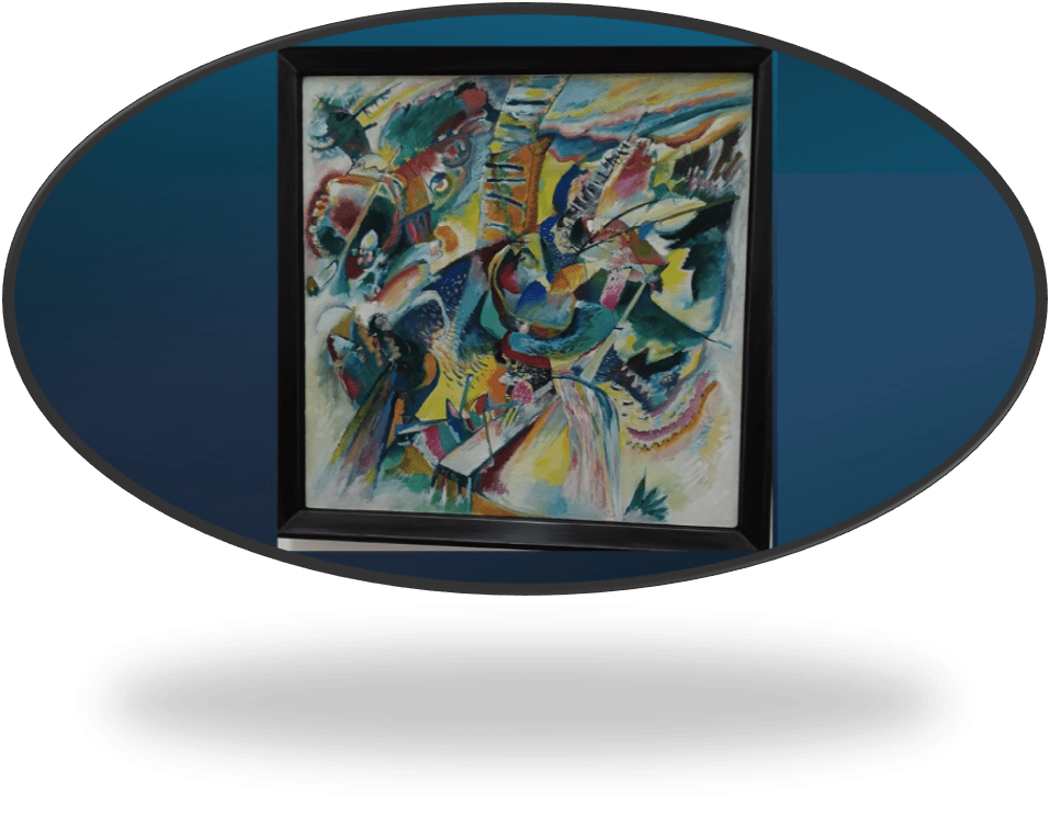
1914 ‘Improvisation Gorge’ Kandinsky
Of course, there is more to say. It shocks me that I have not included Gabriele Münter For I love her painting, as I indicated in my earlier blog and she did not disappoint. All I can do is end with a detail from Listening, a portrait of the painter Jawlensky in part but also a representation of how sound might be represented in colour and form, a key goal for all these painters. In a very simple painting with many blocks of colour, through each multi-toned, she shows the flow and flutter of heard sound. Again I wonder if by the end of this long day, I was too tired to fully grasp it all. And Münter’s photographs are wondrous shockingly beautiful exposés of colonialism and inequality/

So bye for now. All my love
Steven xxxxxxxx
[1] Eddy Frankel (2024) ‘Expressionists: Kandinsky, Münter and The Blue Rider’ in Time Out (Tuesday 23 April 2024) Available in: https://www.timeout.com/london/art/expressionists-kandinsky-munter-and-the-blue-rider
