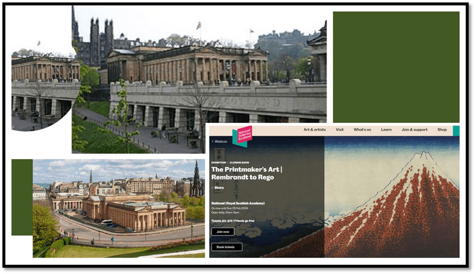
A day in Edinburgh with Prints and Photographs: Exhibitions in National Galleries of Scotland: (2) Hidden ingenuity and affordances to thought and meaning in the Art of Printmaking (Part 2 of Edinburgh blog).
For Part 1: A day in Edinburgh with Prints and Photographs: Exhibitions in National Galleries of Scotland: (1) Introduction; use this link.
I have struggled to get an angle on seeing The Printmaker’s Art exhibition at The National Gallery of Scotland. The aim of the exhibition and its catalogue is relatively straightforward: to educate an audience willing to pay an entry fee to such an opportunity about the art of printmaking, without pretending that any one set of knowledge, skills, or the ability to understand the skills of others, or values will fill the bill in this regard. The point is that prints created by different techniques and using different tools invented for the purpose are themselves the product of such different processes that we group them together, and distinguish them from other graphic art like painting and drawing direct to one’s final medium of capture of the image created, such as a canvas or a piece of paper, only at the expense of over-generalisation of the category. The exhibition and catalogue are organised under sub-categories based on primary printing ‘method’ described as; ‘relief’ intaglio; planographic; screenprinting and stencilling; and photomechanical and digital processes’.[1]
Since the catalogue I cite and sold to me as the exhibition’s catalogue was published nine years ago however, I think another aspect of the reduced ways in which galleries mount exhibitions is also on show, based on use and reuse largely of the materials from a gallery’s own archives and their recycling in different forms. The catalogue is, in fact a stand-alone publication intended to mainly introduce the collection of prints held by the Gallery, with a brief introductory essay on how the collection was put together. The difference in time of production of ‘catalogue’ and exhibition may well explain why the examples for some artists of the prints shown are different. The exhibition too updates the collection’s range. The final piece seen by me as I negotiated the gallery space postdated the catalogue, and used hybrid technique. The explanatory plaque shows Ciara Philips asserting her right as an artist to mix categories in the production of her art (between in this vision a very old older woodcut and more modern screenprint technology. What Ciara Philips insists on too is that, as perhaps with all art but particularly printing there are all kinds of collaborative process involved in the work of printmaking that are hidden by them being spoken of as the art of one person. It is a wonderful example to ponder, for if Phillips likes ‘the level of uncertainty that comes from printing’, involving the different tools, materials and media of the trade, how much more so is the looking at interpreting an artwork where the combination of those things are more hidden (even the differences between different ‘prints’ in one edition, as is common, to interpret as art.
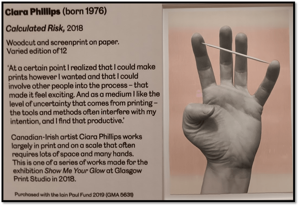
Calculated Risk is a huge work (153.00 x 102.00 cm (base size)). It takes the notion of a ‘hand’ and complements it in terms of the many hands required in its production processes, and uncertainties (‘risk’) involved in those processes and stages of making, for that one hand to emerge to our viewing. A painting that plays with notions of measurement (‘span’ for instance) becomes even trickier and more uncertain as it is interpreted and evaluated as art.
And at the base, the key ambiguity is one that Ali Smith so brilliantly plays with her book Artful. For art and artifice are both implied in artfulness, together with a range of value judgements about whether artfulness is a virtue or a sin, a matter of lies or truth, fiction or fact, duplicity or integrity. And as a viewer of art, we are in the thick of such judgements and interpretations of the artists, their working methods, collaborative and mechanical necessities and of ourselves as persons coming to term with a phenomenon not all of whose aspects we can ever fully understand or appreciate. One famous work in the collection is a prime example of all this, whose analysis cuts across many art forms and the complexities of their reception over time, space and culture. It is Claude Mellan’s seventeenth-century work of art (religious or ingenious but certainly artful) Head of Christ: The Sudarium or Veil of Veronica (1649).
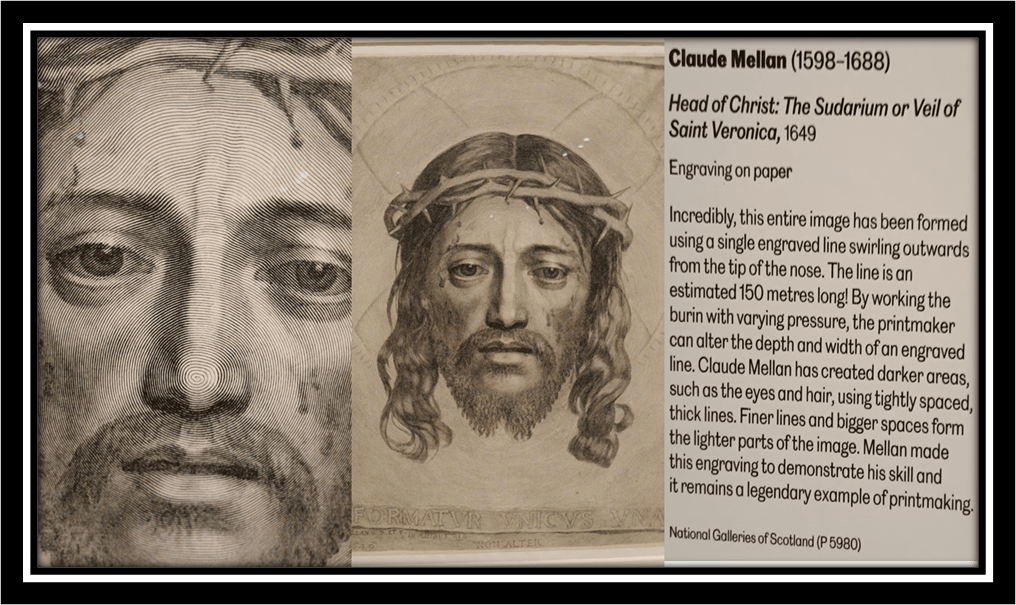
The catalogue responsibly gives you enough to relate this print to a tradition in every kind of art (sculpture, painting) and so on and to the discussion of the image in religious discourse, especially the prohibition in Judaism, Islam and in some versions of Christianity of the ‘graven image’ used in the place of the God it is meant to represent. I have written many times in blogs of the play with this idea in the tradition of the Acheiropoieton (that art or divine image which is ‘not made with hands’) and its relation to the myth of Saint Veronica whose facewipe (sudarium) became imprinted with the face of Christ when she lent it to him on his route to execution. For other of my blogs, see the one at this link for fun, and this on the Counter-Reformation Baroque usage in Spain.

The Latin text of Mellan’s PRINT is an elaborate joke: FORMATVR VNICUS VNA (‘the one made in one’). This is because the only work is formed from one engraved line on the mental printing matrix that spirals out from the centre of the Christ’s nose. Colour variation was possible because of the ‘contours created by the changing width of the line cut by the burin (the engraver’s hard diamond-edged tool) and by variations in the tightness of the spiral at different points’.[2] If one line creates many effects surely this is as magnificent as ONE god made of three or many manifestations. But te point remains – to whom is the glory of achievement due, God – the AUTHOR of all, or an artist, who may like Satan be a master of appearances. And the appearances are potentially many. However ingenious Mellan, printers could not work alone and anyway to ascribe to oneself the ability to create God and embrace it as technique holds many potentials for sin as the Catholic Church would see it, despite the nuances of the Council of Trent on the matter.
I suppose my point is that, are we held to the admiration of the technique of a great artist (or craftsperson) however we want to conceive Mellan in looking at and understanding this piece (and the beauty of the face, and even its pain, in this work of art0. Is it the meanings we find emergent from the work or the analysis of its form and composition that should interest us. And as, for what a burin is and how it is used. Is this integral? We are and should be left with all these questions. Personally , on this occasion at least I passed over a lot of the vitrines displaying tools involved in the printing process (not so on visiting Bewick’s family home at Cherryburn, near to where I live, for there the context is all). They are of immense interest but so too is much and yet, one’s ability to take it all in remains so limited). But see it (and read of it in catalogue together with its fabulous illustrations), at least, I did:
In what follows I leave technique behind me and just enthuse at the wonder of this exhibition, which, in truth, requires many visits. I want and search for meanings and values, therefore, in the rest of the blog but not because I do, or want to do, disregard the labour of these artists and their skill of realizing complex artistic ambitions in uncertain and risky materials, processes and media, but because I don’t have the talent to take into account (I would like to say ‘yet’ but at 69 that’s pushing it). But if you can’t see the exhibition (it finishes soon) then get the book. And a true appreciation MUST need those skills I eschew in the rest. Before I leave that point, consider Monica Poole’s work Chalk, Flint and Bone (1986), one I returned to many times.
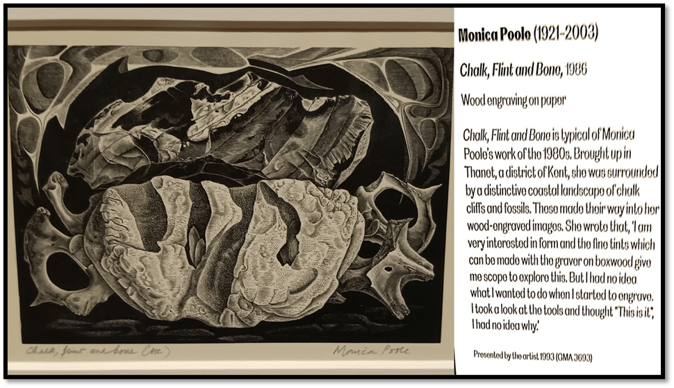
The plaque I reproduce just must be praised. After all, taken the words of Poole literally on the plaque her interests seem mainly in the achievement of tonal contrasts made possible by her medium, tools and work processes and based on nothing either ideational or explicable other than it the statement of achievement, ‘This is it’. I Think this admirable and I have no doubt of its integrity, but the question of what ‘it’ is remains for the viewer and the questions why it, should look and feel to the senses and raise ideas on the cognition and affects in the feelings of the viewer are still there for us. They are the guarantee that creative processes have occurred amid all of Poole’s absorbed inventiveness, sustained through gruelling work processes.
For me this piece is as figurative as it is beautiful in its composition of abstract forms: it is anthropomorphic and biomorphic, it raises ideas of the containment of sleep and death and the softening of hardnesses by haptic texture. It is about objects and the spaces (gaps, concavities and holes that vary in sort and depth) between them but, it is so, to me with sentient as well as abstract effect in terms of its composition and framed nature, perhaps more the former than latter. The title suggests that the artist is representing things as the products of process – calcification, decay and fossilisation. Chalk and flint are extremes of softness and hardness in solid mineral form and bone – well that is hard even to describe in terms of its potential to both hardened form and fragility in some instances, Of course time is implicated even from the moment we mention the materials represented, as indeed those art uses to get made. Should I know how all that translates into the feel of wood cutting tools in the process of creating the fragile matrix subject to wear in the printing process (more fragile anyway than Mellan’s metal plates). Of course, I should know that and more, but I cannot. All I can say is that it would be worth the effort and a recognition of what we call the work of the art. Oh, we take too little care of this. [3]
But before I wax too tragic, I think I need to remember that artists are artful in part because much of what they do and think remains ‘hidden’ in the complexities of their processes that are far from immediately available to either thus or them. Some of what is in the art is hidden, no doubt, to them too – of this we can never know, but some is it and is hidden for a reason or a caution. The great NeoPlatonic thinkers called some of such hiding the principle of reserve, in which great mysteries are so simplified they may seem on the surface to be contradictions or lies. But we need not be cowed by the reserve, conscious or unconscious, of things that may be beyond our ken, at least in this moment Instead we can see art as offering us what Gibson, the founder of ‘ecological psychology’ called affordances. He says:
The affordances of the environment are what it offers the animal, what it provides or furnishes, either for good or ill.—Gibson (1979)
A low-level (but not a bad thing) commentary on this adds: ‘The idea of affordances is that we receive information about how we can act about it by looking at objects. According to Gibson, we can directly perceive affordances; we don’t need any prior knowledge to decide how to act’.[4] And by ‘act’ I think I mean also feel, and think for a human, though not by ignoring either more physical action of the body. If you like, what remains are affordances based on merely seeing the art as objects in an environment. What we need to learn from Gibson though is that when art ‘provides and furnishes’ it does so with adding to the means by which we understand and take in from it ‘for good or ill’, and that, in doing so we have justified its existence – even when the final effect is illth not wealth.
As I tried to make sense of the gallery various themes cross between works however they were categorised in the exhibition. Hence the rest of this piece tours around such affordances taken by me, described in comparative collages – sometimes comparing whole works, and sometimes details, and sometimes a mixture of the two. Of course, sometimes a work became commanding in its call to me. One such was Vanessa Bell’s The School Room. Of course, I have blogged on Bell so many time – here is the most interesting (in my judgement) – use the link if you want to see it.

I love this lithograph. It is if you like a work oft about the affordances of environmental beauty, both its absorption and reproduction as art. A gold frame for a blank grey instead of a picture calls our attention because the gold is the same colour as the hair of Angelica Bell, Vanessa’s daughter, sat at the piano, reproducing art from the music on the piano before her. Bell chose to have this picture blanked in grey I think to highlight the affordances of merely looking as a means of reproducing beauty. Hence Angelica’s playing and her ginger-haired sister’s writing (a novel or a play or a diary comment – for it is Virginia Woolf of course – all have their eyes, the eyes of artist all in the making, in studied deflection from our gaze. On the other hand, the self-portrait of Vanessa does not look out at us whilst it does (it must) take in the room from other vantage points of vision, perhaps using the affordances offered by the beauty of the tulips and vase to promote her reflection. The eye of the artist is in many places – it takes in each detail of the whole scene but is also vicariously placed in the scene to show the concentrated attention that looking at detail, as well as wholes ought to be. In a sense this is meta-art of the highest order.
If lithography requires some simplification of colour patter, this does that by maximising the potential of basic colours, each printed, as is necessary, singly but cumulatively. Yes, I have technical questions – about the production of the shadow in the room recess between Vanessa and Angelica and above the table and lamp. Just how is that done. But I allow myself to live with this uncertainty – because of the affordances offered by this hymn to the beauty and validity of lifelong learning and study, as a choice (a Bloomsbury or Charleston theme).
Meanwhile a final example in adieu to the exhibition’s informative plaques. Here it is on a wonderfully characteristic print by Whistler, which explains how the intaglio process of etching achieves ‘tone’ and why Whistler used these. In the catalogue there is a fuller and clearer example of how differential cleaning away of areas of ink from the matrix before each printing created massively different effects of relative brightness / obscurity, as with the lamp on the side of a palazzo in this example.
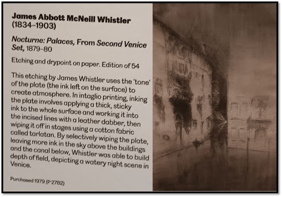
Artists sometimes use print methodologies for effects that they also strain for in oil painting. This is clearly the case with Whistler. His aesthetic experiment with ‘nocturnes’, which Ruskin claimed were the equivalent of ‘throwing a pot of paint in the face of the public’ were in fact experiments in the application of tonal variations, often associated of course with night and dusk scenes where figures and forms became indistinct. His interest, as the catalogue has it, in ‘the shifting lights of a city’ though is surely about more than experimentation with form and design for its own sake or as a move to abstraction. I kept returning to Whistler from other paintings, which in the affordance of the lights they offered began to colour Whistler’s Venice in a rather different way than the exhibition suggests.
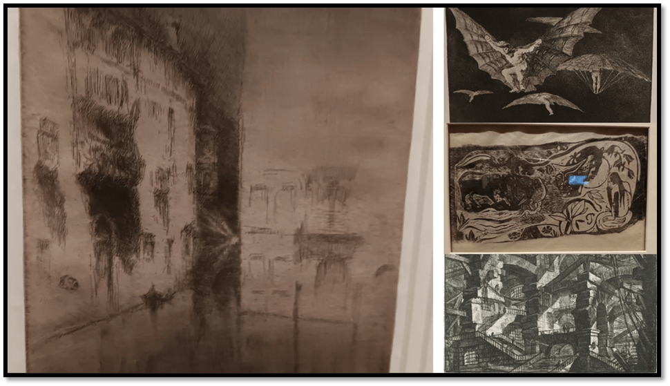
It cannot have passed Whistler by that variations of tone of blacks, greys and etched lines of detail and or tonal ‘hatching’ could be further variegated suggestively in changing cityscapes by selective re-toning of versions by selective wiping of the ink from the matrix plate. For etching is a wonderful means of conveying dark, light and nuances between that binary so necessary to Gothic effect, of whom there are no greater masters than Piranesi in the eighteenth and Goya in the nineteenth century. That Gauguin also used such methods was not known to me but his print in the exhibition, together with others emphasised that Gothic effect is so strong in the examination of the projection and introjection of dark and light in that Romantic genre. Of course, you cannot seethe works properly in my collage, but I merely want you to feel the affordance I was given by the comparisons in my mind between what I saw next to puzzling over what exactly Whistler might be doing in his nocturne, not least because Venice was a locus for many nineteenth century men of self-exploration. I find the Whistler enchanted and enchanting not least because it oozes the stuff of the fearful and untried.
And to pass from that to Paula Rego. The exhibition tells us of her debt to Goya as well as to the methods of printing – in the example below, etching and aquatint – to foster both her imaginative capture and thematic interest in ideas of the secreted in families and close communities, which feels like that in Lorca to me. Her 1989 print Secrets and Stories plays with light, dark and tonal variations thereof that yield the ability to see what is oft unseen in those ideological institutions, where gossip yields danger to the vulnerable and those deprived of their own voice by unseen power dynamics.
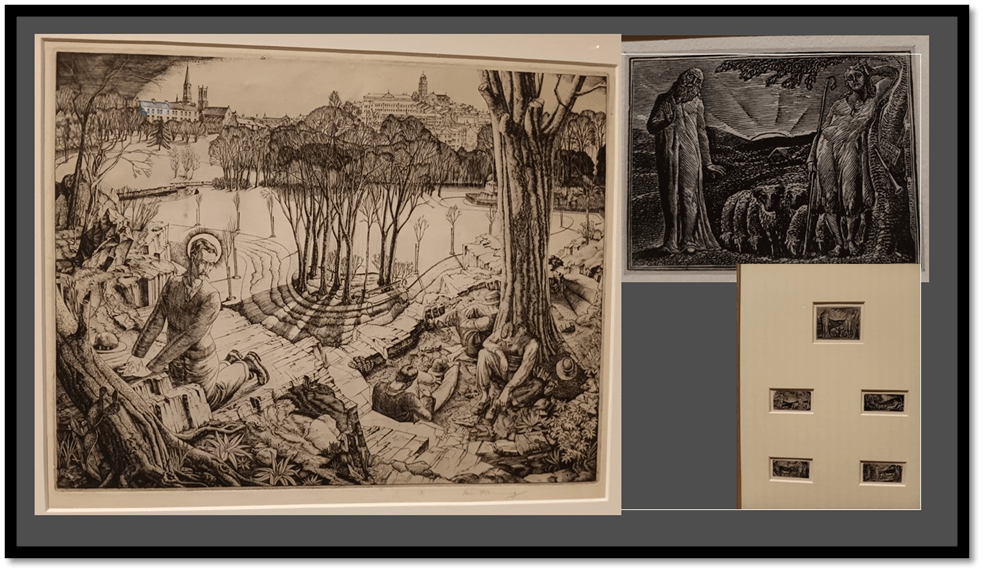
This plays with innocence and the childlike like a child plays violently with a doll when necessary. And those effects of light variation do not only need to show in scenes of incarceration in the bewildering structures of powerful institutions as in the Piranesi Carceri prints. They might show the nuance in scenes of love and care questioned differently than by Rego in works there by William Blake (a set of very small printed scenes from a book of Pastorals) and wonderful Gethsemane (1931) translated to Europe by Ian Fleming, in which he plays every stage of the suffering of Christ in the Garden. He praises the concentration on the meanings attendant on LINE drawing in etching.
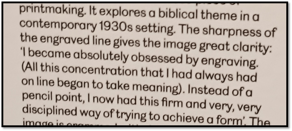
Detail from the plaque. Fleming was only 25 when he aid and drew what we have here.
The line matters in Blake and Fleming but note the central important of tonal variation in nuancing simplistic ideas of peace and love in both, and even care for one’s flock. Sometimes light seems reluctant to show itself. Sometimes it blinds with too much responsibility, as in Gethsemane, so that retreat to shade is preferable. Many young men felt that in the 1930s.
At other times chiaroscuro effects add not to contrasts of fear and hope in life experiments but to nuances of relationship (sometimes of power or sexual attraction) or of responsibility – sometimes a mix, as in these pieces by Degas and Frank Eugene (using photogravure in 1910) respectively. Degas’s response (in about 1879) to fellow artist Mary Cassat is highly complex (even technically – he took the print through 9 states) I think. There is total respect but somewhat of the fear that remains in awe. He keeps her staring away from us and him at grand art in the Louvre, our sight of a fearful female contender appeased by Cassatt’s companion, her less threatening sister. It feels rooted in the deeply patriarchal this picture.
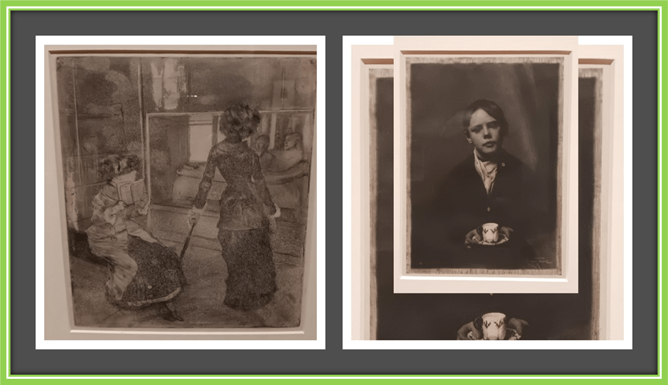
Of the picture of the boy, the son of a fellow actor I believe, I cannot but be haunted. The picture is called Tasse Tee. The deepening and volumizing of the boy is caused by using engraving techniques on a photographic negative. But the boy’s appeal to his artist seems complex, bound up with real and imagined power relations.
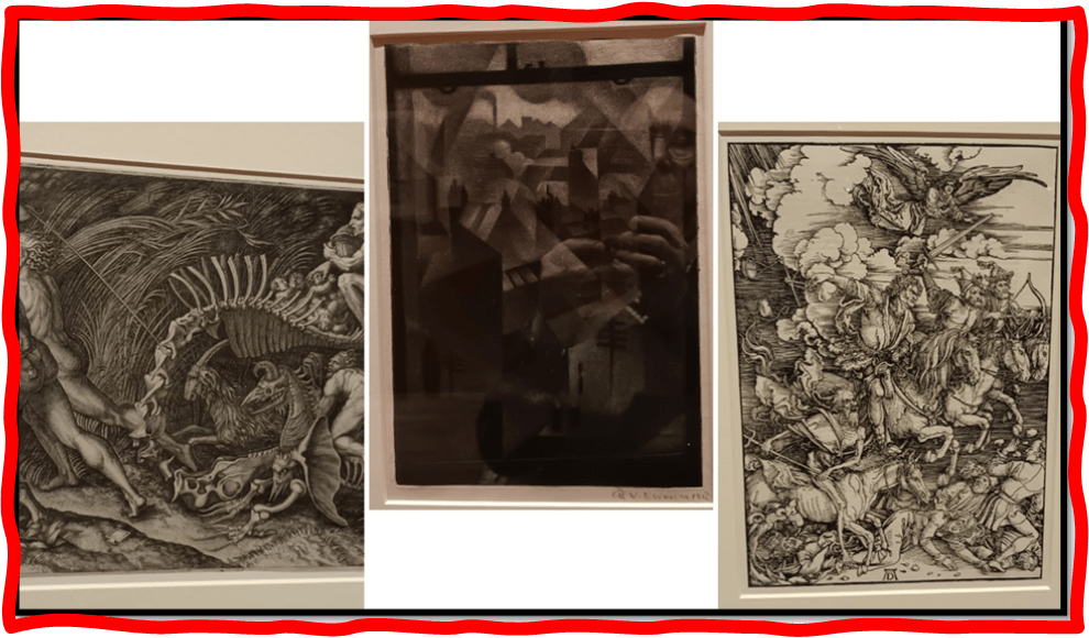
Again I feel the potential to dark meaning here that printing has exploited from beginning (the earliest print in the exhibition is the Durer one of the Four Horsemen of the Apocalypse. But the association with the hidden and the monstrous I think illumines (if with obscurity) even Christopher Nevinson’s unearthly and beautiful View from an Office Window (1918) which reflects not fog and pollution overlaying the city but also the shadow of Nevinson’s and many other’s experiences of the First World War. The mix of the supernatural and the return of the repressed in the more legendary scenes I put it next to (the first detail is from The Witches Procession by Agostino Veneziano in c. 1520.
Do these affordances take me interpretively too far, finding in ar the depth of misery that alone justifies the heights of ecstasy art also offers. I wonder. But even if this is the case, I wonder if it is the detriment of the uses of art to make us see feel and act on cases where the environment is so distressed, it screams at the lack of the joy it is capable of offering. To illustrate I want to compare one of the fine prints here one of Picasso’s with two other paintings sequentially. The comparison in each case renders differently how we see the Picasso linocut. Since in (1958), Picasso applied each colour from the same piece of linoleum that he modified between stages, it destroyed his matrix making the limitation of the edition final at the 50 he printed.
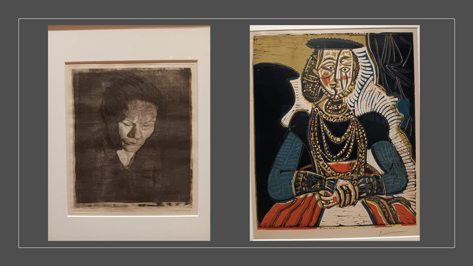
Picasso treats his Cranach original to same expressive techniques he used in his original portraits, dissecting the face of the figure such that he could suggest its variations in time, space and, I think mood) (especially in his very great Dora Maar portraits). One of the finest prints in the exhibition is one I didn’t know by Käthe Kollwitz called Woman with Bowed Head (1905). It shows a working-class woman, but its aim is to take the titled gesture ‘Bowed Head’ and transform it. Here is a picture of a woman who has probably suffered but is bowed only physically and then only to attract more light on a face created using all the fine nuance allowed by etching and cognate printing techniques. This woman is complex and the complexity is covered by effects of tonality in solidifying (and softening where necessary) the realism of physical body and yet suggesting inner feeling emergent on her surfaces. When I move back through the gallery to look again at the Picasso I see some elements in this model of womanhood there too. The left side (as the viewer sees it) of her face seems cracked by the facial division emphasising the suppressed sadness at the yes that is belied on the other half of her face. Shifts of colour patterning at the cheek help and solidity here is not that of the illusions Kollwitz’s methods allowed her but of the cubist belief that only the fragmented can address the unchangeable flatness of the medium on which a painting is drawn. Here though is a woman who bleeds.
But look at her in another context, next to Lucy Mackenzie’s Lipstick I (2020) based nominally on art deco lipstick advertising methods from the 1930s and realised as a screenprint.
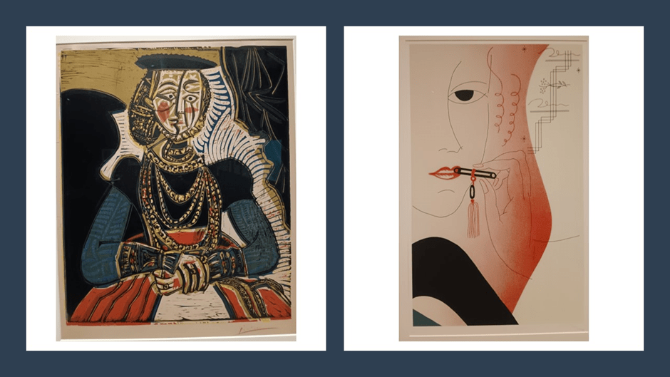
There is much to learn from the affordance of this comparison. This is not only in the difference of mood. One feels primed in this comparison more to right half of Picasso’s model and its complexly bold face, in which sadness cannot show. But we see to that in both cases that face is constructed, indeed made-up, so that woman ids covered by the appurtenances and self-painting that obscures her, or perhaps simplifies or reduces her to one mode of being seen and seeing. Red operates here to render the grandiose not reveal the interior, even on her hand, that one, appearing on the left because her hands are crossed. That hand bears a riband of authority not a cut, as on the other. The red is the red of a complex grandiose dress.
In Mackenzie’s woman, the face fades into outline supplanted by curvaceous red areas that come from any part of her body and are presented as sensual to the male gaze and perhaps bruised and sore from its attentions. The beauty of this print is offset by the cruelty of being reduced to forms that so not serve the woman (she does not even hold her own lipstick) but the gaze she is created to satisfy and invite to action she does not want.
Sometimes the print not only points out the artifice of social self-making, artifice rarely in control of the person who forms its material, but also makes those forms so objectified that we must see them, instead of allowing the artist to hide them. That may be the simpler message of a Lichtenstein print as in the collage below, where pop art shows multiple means of constructing gender externally and internally (the latter by music and lyrics), but what is happening when Joan Miró in his The Lizard with Golden Feathers (1971). The plaque to this painting shows how complex variations are achievable in different states of a colour lithograph (using multiple matrices) but my own feeling is that this is the artist thinking about the ‘artful’.
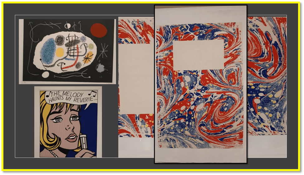
It is not just because this object is so little like a representation of a Lizard (and anyway why with ‘feathers’) but that it insists on the freedom of art with limited ontologies of the animate. This art plays with symbols produced by the line and by colour contrasts and juxtapositions. It insists on being what it is and on being anything else it wants to be or you want it to be, subject to you being willow to discourse on its details (not necessarily in language). It’s recall of musical notation is deliberate, as we see in a Klee example later. This commentary of art by arts without words is also prominent I think in Lucy Skaer’s tremendous Hogarth Reprinted: First Poems (2014). I have blogged on Skaer before (use link if interested). Her methods are so varied, but here she removes all text from definitive textual originals (Edwin Muir’s poems as published by the Woolf Hogarth Press) and republishes in variations (as the original cover was in colour variations between copies) to comment on what art is – what it emergently is and not forever IS.
And sometimes affordances come from similarities in subject or part- subject in a print. Take the example of hands in the prints in the collage below, one of which I spoke earlier.

Of Christian Noelle Charles’ wonderful Caress / Growing Opportunities (2022) I don’t still know exactly why I was called back to it so many times. Her view is that printing techniques bear analogy with other arts (as does Klee and Vanessa Bell obviously). She emphasises the physicality of screenprinting (her plaque says) and aligns it with the performance arts she is also involved with. All are ‘full body experiences’, and herein is the draw, in those hands which caress but also claw. They encourage one out of uncomfortable passivity These hands conjure and exude as well as invite inclusion. They are just wondrous.
But before we leave Klee, I wanted to place him in another collage next to a print that also addresses the music analogy in a graphic print, Man Ray’s impressive pochoir (based on an original in a collage of cut-our coloured papers) print Revolving Doors (III): Orchestre [1926]. Similar cubist pieces by Picasso and Braque express that same analogy in painting, but the Ray example has a rather wonderful clarity in its handling of colour contrast and overlay – since each colour was printed separately – to convey ideas such as harmony, counterpoint and odd moments of fragmented and deliberate dissonance. The printing methods are different, and the effects they achieve are different, but they results are a one-up for the proven versatility of the art of printmaking.

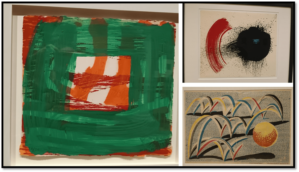
Colour in Man Ray, however, makes a good bridge to Howard Hodgkin. Hodgkin’s methods are always difficult to categorise since they so queer the conventions. The plaque on Home 2000-02 (below)on it boldly tries to show how Hodgkin uses methods that leave impressions of his physical presence, but I am lost in technicality here. This is less so with the Wilhelmina Barnes-Graham and David Hockney examples, but their complexity is limited if not lesser in effect. Hockney’s Bounce in Bradford is one of the most joyous prints I know. The simple point I want to make about all of these is that their artistic play with aligned and overlaid colour contrasts makes art meaningful at times when you think it no longer is – ‘not interested in all this sh+t’ as a person I formerly loved once said to me in disdain.
Home. What is it – a rest and a prison, sometimes both, but the feel too of a caress? Foe me more of the latter now what frenzy youth once had has gone but none the less as complex as the printing process used allows to be shown. Were it not so, it could not be a human construct especially as seen from Hodgkin’s queer perspective.
And whilst we address thematic comparison we can turn to prints of Animals. In the collage below, I place Andy Warhol’s wonderful Cow (1976), which should be conceived in terms of Warhol’s tendency to sceenprints in multiples in which tone and colour of the object could be varied. See it on the left of my collage. On the right is Elizabeth Frink’s equally wonderful but very different conception of a Grey Horse Head (1990. It is a conception sculptural and monumental like the artist’s sculpture. Nestling between these is that print by Monica Poole that I said above I believed to be zoomorphic, although a conception of biology veering between life and death and long temporal process. Are you any more convinced? The contrast of Warhol to Frink though also sees to me to contrast the living with the dead animal. But after so many tries I no longer want to talk about why print techniques work here, assuming you will now agree with me that they very much do. LOL.

On the right a nearly full version of from Patrick Caulfield’s still life print Napkin and Onions (1972). It is a work that glories in the ability of print techniques to entirely still processes. The real focus is the bright and happy wallpaper strips but there is surely irony in using a napkin dropped on a set of onions as a companion subject, for dropped napkins are rarely left to rest for the time needed to complete a still-life. Clearly life has become very stilled. This is a truly relaxing print. I know I should have noted the details of the conceptual word art work EXI/BIT/ION but I did not believing it in the catalogue and not registering that the catalogue was actually an old recycled publication, too old for this piece in all probability. But the fun of this piece, lying in the absence of the ‘H’ in the word EXHIBITION, is actually of a piece with the whole show – for this print is the first you see entering the door. Somehow the spelling error gets us bear to the fact that exhibitions are in fact the antonyms of INHIBITIONS and nothing could be less inhibited than this exhibitionist show. And the three works together speak too of the exhibitional range and diversity in method, affect and effect of the whole.

I feel I can’t do justice to the entire show and in penance I will add as an appendix some must-see print classics I was too tired of contemplating in the past to say much of now.
So ends Part 2 of my blog on my Edinburgh Day. Lunch came next – all chosen from the board below at the Mussel Inn on Rose Street (highly recommended to seafood lovers and pescatarians).

Part 3 deals with my after-lunch visit to a National Portrait Galley show on photographic images of space, particularly architectural space (ruined, new, and ruinous) and a visit to some portraits that were either new or old portraits (and a weird story about the fate of William Strang as a great Scottish artist and printmaker).
I am not sure how long this will take me. LOL.
Much love Steven xxxxxxx
APPENDIX: CLASSIC PRINTS IN THE SHOW
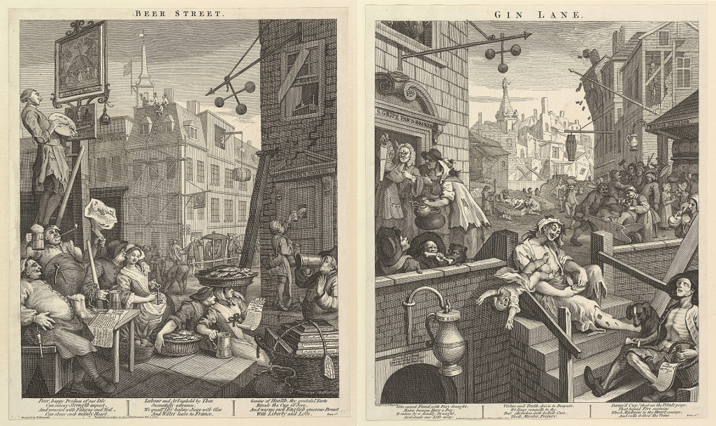
William Hogarth’s Beer Street. This is one of the prints I hate most in history. Intended as a companion to Gin Lane, it was to serve as propaganda to show how a detestable working class might be more easily patronised if they changed habits to beer from cheap London gin
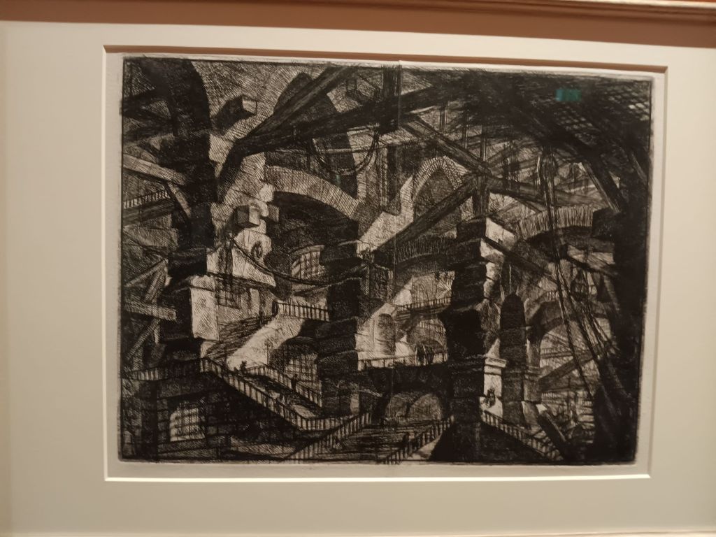
Of course a full version of Piranesi’s The Gothic Arch (1749-60) is mandatory,
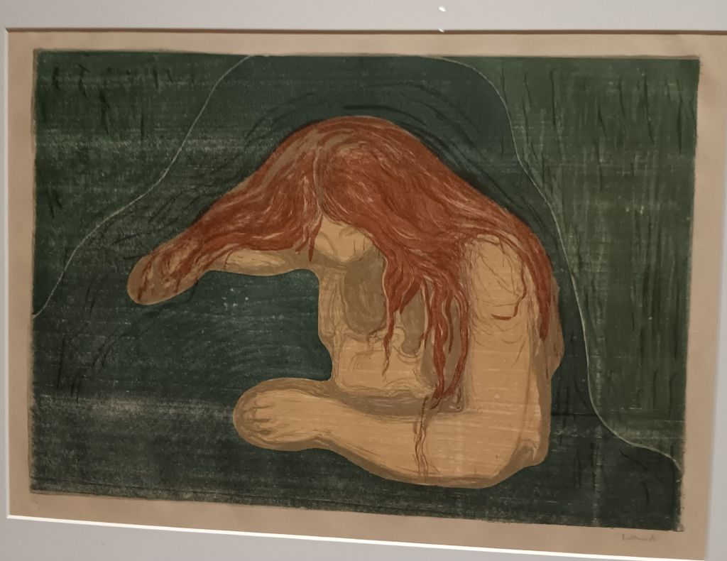
It was a delight to see Munch’s Vampire II. The full horror of Much’d misogynistic fear of female sexuality pumps through its cut lines and colour processes.
And, having seen Durer’s painting of St. Jerome in his studio (for my blog on the exhibition in London use the link), to see the print of Durer’s more saintly version with his lion and hind lying placably together is a must. LOL.

[1] Hannah Brocklehurst & Kerry Watson (2015:9) The Printmaker’s Art: A guide to the Processes used by Artists from the Renaissance to the Present Day Edinburgh, The National Galleries of Scotland.
[2] Ibid: 43. Italicised additions in brackets by me.
[3] King Lear, Act III Scene iv, 36f.
[4] https://www.studysmarter.co.uk/explanations/psychology/cognition/gibsons-theory-of-direct-perception/#:~:text=The%20idea%20of%20affordances%20is,the%20affordances%20of%20a%20chair.

2 thoughts on “A day in Edinburgh with Prints and Photographs: (2) Hidden ingenuity and affordances to thought and meaning in the Art of Printmaking.”