Matthew Rugg says in film of him shown at the current retrospective of the late artist’s work at The Hatton Gallery in Newcastle University that that there is ‘something intrinsic about the nature of making marks that slows down, when you start interpreting them’. This blog is an attempt to learn what he might mean with regard to his own rather remarkable and neglected art. This blog uses the book that accompanies the exhibition (though not its catalogue as such): Michael Bird with Harriet Sutcliffe (2023) Matt Rugg: The Many Languages of Sculpture, London, Lund Humphries.

Going to the exhibition at The Hatton Gallery inside the rather lovely campus of Newcastle University was not something I expected to do on the day we visited that campus to the Northern Stage theatre but we arrived early by 30 minutes and it was raining. The story of my first visit is told in an earlier blog (see this link to read it – it’s short and snappy). It points out that I had never heard of the artist, Matthew Rugg, and that I had no particular interest in seeing him. All I did know about him in fact was that he had been a past student, and then lecturer, on the BASIC Art course of Kings College university art school, whose degrees and awards were then validated by Durham University. I had little or no interest in the idea of an academic artist from the high watermark period of the fashion in abstract art. That was, by the way before you say it, a very ignorant and lazy response for the art course at Kings was probably one of the most innovative of its time.
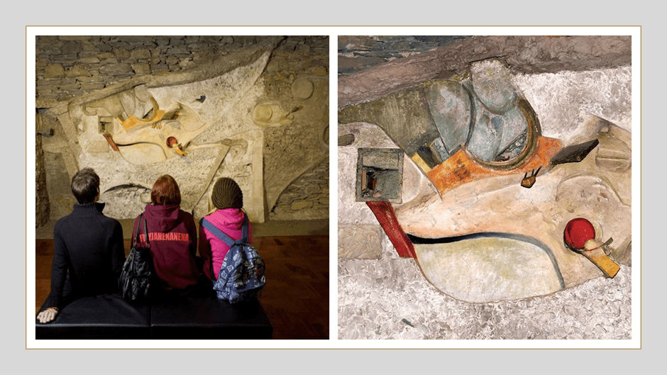
Its story is not only told but the significance of that story underlined in Harriet Sutcliffe’s chapter on the Basic Design or Basic Course at the College which all learners there did as their foundation in artistic methodologies, in itself a more practical pedagogic approach than in other schools in England. The director of art, Sir Lawrence Gowing, aimed to transform the course: building a fine archive of paintings from across the history of art to ensure that learner acquaintance with original works was part of the ethos of the place. Gowing recruited an innovative staff at the forefront of contemporary movements, such as Victor Pasmore, who was at the vanguard of the move to abstract form in English painting, public architecture. Interested in Pail Klee, he led thought in the UK about the modelling of form across the arts. Richard Hamilton headed the Basic Course and he was the intellectual lead of Pop Art. Learned in modern movements, he acquired and transplanted the Merz Barn Wall, the remnants of the Cumbria Merzbau (Merz house) designed by Kurt Schwitters’s and adapted from a barn in Cumbria, to further enhance the collection of significant art at Newcastle started by Gowing. The Merz Barn Wall has to be passed by in this exhibition in transit between rooms 2 and 4.
The Merz project seems as important to Rugg as the influence from Hamilton and Pasmore – in my view more so. There is something of the grace of Schwitters in Rugg’s work (I did a rather brief piece on it for a MOOC course run by MOMA which despite my embarrassment can be found at this link). Both Hamilton and Pasmore wanted their BASIC course to teach knowledge based on the understanding of form and design, dissolving often what they thought to be artificial boundaries between architecture, sculpture and painting and asserting the need for a sound epistemological basis for the understanding of form and composition. It would elaborate art as being somewhat like a science through learnt by ‘doing’ more than theory, especially in Pasmore’s hands. The course was founded on the same principles they thought as those at the Bauhaus run by Itzen and Paul Klee (both major influences of the Kings ethos). Hamilton was a sound and learned theoretician. In a film shown in the exhibition (curated like the exhibition itself by Harriet Sutcliffe) Rugg speaks of the vital role in his art – not of these men’s lecturing or even ‘one-to-one teaching’ but ‘their example’ as artists. For that they primarily were and Schwitters’s example was also at hand at the Hatton as it still is.
In one of the vitrines in room 3 of the exhibition (where paradoxically the visitor starts off) is a typewriter typed paper syllabus (on College notepaper) for Year 2 of the BASIC course, headed BASIC FORM Second Year. I found it fascinating and reproduce its content here in a simple table, with a heading line that does not exist on the simpler original. The rest of this vitrine is filled with copies of books important to Rugg, including T.S. Eliot’s The Four Quartets, of which more later. I will reference this as we look through the exhibition in this blog for its intention was to create a language and structure for the making process whether in sculpture, painting or architecture (for at this level these became indistinguishable) that became the pedagogical content of classes, and eventually of the recommendations nationally for art foundation courses. For instance the following from the 1970 Department of Education & Science Advisory document on Art Education describes the thinking behind the sample table below, for it recommends ‘observation, analysis, creative work and technical control through the study of line, form, colour and space relationship in two and three dimensions’.[1]
| Day | Session on Day | Topic |
| Tuesday | Morning | Point and line (with matches and abstract) |
| Afternoon | Line (with string and abstract) | |
| Wednesday | Morning | Shape relations / abstract |
| Afternoon | Shape relations / abstract | |
| Thursday | Morning | Colour |
| Afternoon | Colour | |
| Friday | Morning | Colour |
| Afternoon | Colour |
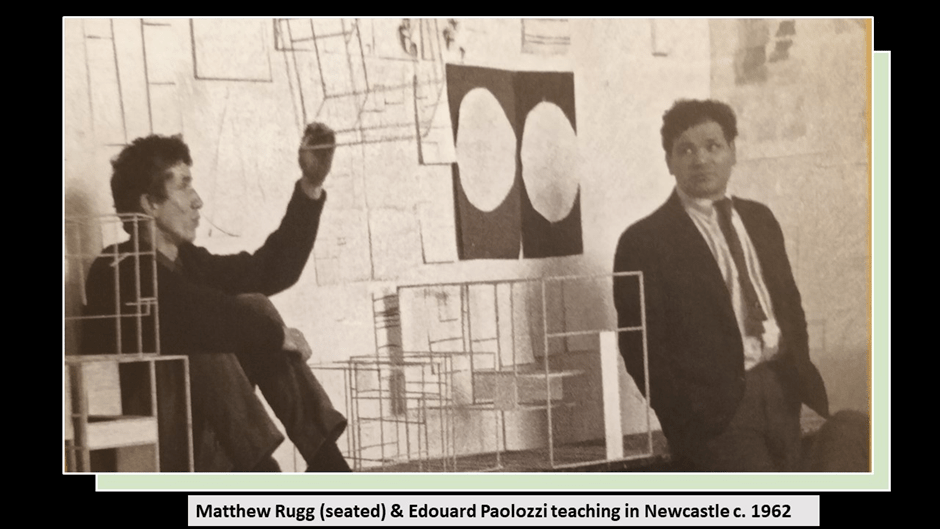
The language and structure for the making process I refer to above was to be embedded in trial-and-error experimentation and a process of learning by doing. It was to serve in order to learn not only about the basics of a drawn or moulded artwork, but also the relationships between the categories taught in each session with other categories and how to use and talk about them in words or visual form or in the act of making things they could call art. That would include how colour is used in relation to shape and other colours and, conversely, shape used in relation to colour and other shapes, for instance. It fascinates me that each of these formal elements is related to the visual point or line as a starting point so that all are integral to the work, however abstract in conception and not dependent on the imitation of external form. The influence of Picasso was, of course, very strong in this regard. And this course Rugg went on to teach with Pasmore and various visiting lecturers with big contemporary names. Her, for instance we see him teaching in about 1962 with Edouard Paolozzi.
But I have to repeat the important part – that Kings College, Newcastle saw itself as moving art into new realms whilst paying regard to the things that art had always done – make beautiful things – even if in the light of aspirations of other cultural goals. The art produced was not based on the kind of clumping dogmas of critics such as Clement Greenberg used by the latter in his attempt to dominate practice in the USA (with Jackson Pollock for instance). It was as interested in how ideas of visual depth were to be understood in visual modernism as was Brunelleschi, and the handling of time and the instillment (I want to use this word as if it referred primarily to action upon the idea of time as we shall see and therefore I have coined it), if not eradication, of narrative and story in visual art as was Cézanne, Matisse and Picasso. For we will find something like story returning in the work of Matthew Rugg I think. The book I refer to in this blog has a brilliant postscript by Phyllida Barlow, a colleague of Rugg’s and a great artist, that I will use in this respect later.
However, one way in which the objective nature of the artistic project was signalled was the use of names like ‘map’ or ‘anatomy’, or some other technical or scientific language for the understanding of the artwork. Both these terms are used by Rugg. Even the word ‘project’ was disliked by some of the people who surrounded Rugg when he moved to Chelsea College of Art for whom a project was too utilitarian a term. He preferred the manual crafting term, ‘making’ and Rugg may even have used that term before him in developing the Basic Course pedagogy which stressed according to Bird and Sutcliffe ‘a narrative of the passing on of ideas and ways of making things, a continuum forged through teaching and learning, which has a living process of its own, parallel to the processes of artistic production’. The term ‘anatomy’ could not embody this more clearly and we still see this in his late sculptural hanging works named Anatomies.
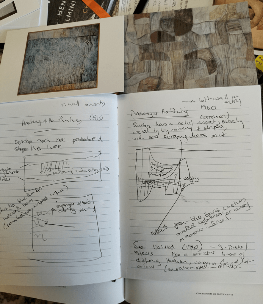
I do not think this is because these English artistic innovators rejected the idea that art was the product of an artist’s imagination but rather that they saw all products of individual minds as cognate with the viscera of their bodies, for the embodied mind was paramount. What they disliked was the idea that the purpose of art was to make a reproduction or imitation (even when dressed as Aristotelian mimesis) of the external world. Art could be industrial and mechanical (and approximate to manual labour using hand tools as we shall see) but it is also biomorphic: according to Bird and Sutcliffe, ‘openness, a relaxed play of bold geometries within which, even something human or biomorphic stirs’.[2] In championing Marcel Duchamp, in this respect, Hamilton insisted Newcastle was changing the rules of art, summarising them thus: ‘art is conceptual – that is to say it has nothing to do with visual stimuli external to the artist’s mind’.[3] Of course, I think this may be truer of the cognitive turn in Hamilton than in the embodied mentality we see without having to hear theory in their wake (for neither of them liked theory) in Victor Pasmore and Rugg. His early award-winning paintings called Anatomy of the Painting of 1960 both were intended to query how relationships of line, form, shape and colour both conflicted and cohered worked separately and as a unit in parts of human and animal anatomy did. Below we see a photograph with one such painting and some less than compelling reproductions of an unreproducible work, taken from published postcards. Currently at the Hatton the supervising staff forbid photographs in Rooms 2 and 3, although I have a press photograph of the former later. Hence, I made notes and diagrams of effects I wanted to remember – see a sample of these related to this painting in the second illustration immediately below this.
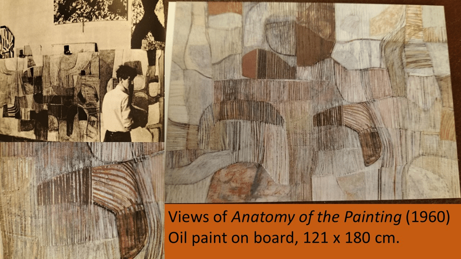
Nothing is said by Bird and Sutcliffe of this painting. I think that is a pity because it is, in my view, clearly meant to be received as a tool of pedagogy as well as theory and to combine ideas of geometric and biomorphic living form, industrial art process (such as after all surgery is) and effects of skin tissue and/ or body hair and their serrations. The thing that I puzzled over most in my notes was that this painting has, in transit of the eye across it and especially on first acquaintance, a three-dimensional (3-D) and mobile effect to the eye moving across and around it indicating ripples of fluid substance, and sometimes of the layering of forms within each other and of a variety of surface effects and textures. These depth and mobility perceptions are entirely related to trompe l’oeil effects I think exploiting the saccade movements of the eye, and it took to my second visit, with longer looking to see beyond them. The irregular stripes, sometimes with the look of the lines on skin, or a more hardened form of the grain and ring patterns in wood, and even the recall of the shape of a boomerang (so clearly evident in the wooden relief construction of this shape in whole and fragments in the work Boomerang (1962) itself suggests that the mobility of that tool, rested and caught up beneath another semi-occluding surface is intended to be conveyed. In the wooden relief both distortions of the shape, and the circular eddying form of the grain of the central block against which it rests, imply motion relative to the apparent downward flow of the grain on the framing wood layers.
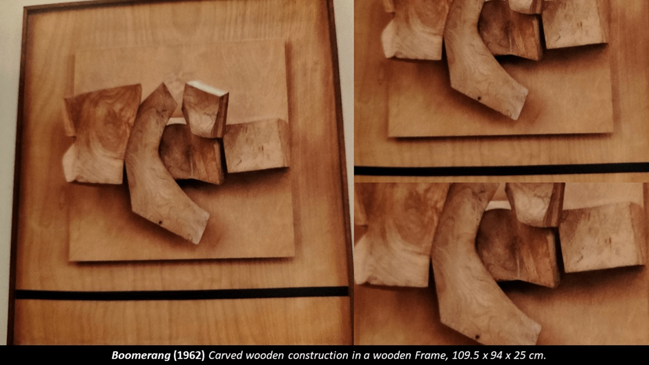
The layering effects of Boomerang are precisely like those of Anatomy of the Painting. In both cases there is a reflexive moment in which the artwork contemplates itself. After all, calling the work Anatomy of the Painting rather the Painting (or just Painting) ensures the title phrase reads as an if it were anatomising itself not ‘painting’ as an abstract whole or another unnamed possible singular instances of ‘a painting’. When the piece queries itself and its meanings in these layering effects, whether real or illusory – and in both works they are both layered in one way or another – it questions what art is and is about. The depth effects are in a little way created by minor impasto effects but there is little heavy impasto on the painting (as in Frank Auerbach’s habitual methodology). What there is of impasto though contributes. Depth is also implied in that the lines in the painting seem created by different methods – by simple drawn brush-strokes, painting and over-painting in more than one colour or by scraping off paint or erasure using string or some tool (perhaps made up of multiple strings in concert effect). In a vitrine displaying Rugg’s tool near both Anatomy of the Painting paintings there is such a tool made of string strands loosely compacted in the central are but tightly bound by masking tape of some kind at the ends loosely at the end. Rugg’s tools including house-painting brushes with thick bristles that reminded me of my father who, as a master decorator (he venerated that name from his apprenticeship), used a variety of tools to create wood grain or other substance surface effects when painting. Though Bird and Sutcliffe tell us somewhere that ‘craftsmanship’ was not the aspiration of the Basic course, there is a sense in which the craftsman or woman (the person who works at making something) is his model rather than the mythical artist of the ‘Fine Art’ schools. The crafts Rugg learned and reproduced as motifs in his art from – music, decorating, sewing, manual metalwork, wood-care – definitely crossed conventional gender boundaries and divisions of high and low art both within and between genres. His found materials – as with Kurt Schwitters – always valorised the everyday.

I think this tool quite beautiful though there is no aspiration to beauty in its making. Its aim is clearly to enable some of the grained and layered effects on subtly painted and manual tool handled surfaces that create an illusion of discrete colour areas but which actually create three dimensional (3-D) tromp l’oeil illusions and are sometimes genuinely layered by tooling. I think this is why shape, form, line and colour crossed art genres – for only in imagination is a painting ONLY a surface, and indeed in Frank Auerbach is NEVER just a surface.
Before moving on though, look back even at the reproduction of Anatomy of the Painting for its layered effects can be seen – its transparent films as well as its declivities and protuberances to the eye. There is a second painting from the 1960s with the same title (but at least the title isn’t Untitled as so many are). This painting creates levels by using irregular margins where texture is differently handled – in the direction of the serrated lines for instance, or in the presence of grain effects like those of wood knots (again like those in Boomerang, eddying in on themselves). In my notes I noted a line drawn across the centre left of the painting (not visible below) which is a line painted thinly in blue. The line painted over a scraped or serrated surface (perhaps with the tool above) giving layers even in detail to the observer’s eye, and contrasting with the variations of thickness and painted style of the lines bordering the rough margins. I found it beyond moving.

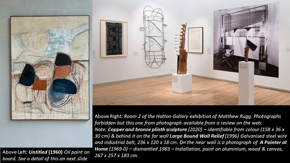
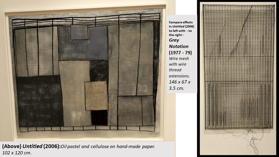
The lines in another piece (Untitled 1960 and painted for his degree show) has bolder colours and creates depth dimensions by the creation of complex relationships, often intersecting, between colour and shape and by lines of variant thickness and number of colours used in their drawing. The serration effect too varies massively. Rugg never tired of this I think because it is used brilliantly in Untitled (2006) from a room where photography was allowed. This painting uses all the effects we have looked at and it’s use of colour creates a solidity and volume more impressive than any other. Find there, for instance (even in the reproduction above), an irregular interior shape bounded in a blue and purple thick line(the colours interact and so the final effect varies). This too creates layer effects.But I needed to gaze longer.
I did find after the exhibition a good reproduction of this on Rugg website. See it below together with a press photograph of the photograph verboten (but not apparently by the curator) Room 2 with some art I would have liked to have written about. However, I already feel overwhelmed by the art so I won’t (and possibly can’t).
I hope the effects I point to in Untitled (1960) show better in this detail (taken from an illustration in Bird and Sutcliffe). There is in this painting an appreciation of things usually achieved as mimesis of external visual stimuli, even if imaginatively transformed, used, for instance, to simulate still lifes or landscapes. It learns from Cézanne most surely but it refuses to use drawing mimetically. The serration effect of the painted lines as the depth illusions of floating lines above the shapes are not those of Rembrandt. They do not assert a primal scene that has been imitated.
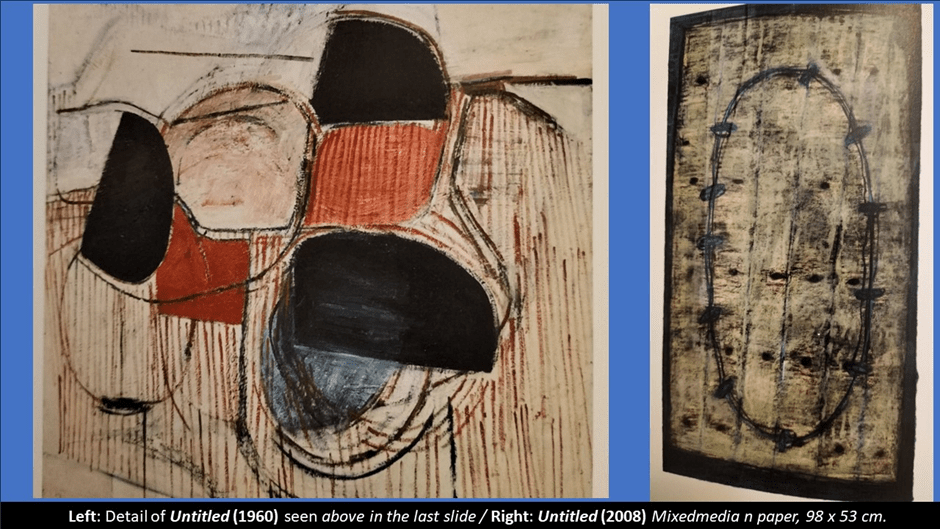
In the collage above I look at another use of shape and line which crosses the boundary between Rugg’s 3-D and two dimensional (2-D) art, Untitled of 2008 in which boundaries appears (unlike in other works that have the irregularity of a physical map boundary – as in Untitled 2008 reproduced in Bird and Sutcliffe on page 84) like an oval circuit with regular nodes. Again the use of multiple lines adds a kind of depth that makes much more sense if we look at the sculpted work using plastic or steel wire, with nodes cut from industrial belt. The use of faint serration running horizontally and vertically adds to an effect of relief hanging from a wall or suspended in front of it.
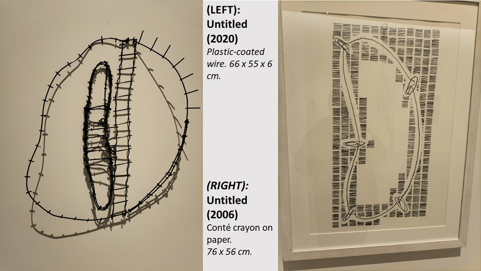
In a late and very beautiful, sculpted relief wall hanging, called (surprisingly) Untitled (2020, complex effects such as I point to are created by a circuit of plastic-coated wires with razor-wire like nodes intersected by a ladder-like transverse rectangle and a distorted version of the same next to it but appearing to float forward of it to visual illusion (see collage below). The doubling of the lines painted and scratched in the 2008 piece are here shadows cast by light falling on the wire, such effects of doubling can in light that moves (like the sun through a window) can achieve even less illusory motion effects for some of the motion is occurring. in the externally to the work but contributing to its varying appearances. I think, but I am not yet convinced that some of these effects are attempted in Untitled (2006) next to it, using patches of regular background serration by conté crayon, that sometimes create an illusion of elevation of the nodes on the circuit, or where more white space is used, absorb them into its deeper space.
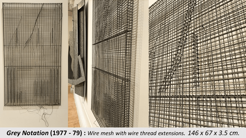
I felt some kind of even more telling comparison between the items pictured in the next collage below, where effects of a wire box with louring caused by quite different methods. I find Untitled (2006) very moving as I sense a 3D rectangular box with line bars at side, top and front. The lines that cross it collapse the shape totally into a flat surface made up of intersecting rectangle shapes that I feel I want to see as a door to the cage but which it cannot be. The play between surface and depth is very different in the sculpture Grey Notation, which is a 3D mesh wire cage like structure containing internal structures and densities of layering of wire pieces that create a shading effect. Musical notes are referenced I think but again the work needs longer. The effect is quite magical.
In the collage below I show some details of the internal structure of Grey notation to make my reading of its form easier to grasp, I hope.
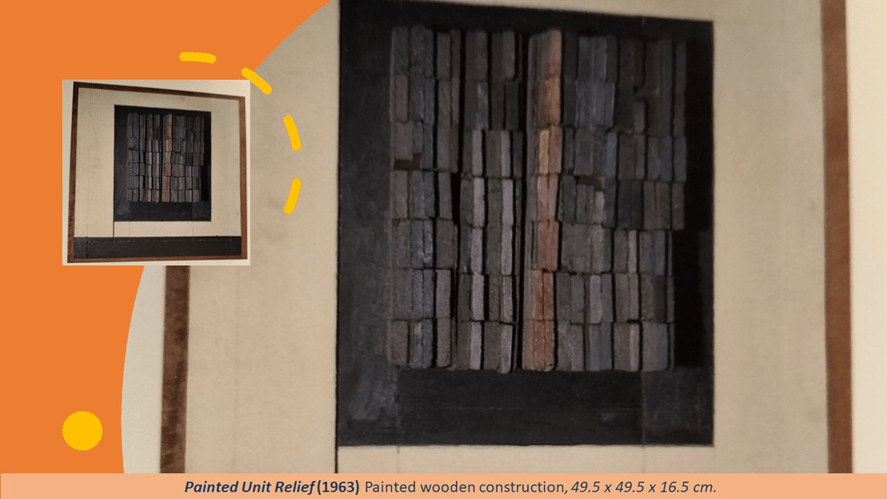
Phyllida Barlow, a colleague at Chelsea School of Art and friend of Rugg’s, and of course a an immensely better-known artist, writes a postscript to Bird and Sutcliffe’s book that speaks beautifully of what I have called his effects of layering. She references his 1960s reliefs and to represent these I give below his Painted Unit Relief of 1963, although in my notes I reference the unpictured Unit Relief of the same year and hence below that I show a reproduction of that found on the web.
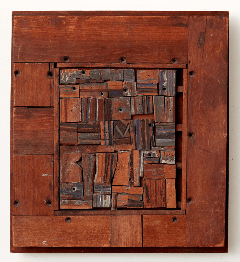
Unit Relief 1963
To my eye the effects of Painted Unit Relief are showy compared to those in Unit Relief, for in the latter they are created by the facility of compositional [placement of found materials – scraps of wood from an industrial setting (‘poor materials’ in the wall plaque description) of wood pieces that are charred, gouged, worn, chipped and marked with dents that sometimes seen decipherable like the ‘v’, and the holes for capped screws in the internal materials and framework pieces. It s the ill-fit of the internal materials that cause the relief effects, together with real or paint marked serration oh the wooden pieces. There is a kind of depth to this piece that promises a void deeper than any mere depth effect. The gaps between the materials are the accident of its art or are designed to open up the reader to a quite fearsome reality behind the fragments of the time of an old working population from which the pieces are found. In Painted Unit Relief, paint and obvious irregular margins make some of the same points but make the artifice of the work more obvious that the magical collection of fragments into one piece, that I have no doubt Rugg felt was a representation of the methods in language and poetic form of T.S. Eliot’s art.
Barlow makes finer points about these and other works though and which unite his work on paper, in sculpture and micro-architecture, so I want to cite them here:
The assemblages of cut and honed wood, arranged and joined with precision, which sublimely exemplify the need to give the flat qualities of drawing another physicality – not just a three-dimensional physicality … but to render flatness as a physical presence in thrall of its materiality. I am reminded of Picasso’s remarkable 1914 A Glass of Absinthe, where the painted spots and patterns both mimic and argue with the modelled surface beneath the paint, teasing the object to defy its different layers of reality. And so too with the delicate painted surfaces on Matt’s 1960s painted reliefs, where momentarily we wonder what is what …. is the painted surface prioritised or the structure beneath? Are they in harmony or edgily in conflict … are they landscape or still life, inside or outside, interior or exterior … or somehow all of these?[4]

Thus what I have called depth illusions above in Rugg’s work are more properly, as Barlow says, a rendering of flatness that is physical and sublime at the same time – an object but also a magical illusion of itself made of solid volumes. This I think a hint that Rugg used layering to layer the grasp of what we call reality: that his art is both epistemological and ontological in orientation not just aesthetic. I think we need to grasp this point. It is implied, I think, in the quotation I took from the film shown at the exhibition from Rugg himself when, talking ostensibly about his own process of making, but actually probably abut much more, says that there ‘is ‘something intrinsic about the nature of making marks that slows down, when you start interpreting them’.
This apparently simple statement makes perhaps its first impact by being an obvious reference to the fact that making things is a process in time with duration and pace (a pace that can vary), but it also implies that making at some point must mean interpreting the elements (here the artist’s marks on canvas or paper) in the thing being made and perhaps the emergent thing in itself. Barlow calls that the moment where we ‘wonder what is what’ in the citation above. It is that moment where the layers of a thing take on meaning. Barlow develops her point beautifully later in going on to talk about the galvanised steel sheets and other elements in some of Rugg’s most beautiful pieces made from industrial salvage found in Newcastle dock meshes, yards. She describes being shown this work in his abandoned studio by Evelyne, Rugg’s widow. Among:
fibrous boards, coils of wire, steel and aluminium meshes, emerged burgeoning works in progress … a perfectly cut eye-shaped piece of galvanised steel; slotted sections of corrugated steel, collaged with strips of wood impeccably joined with tightly bound wire; …. And this miraculous Aladdin’s Cave kept giving, revealing its ceaseless and timeless inventiveness – and its alchemic transformation of materials into these opening and closing layered forms (my italics).[5]
The references to both meanings in association with form that is ‘opening and closing’ (in a liminal state between outside and inside a thing), layers and meaning could be Rugg himself, and Barlow knew him well). And all of it may be expressed as magic but it is also WORK (even the materials are the remnants of past industrial labour) and costs time – and more time the more the shapes interact with each other. Explaining his ‘inventiveness’ in the film at the exhibition, Rugg says that it was about ‘wishing not to stand still really’ and this phrase is quoted by Bird and Sutcliffe as a description of his art as a ‘continuum’ in time or a journey where ‘the destination is not its end but its pretext’.
At this point my mind returns to the vitrine in Room 3 holding his copy of T.S. Eliot’s The Four Quartets. I would have loved to examine this for notations and underlining, and the ways it like Rugg makes music a mode of the existence of plastic and visual art. The authors of the monograph on him I use above say that the often-quoted words from ‘Burnt Norton’ (‘Can words or music reach / The stillness, as a Chines jar / Moves perpetually in its stillness’): ‘postulate an equivalence between formal systems of language, music and visual and plastic art, and a mysterious simultaneity of movement and stillness …’ , In these words a lot of the interpretative characterise that ‘slows you down’ (into stillness eventually – both a state of stasis and silence) in which Rugg’s works live. Forgive me if Barlow has already said enough but I want to turn to show more of the works using his distinctive found industrial materials with (in Barlow’s words again) their ‘recalcitrant and unforgiving rigidity, their flatness, thinness, their airiness, stiffness and hostility’. Let’s start with Arc from his early career:
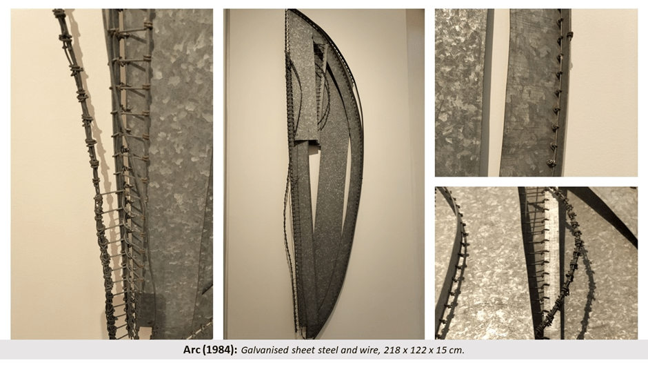
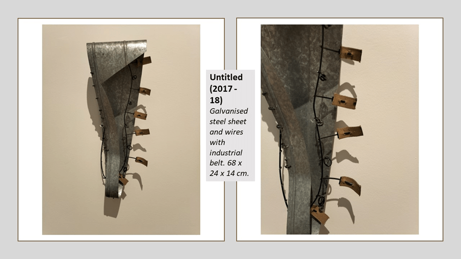
This piece inevitably recalls the High Bridge that stands so distinctively above the Tyne between Gateshead and Newcastle but it is the arc too of an ethereal musical instrument, its hard bared edges softened by its curvature, and its stillness spun out by the entangled still motion of projecting wires. It is beautiful. Musical instruments are often recalled by these works, like the late Untitled (2017-18) that looks like the head of a stringed instrument (either guitar or cello). Its parts include fragments of industrial belt – those moving strengthened fabrics that run industrial machines, passing motive power between cogs moving its parts. Here the metal may be unforgiving but it has been folded so precisely that it gives a softness to its product, its margins extended and made plastic and mobile by its own cast shadow, an effect we see more and more with these pieces.
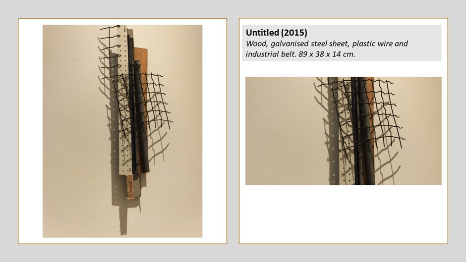
See that effect with cast shadow in, for instance, Untitled (2015) where aluminium, mesh makes strange shadows nearly but not quite conjoining with the hard materials that cast them – imagine such shadows in diurnal moving light. Motion and stillness are made plastic therein and nature would help complement the beauty of the made thing – still but moving (emotionally moving as a reflex of the dynamism few imagine in these pieces).
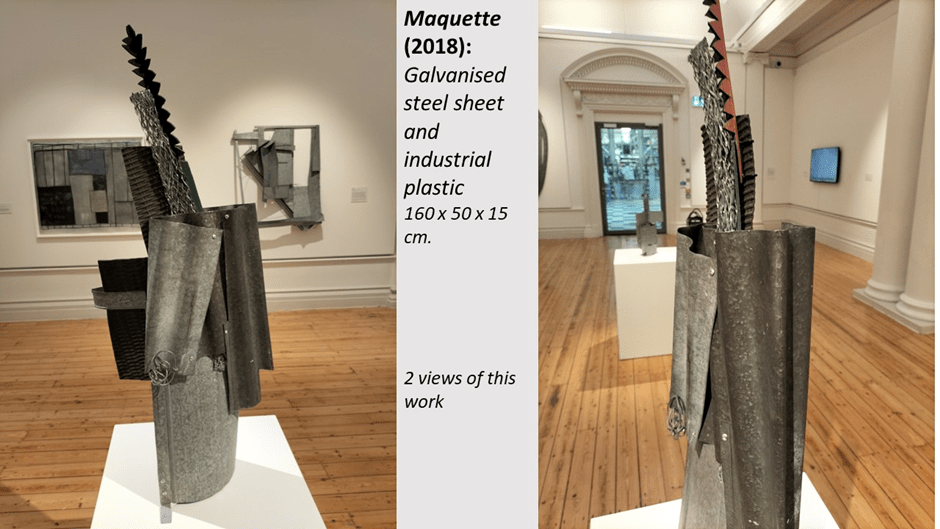
Often the motion is about the effect of the gallery visitor moving around a static piece such as the Maquette of 2018, where the layering of the thin rigid sheets and projectile pieces of plastic that looks aggressive but is softer than that which surrounds it. I give two views but with more, more of the shifting of what might be considered inside and outside the work would be revealed. In this work another important binary in the work is clear – that between the role of surfaces to defend or offend against the viewer – to present as hard and soft. In my mind this is where the art touches on its examination of masculinity, an association that came from its materials and the nature of the labour it encapsulates. This shift between gendered processes – for Rugg these were between fabric work (sewing and matting) and those he preferred not to use but which are implied in the materials, welding and bending. You approach the work here aware of its ability to attract and repel, come onto or defend against you simultaneously. This has an effect of your proprioceptive relationship to it and the boundaries you set between it and you, as a person standing proximal to it.
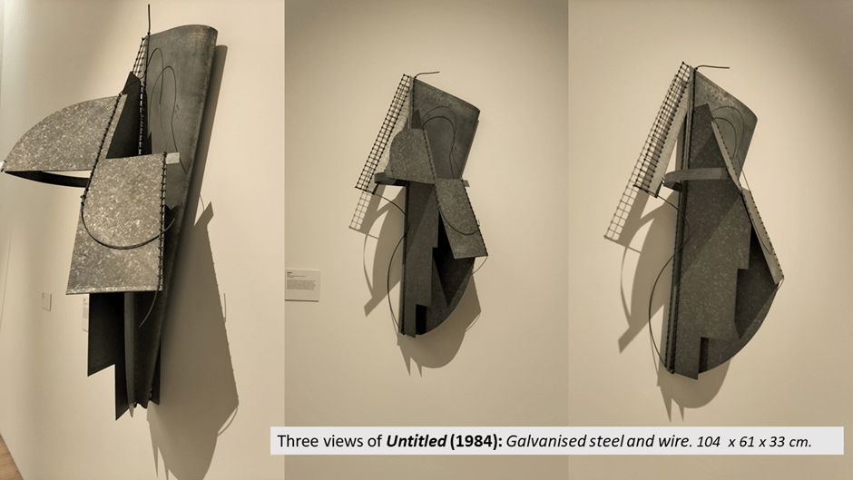
Before we think of these as late effects of the mature artist, let’s look at Untitled (1984), a piece as unforgiving as you can get in its flatness and rigidity of materials, where the wires give such beauteous curves in mitigation of surrounding hardness as do the strings of a harp, which it recalls. But it reminds you better than any other example yet given of the role of shadows – only held still by unforgiving (if brilliantly handled in this case) gallery lighting. For these things are pieces of theatre too – with some of the effects of that art.
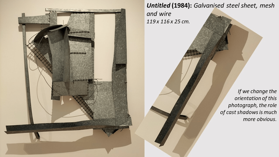
And his early work was not always as angular as the above as we might see in yet another Untitled of 1984 below, which even better illustrates the effect of layering in combining openings and openings in the work, shifting insides and outsides, defensive enclosure and passive disclosure. This work is for me self-evidently a contribution to the debates ion sex / gender in the period.
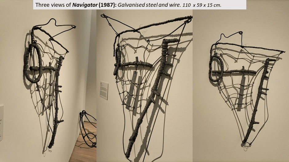
Likewise the cartographic inspired work of which I give one below, the wondrous Navigator (1987), a wall hanging which changes shape from every angle it is looked at from partly by the shifts caused by whether certain aspects of its dimensionality are seen or not, such as the projecting wires from its top or head. In a sense it recalls a relief map (is it the Indian or African (sub-)continental peninsula?) with bold mountain ridges and patterned rivers (sometimes confluent). And the shadows are amazing, the whole playing with a scaled variation of light and dark, space and boundary, delineation and shape.
The natural metaphors for works based on industrial materials are at their height in a series of works named Confluence [2014-16] (raising the idea and pattern of waters flowing into each other), pictures of which can be seen separately in Bird and Sutcliffe.[6] In the exhibition thy show layered up each other, as Rugg sometimes though to show them, and how beautiful they are in this form.

We need though to return from architectural and sculptural pieces to drawing and painting, not forgetting that he saw these as cognate not different arts. The relationship between drawing and painting and sculpture has often been spoken about as if the drawing work were a study for later sculpture and some pieces may give that impression, such as ones we have already seen but I think it is more likely that Rugg saw them as different companion pieces rather than stages of the same work. He played with this idea of the finished or non-finito anyway as did all modernists in many genres (Eliot in poetry, Picasso in plastic art). Hence why one finished work shown above is still called maquette as if it were a stilled stage in the emergence of a work. Matthew Perry who also had a studio at 52 Acre Lane, Brixton, and like Rugg but few other artists there attended it nearly everyday, said of the relationship between study drawing and finished sculpture: ‘I always thought he faked it and did the drawings afterwards’.[7]
But that aside, I want to look at a work definitively hybrid between relief sculpture and painting, the glorious Industrial Landscape. At the exhibition picture supervisors told me that Sutcliffe, the curator, remarked that the ‘scene’ of this piece actually exists and was seen by Rugg regularly on his train journeys between Newcastle and London, but I cannot vouch for that.
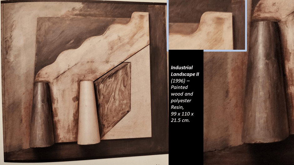
There is, I believe, more than one version of this and I can only refer to that seen in the exhibition, though the photograph above is taken from a postcard that may not be the same work, other than in appearance. I have to say that because the interest in the work from my noes is on the management of relief and depth effects in the work. So much of the work plays games with the shape relationships in painting that create depth effects, such as the painted blocks to the rear of the cooling towers, which are definite semi-relief, standing out a considerable distance. However, the line from the base of the dark tower to the left edge of the painting gives a definite relief effect but is merely a line. Yet close examination of the smoke pile from the towers suggested to me that while drawn near its base, it attained some genuine relied at the upper point shown in my detail to the top right of the picture of the whole work. So profound are the trompe l’oeil aspects I cannot guarantee this. It reminds you all this that there is fiction in that ‘fact; used in the history of art that dimensions of paintings should be given in two dimensions, but three in sculpture. Painting, after all – especially modern painting (but think of Titian too) does have depth and depth variation even if only by virtue of impasto effects. The play between abstraction and mimesis in this painting is of the same nature as that between trompe l’oeil and real relief features of it. It is a game with the natural magic of how we see. It is the kind of magic that Rugg noted in his notebooks from those of the Cubist Georges Braque (for cubism is important in all this) and see-able in a vitrine in room 1: ‘Magic is not less dangerous for the one who practices it than for the one it is practiced upon’. The issue is that magic is involved in all the concepts of our conjoint ontology as humans and its epistemological offshoots – concepts of depth (physical, emotional, cognitive), integrity (being a unit), truth and beauty.
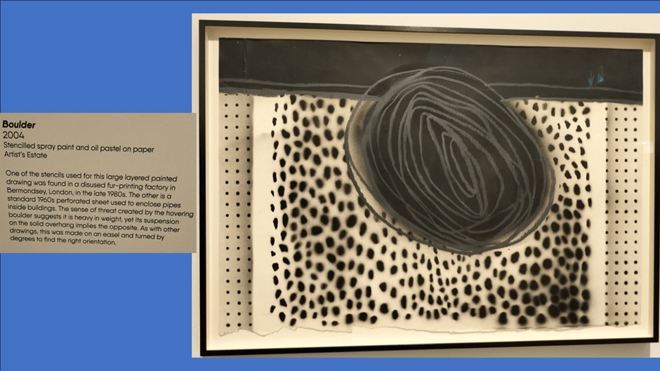
All of these are implied in the play of layered density in the painting Boulder (2004) which interprets depth, integrity or its lack, and spurious wholeness. Its background feels to me as id a curved one on which a very crude boulder forms – but a boulder with the flat relief patterns of a map.
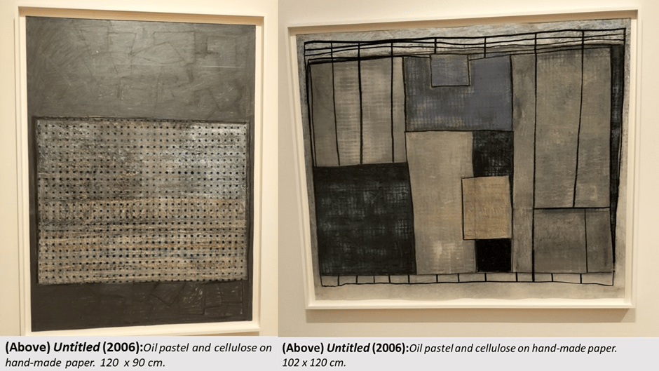
In the exhibition film Rugg speaks of having ‘some kind of sympathy with industrial form’ but we should see how tensile ids the relationship between the arts of sympathy and the hardness of the (then) hard masculine industrial world. And, as I have shown already hanging relief work in metal can be hard to distinguish from crayon drawing, although the difference is sometimes pointed as obvious. For instance earlier I instance the painting Untitled (2006) in comparison with Grey Notation, but here it is with another great painting also named Untitled (2006) – on the left in the collage. Whilst a composition entirely of paint and of relationships between rectangular forms, that latter relation looks like an inset relief until you get quite close. The lines of points running across the inset rectangle look like drilled holes in a galvanised sheet of steel. They are not. They are paint. It is a most intriguing work that makes flatness look solid in more than one way.
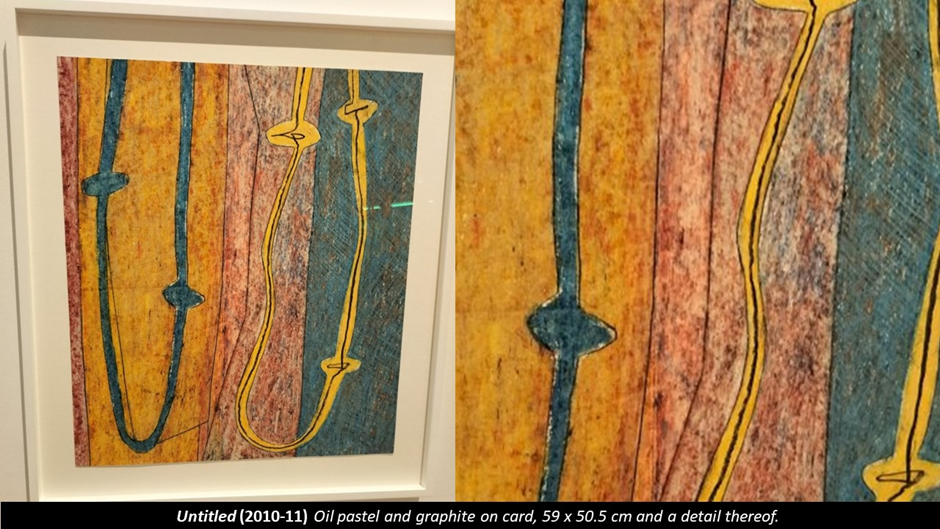
Sometime a great work will renounce all mimesis in its powerful preference for using a flat surface in order to compare the fact of colour, form, line and point relationships as in Untitled (2010-11), a picture I find so moving but which I have not comprehended at all yet – so I am just instancing it. It clearly though references all the earlier knotted strings and wire circuits.
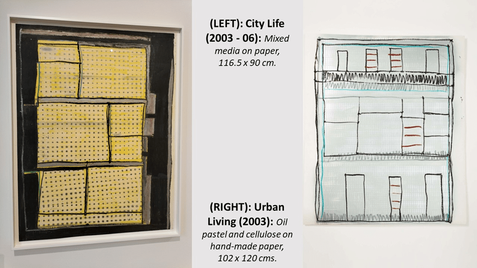
As for the cartographic mode I am still heavily intrigued by the responses to modernism that Rugg himself, with some of his rare titles, made to be about the nature of the city in modernity. Below are works named City Life (2003-6) and Urban Living (2003). Both seem like a kind of stereotype of an urban ground plan, the former also invoking industrial material and processes, but here moreover could also be (especially Urban Living) an architect’s front elevation of a building, although at early stages of conception. Urban Living almost feels to me like a satire on the class system with an upper floor that might be a balconied penthouse. But if interpretation s important in Rugg it is not so simply coded as all that. Hence again I just offer these up. I love City Life, party because I do not love the idea of city life.
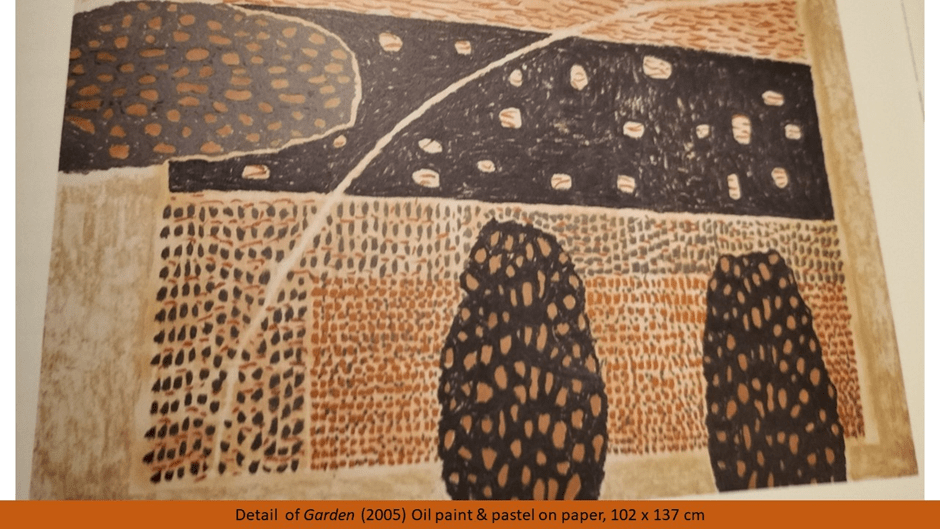
But then Rugg too gave up City Life and his later painting Garden (2005) has a similar relation as ground plan and front elevation of his own rural garden. It is a contemplative piece, where a rural retreat in peace is shot through I feel, with quite a depth of anxiety.
We must always leave the best till last and that is Room 4 of the exhibition containing all eight of the famous Anatomies (back to this metaphor). It may I think be impossible to take ownership of a knowledge of these are works, for though hanging sculptures, unlike the wall hangings we have seen this far these are animated in space not of a wall and dependent on suspension from a sturdy ceiling. Rugg never gave a recommended height for the ceiling and hence the hang of them (and their appearance seems heavily dependent on that fact. As I saw them they very much give the impression of standing on their own base whilst that is not the case. Their appearance must change in every exhibition space as a result and the following collage cannot give a thorough sense of them. They are displayed singly in photographs in Bird and Sutcliffe but even there the same proviso as to the ‘authenticity’ of their look has to be applied.
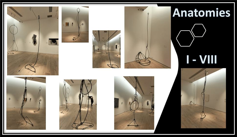
Though then I find these the best of his work and extremely moving I neither want to represent nor discuss them much, other than to point out how the term ‘anatomy’ seems to change in the series. Anatomy I is a sculptural version of Anatomy of the Painting, looking at the way shapes relate and interact, in a very busy network formation but in three dimensions now. AS he simplified the concept he suggest a greater sense of biomorphic anatomy with, as Bird and Sutcliffe say, ‘a larger or smaller circular element suggesting a head from which the rest of the Anatomy hangs, or, equally, a balloon that lifts it into weightlessness’. Those two options tell us how ludicrous is the idea that Rugg was simplifying anything in the series of these works. Instead they animated relations of sensed lifting and falling, dense weight against airy lightness. But many meanings are possible. One commentator in the film at the exhibition says that the base structure of each Anatomy always reveals and conceals something that looks like a kind of animal trap, which may have caused me to take the following photograph, for it recalled the ‘man traps’ in Thomas Hardy’s The Woodlanders:
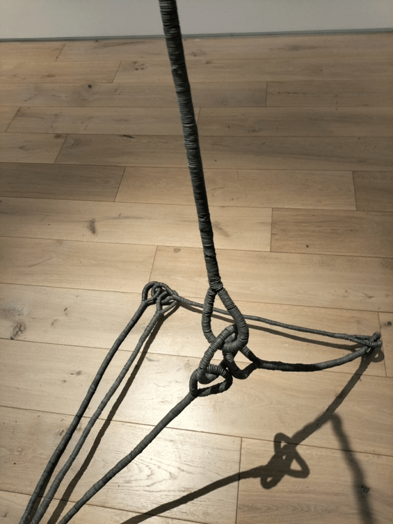
I prefer I think to anything I might try to say further about Anatomies I – VIII the description in the introduction of the catalogue of the exhibition in 2011 in Chelsea Futurespace (an exhibition which included Anatomies I to III). It is by Phyllida Barlow, and is featured rightly by Bird and Sutcliffe in their book, She says their subject-matter was reflexive contemplation of their own form, technique of making and material – their ‘obsessive winding of the wire around itself’ and ‘wiriness’. Such a theme would, of course easily lend itself to the study of masculinity or sex/gender or of the notion of a constructed notion of a human self. Is Barlow hinting at this in her language here, wherein she says that ‘the subject is the stuff itself … This is the action of the wire itself in a dream state’? The idea of anatomised stuff that has dream states means so much in the vision of an art yearning to embodiment and themes of incarnation. I read the following, for instance, in ways that refer to a whole tradition of the sculptured gladiator or even the Laocoön and His Sons, even whilst it says the sculptured Anatomies ‘defy categorisation’:
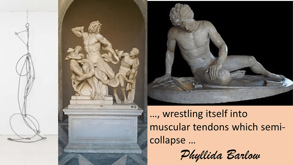
It is coiling around itself over and over again, wrestling itself into muscular tendons which semi-collapse … These nameless, robust, heavy, but paradoxically elegant and seemingly light and almost airborne structures defy categorisation.[8]
There is so much to learn from Matt Rugg. When he lived one student, I think Lesley Kernan in the exhibition film, thought him a teacher and mentor who ‘made a kind of climate around us that encouraged creativity’. But there was also some that was not just flexibly creative and had sympathy with industrial labour who, again from witnesses in the film, who did art ‘because it was something to do’, even though he loved it too. Another characterises him as someone who believed that ‘you went to the studio everyday and made your work’. What he did not like is exhibiting and showing, an interesting aberration for an artist from his particular period. But doesn’t it make you love him.
All the best and with love
Steve
[1] Cited Michael Bird with Harriet Sutcliffe (2023: 131) Matt Rugg: The Many Languages of Sculpture, London, Lund Humphries
[2] Ibid: 13
[3] Ibid: 61
[4] Phyllida Barlow (2023: 134) ‘Postscript by Phyllida Barlow’ in ibid: 133 – 135.
[5] Ibid: 135
[6] See ibid: 73f.
[7] In the film at the exhibition
[8] Cited ibid: 103

One thought on “Matthew Rugg once said that there’s ‘something intrinsic about the nature of making marks that slows down, when you start interpreting them’. This blog uses the book by Michael Bird with Harriet Sutcliffe (2023) ‘Matt Rugg: The Many Languages of Sculpture’.”