Preparing for a visit to the delayed exhibition of the work of Philip Guston at Tate Modern on 21st November 2023. A blog based on reading Harry Cooper, Mark Godfrey, Alison de Lima Greene & Kate Nesin (eds.) (2020) Philip Guston Washington, USA, Publishing Office, National Gallery of Art, Washington.
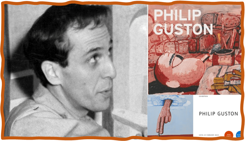
Philip Guston is a force in painting and it seems odd to me that I have never knowingly confronted one of his artworks ‘in the flesh’ though I have forever been haunted by his figurative images. That was to the exclusion of his work when he lived amidst the Abstract Expressionists and even with a clear link to Surrealists, especially in the hyper-realist scenarios of his early work, such as Nude Philosopher in Space-Time (1935). Hence, I feel lucky to get the chance to see as comprehensive a retrospective of his work as the one showing at Tate Modern, on the Southbank at London, now and which I will see on the 21st of November on an overnight trip, where I will also see – the next day – the Marina Abramowitz retrospective exhibition at the Royal Academy that was also delayed. I can’t think at the moment of a painter I feel it more urgent for me to see in the flesh, for I am already beginning to be aware that even the scale of these works demands the immediacy of being present before them, dwarfed by figures that have long been, in my experience, reduced in size and terror by reproductions in books and periodical publications – though I know many of them from that latter method.
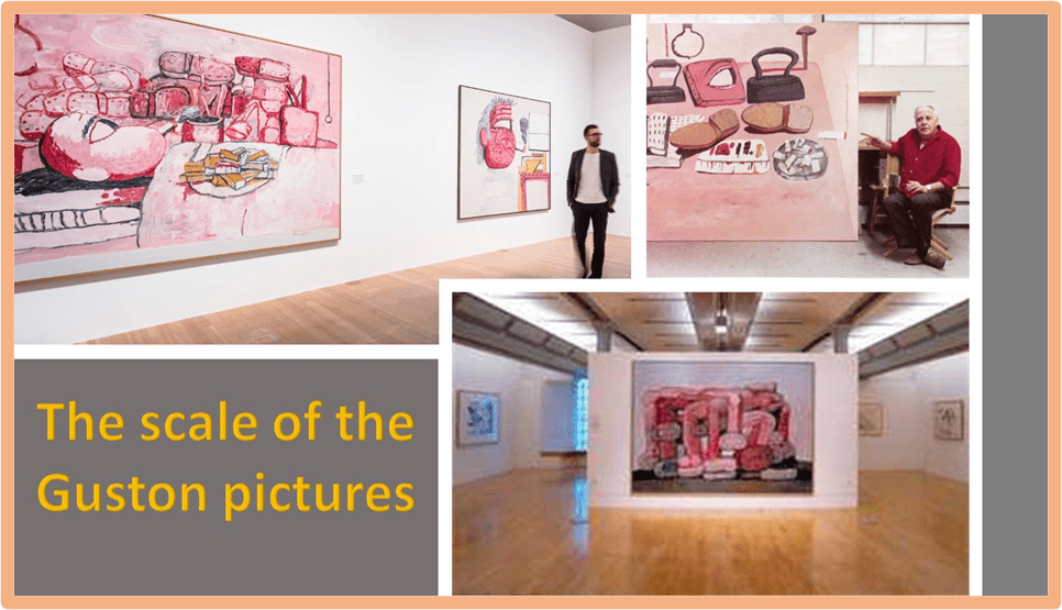
To acclimatise myself to the possible shock of the scale I found the pictures above and collaged them. They show the size of the painting as adjudged by their scale on the venue walls they are being shown in (such as Tate Liverpool) and relatively when compared to visitors or to Guston himself. The paintings at this size too appeared to be impressive even at the level of colour combinations – with that hue of pink somewhat predominating compared to the darkness of holes, voids and impossibly over-specific, and sometimes over-regular, lines. In the catalogue though William Kentridge uses his superb eye to note that for ‘Guston’s palette one has to go back to the pinks and grays (sic) of Goya’s early portraits, or the pink skies of Tiepolo’, but even he seems to think he may be mistaken when he looks closely at the paintings themselves.[1] Of course from photographs so poorly reproduced here how could I convey anything like the feel of these paintings present before me, as they will be in Tate Modern.
The catalogue too might give me clues to the curatorial method, though I have to admit the approach of the essays in this volume takes on a lot of approaches – some inevitable such as the exploration of Guston’s debt to Jewish experience and iconography. Given the sensitivity of the responses recently to Guston’s approach to understanding the psychology of racists in art, the curators’ preface emphasises the fact that our modern society, if it merits that term ‘modern’, has again ‘embroiled’ us ‘once again in the kind of culture wars that defined the 1960s’ and left us ‘facing levels of racism, violence, and polarization that we have not seen for fifty years’.
Hence, this is why the scholarly essays focus on a re-reading of the works in different ways including:
- the sources of his imagery, especially of masks and hoods (de Lima Greene’s essay on The mask and the Lie of Art);
- the layers of image-making that come from Jewish traditions – secular and religious and with a fascinating end on the relevance to art themes of the Golem myth (Mark Godfrey’s essay Jewish Image-Maker), as well as;
- the importance of a concept of the horizon in his art, as and introduction to the artist’s edginess thematically and formally (Kate Nesin’s essay On Edge and at Sea).
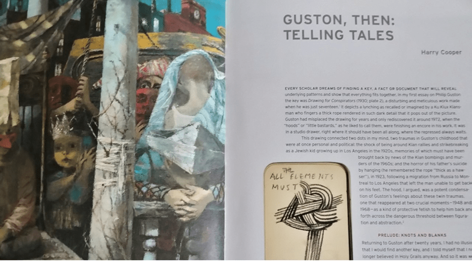
The book too contains short appreciation of themes in the works, or more frequently individual examples that are just so powerfully in opening up the anxiety of his influence in our contemporary artists and brilliant readings, as edgy as Nesin’s in her essay. I adored in particular Tacita Dean’s contribution. However, this book excels as well because of the retrospective commentary by Harry Cooper, which avoids the usual dry-as-dust approach and starts with Cooper’s thought that he may have found ‘a key, a fact or document that will reveal underlying patterns and show that everything fits together’. A large detail of the page from which this comes can be seen below to illustrate the approach to helping a visitor to see such patterns for themselves.
Harry Cooper, Mark Godfrey, Alison de Lima Greene & Kate Nesin (eds.) (2020: page xiv facing page 1) ‘Philip Guston’ Washington, USA, Publishing Office, National Gallery of Art, Washington..
I find this approach useful before seeing the show. It has certainly opened up strands of thoughts of which I was aware and fired synapses that might produce new perception of the works when I see them, for I treasure them. And to talk of strands is important because Cooper tests as a key a page from Guston’s 1941 notebooks which he describes as saying (see it above and again in the collage below) ‘All the elements must ,’ where the blank stands for a schematic, almost cartoony image of knotted rope’.[2] He traces that motif through various different kinds of works by Guston but concludes gnomically that it demonstrates that ‘images cannot complete words, or vice versa. It is not so much a key as an antikey, then, but one worth holding onto’.[3] I think this shows the nuanced open approach to interpretation and exegesis in the whole book, and is therefore an excellent preparation for seeing works that do not get overinterpreted before they are seen and are therefore less easy to see. I find it symptomatic that the first page of Cooper’s account faces a detail of the famous painting If This Be Not I, with its mix of twine loosely tied and holding random twigs to a post that is an interpretive knot in itself.
But I did hold on to this image as I read the text and scanned other literature I had on Guston in preparation. I came across, in the light of this, a late work from 1979 called Talking (see below) which much later in his account he describes fully and there says is ‘the closest Guston ever came to reprising, no doubt unconsciously, the notebook knot with which this essay begins’, though it calls a ‘knot undone or trailing off, like smoke’.[4] Robert Storr reads the painting as one of a late series that ‘center (sic.) on the artist’s arm or hand, but exclude his body’ and illustrate that the permutations through which Guston puts ‘“simple” motifs were, but for time, seemingly infinite’.[5] I suspect both statements have a kind of quality that is as much vagueness as nuance and tell us very little in the end, but they do encourage our readings to be fluid – to find iconography but not to read it as if it were a code to interpretation, for I don’t think art works like that. I will test that out I think on my visit.
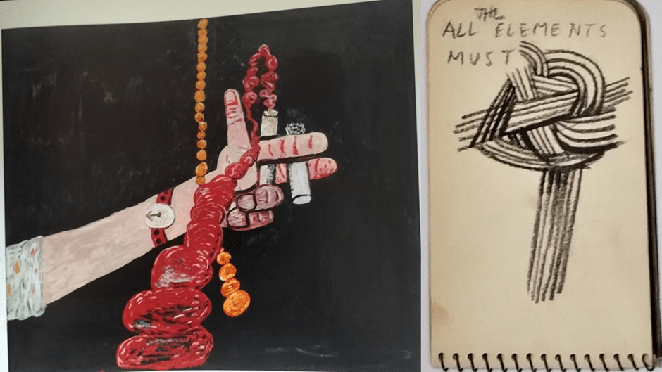
If anything, I think Talking is about what cannot be talked out, aloud and hence why it misses out the parts of the body that speak for ones that work by gesture and other visual means, employing motion in three dimensions, for the knot feels to me, even in the notebook to be very much about the illusion of spatial depth as a feature of drawing and design and about how design configures space in a pattern of illusion. The smoke from the cigarette held near to a stubby paint brush is meant to project into and perhaps beyond the surface level of the picture in illusion and looks like both a strand of rope and / or excrement. These are all important images and ideas in Guston. Yet, though it would be convenient to read the notebook as saying all elements of art must be tied together in a tight knot, or made to cohere, but we can’t really get that meaning from it.
The knot itself has an illusory coherence because depth, upon which knots depend for their substance, is missing from the equation except as illusion and this graphic does all it can to make that clear, sometimes pretending the rope is solid, sometimes an iconic representation that might as well look transparent. The rope ends don’t meet or flow and I don’t agree with Cooper that in this graphic it is ‘only in one place, where two ropes intersect, does the illusion break’.[6] The illusion refuses to hold together at various points, rope connections being far from clear or a workable representation. Potentially this icon is entirely a set of ‘loose ends’ and random pieces as other works that, according to Cooper, use the antikey of the knotted rope motif. After all an antikey is something that looks like a key to interpretation but is an illusion, much like Guston’s random patterns and piles of objects and figurative elements in his late works, like eyes, arms, legs and feet or sometimes the items that those elements wear – sleeves and shoes (perhaps even only shoe soles).
In the early works the lack of coherence is sometimes at the level of meaning or the juxtaposition of memes and associations; in for instance the juxtaposition of a lynched black man and a crucifix, already bearing Christ’s body, being raised next to it. The stories conflict and the ropes that litter the piece do not connect convincingly either in visually logical ways. The position of bodies in relation to each other and their setting is hard to read and markers of deep space are continually in conflict. For instance, the shadows of the Klu Klux conspirators to the rear are cast in a different direction to that of the isolated clan member, which sometimes makes a wall represented as straight look curved. Some of the columns above the wall are so out of perspective they seem to topple. Even the rope twisted around the knee of the man to the front is hard to see as a continuous rope. It is too short and thick anyway for its intended use and the means by which the man has his knee raised hard to imagine anatomically under the robe, since it uses none of the geometric stepped items on the ground in front of it.
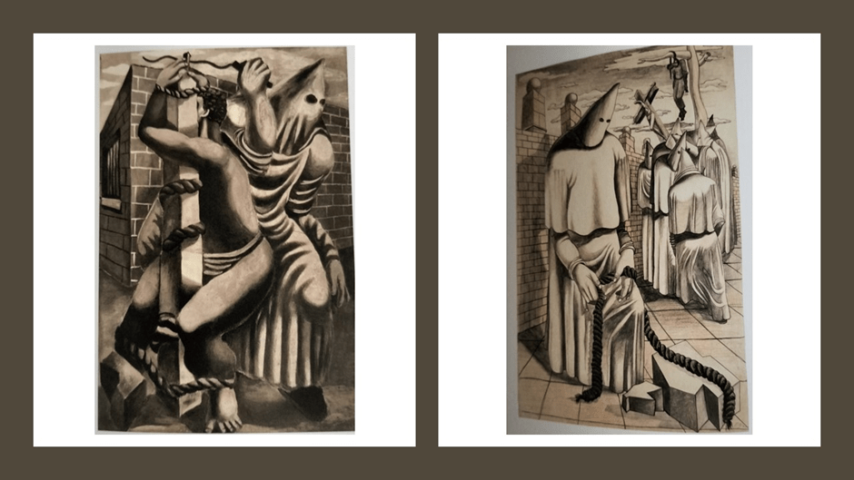
He, in an earlier commission, pictured the torture of a Scottsboro Boy from a set of three frescoes by different artists in the New York John Reed club, named after the impressive USA Communist Reed, and aimed to be political pieces on “Negro America” commissioned by the USA Communist Party. Cooper sees the drawing as ‘surprisingly clumsy’, whereas in my view it is cleverly full of false torsion between elements that ought to connect but don’t, especially in the anatomy of the Klan member who, through the doubling of his body and arms appears to be, whilst scourging him, also holding the ‘boy’ still. But he is also anally raping him as he is tied to the post. The position of the rope or ropes on the pole cannot explain the Boy’s posture, and shadows and flesh seem hard to distinguish as do clothes and underlying anatomy for both figures.
It is the first of many pieces that use loose ends in representation to deepen the horror of what is represented. For while the nine Scottsboro boys (in fact young men – boy is used stereotypically here in this original appellation) were sentenced to death for a rape they did not commit, a rape is in progress here and now in the painting, where the number of participants is suggested by the distortion of two stereotypes. The lack of coherence is used by Guston politically here, as was the intention of the mural set by different artists of which it was a part. Of course, it can’t be on show for it is a fresco that only exists now in photographs, the building on which it was painted having been destroyed.[7]
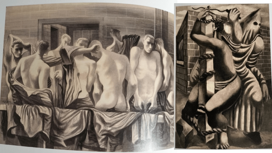
And if I am to look for patterns, despite a lack of support from the literature (cooper or Storr), I think we find a homoerotic pattern very worryingly underneath Guston’s own representation of the scourging of one of those ‘boys’. Whilst such a pattern is not characteristic of Guston as a painter it is I think one of the strands or elements from his observation of the dynamics of American society and of masculinity therein in some of the early works. For instance this exhibition shows a large 1943 watercolour from a set based on military training. The picture Locker Room (Navy Pre-flight Training) is incredibly contorted in the designed placing of the naked and semi-naked male figures. Playing with problems of spatial depth and surface, it shows men dressing ( I think from the gesture of some) from the nude but in so tight a space they must go to great lengths to be unseen by each other and us. Their clothing is represented as a kind of interconnecting rope and framework of their display. But the interconnection of bodies is a knot. One young man’s shapely bottom projects from the surface level of the picture over a bar draped with clothing, whilst the arm of a man to our left of him and apparently alongside him projects too in front of his head. On the other side, a man to our right of him seeks to fasten his trousers over his groin but seems to display great vulnerability in the process. Perspective and depth are incredibly illusory creating an impression of over-closeness against which the men defend themselves. In this mix of illusion, the homoerotic is just one strand amongst many in his work about issues in human life that get unacknowledged and buried.
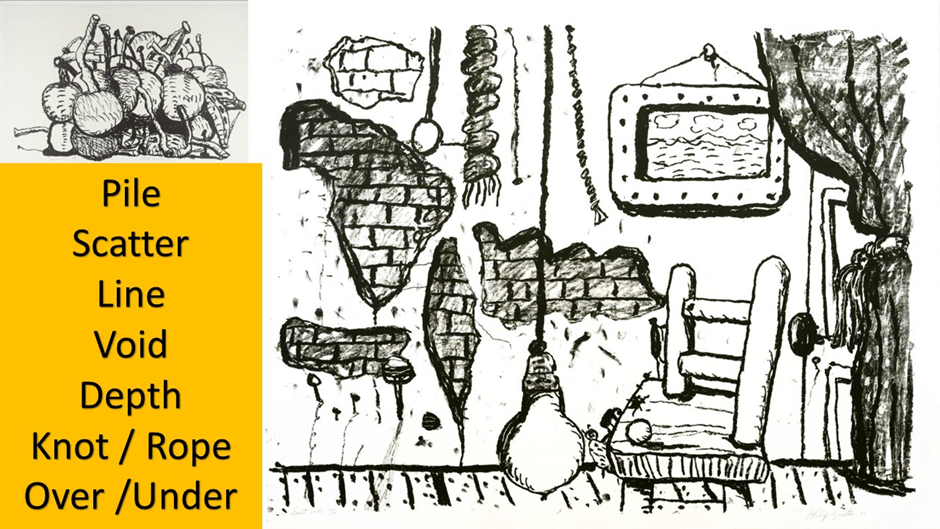
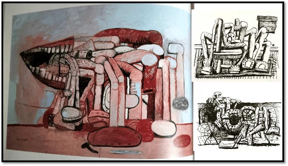
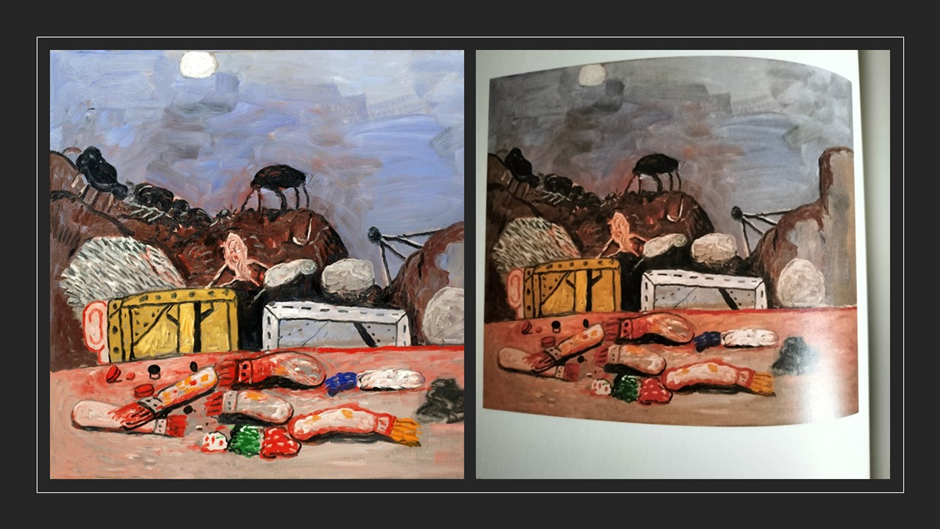
Better with this painter to take Cooper’s line and look for the simplest possible motifs. As I glanced through the literature (and some of the line prints owned by the Tate, the list of these I came up with is in the collage below, on top of which I place the RANDOM PILE (sometimes tower) of items seconded only by a motif of RANDON SCATTER. Among the piles, I would in truth place the Naval training watercolour above. Piles and random scatter collections of items tend to displace issues of illusions of depth and surface design in a drawing. In the example of a study of a room below we see nearly all the motifs but jumbled so that depth perspectives are more unreadable than ever. In the random scatter of a room, the door to our right appears to disappear below the line that represents the floor level on which a structurally impossible chair stands. Depth cannot explain the perspective through which we see Guston’s iconic lamp bulb, nor explain from where the short thick rope is hanging. Artifice and illusion in arrangement are prominent and the whole will not give up the illusion of depth, even whilst it makes the measurement of that depth to the eye impossible – a thing it mocks by including an iconic landscape painting within it, as well as a string of beads that is entirely out of place and hangs there, like so much else, as a ‘loose end’.
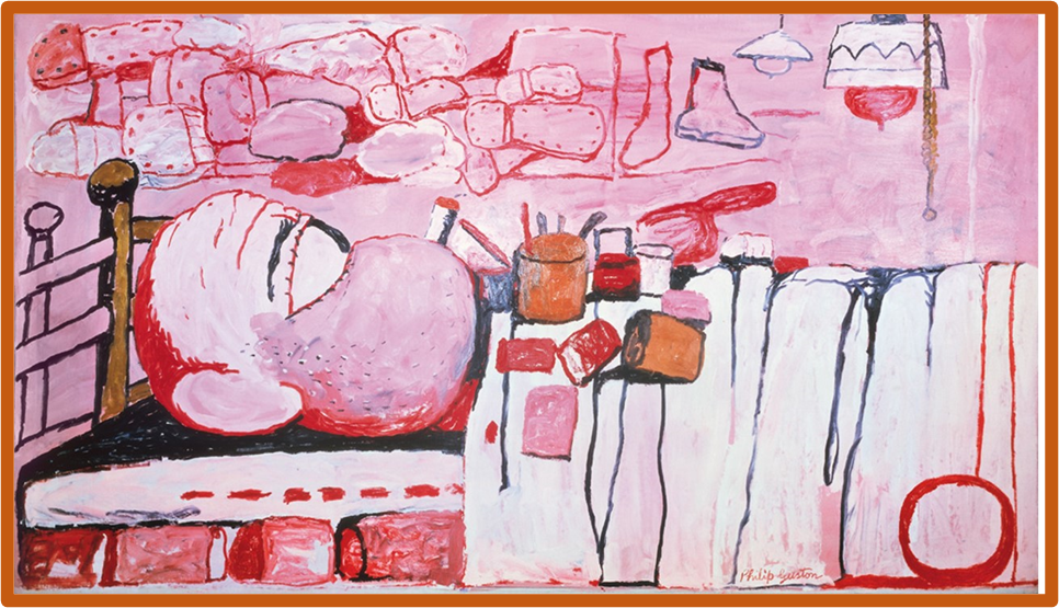
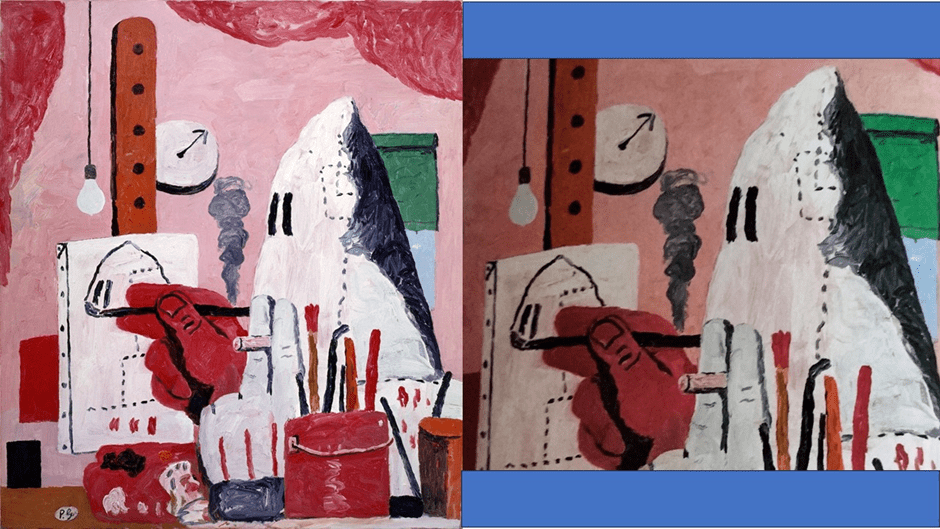
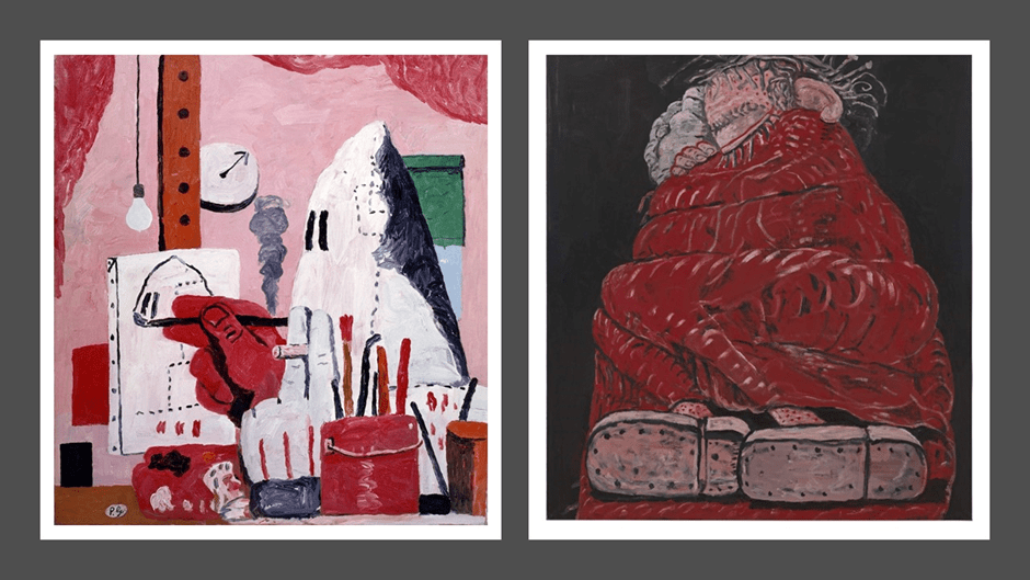
Some random piles and scatters in the drawings are carried into the paintings. The pile of cherries above itself became a painting. Sometime a painting combines both modes. As in the great Painting, Smoking, Eating of 1973. In that painting the excess of consumables is matched by piles of wasted thrown-away items, a kind of social excrement from the excess of capitalist consumption. The piles often in fact indicate things thrown away and treated as waste, and some attribute them to Guston’s memories of images of items taken from victims of the gas shower rooms of the Holocaust, in which victims were forced to make piles of their clothing, and especially shoes. Piles of shoes recall the piles of corpses incinerated in the death factories of the Nazis, but they are also a comment on a life in which production, consumption and excremental process define our society. Below is an early form of that painting where items characterising painting dominate over the foodstuffs over the oil on canvas version in the exhibition from the Stedelijk Museum, Amsterdam. That oil version is even more cluttered, the pile at the rear leaving no void between it and the painter, The use of blacks, reds and Tiepolo pinks emphasise the fleshly nature of the man, a painter who is not painting but scattering items for consumption as if already waste. In the oil, there is a pile of food on the bed. The oil has another icon added – a red – and therefore burning single bulb on the viewer’s left without a light shade (there is a shade on the version below but on the viewer’s right) and there are more blood tones on the greater void of wall above the pile of shoe soles than on the version below.
The link between consumption and waste is even greater in the well-known pile structured painting Painter’s Forms below, where the artists disembodied mouth is either consuming or excreting the pile of items which are legs that might be animal or human bearing shoes. In the drawn version, they are clearly horses’ hooves with horse shoes rather than human shoes / shoe soles. That these are claimed as ‘forms’ suggests too that the painter is recreating externally what exists in some form or other within him, which has taken processed from the world, reprocessed and regurgitated.
In all cases, note also the importance, given full and fascinating treatment by Kate Nesin in the catalogue, of lines demarcating edges (of rooms, of items like the bedspread, and of horizons that can indicate something that appears accidentally, incidentally or intentionally in a painting). Many late paintings, as Nesin shows, show a plethora of hand-drawing-a-line motif which as in the simple Paw of 1968 (not pictured here), a ‘beast’s hand’ (according to Guston) draws a line in otherwise purely two dimensional pink space: ‘We don’t know where we are, but were the hand to keep going, the painting might someday, eventually, tell us’.[8] In the lines that stand behind piles or semi-organise scatter, there is a play between artifice (in the artifice of room construction or the painter’s mimesis thereof) and nature – a sense of the horizon of a landscape, though that can be distorted. In the brilliant painting Above and Below of 1975 it is all these, demarcation and over and under hierarchy – a place underneath a rigid heavily embossed crust of a black line cutting between what we keep under and allow over the line as acceptable or otherwise, Underneath is like a crypt, burial pit, waste disposal facility or repressed memory – for the storage of processed body parts and used objects we don’t want to think about. Overhead is tan iconic natural horizon except it is suffused with sickly flesh pink. An eye remains from the Cyclops figure we have previously seen, disembodied but shedding fragments – marks of white and black near lines but actually dashes. And controlling it two red-lined-and-wrinkled fingers pressing down towards the line. It is chilling: the motifs are from elsewhere but their use re-contextualises them cognitively, emotionally and as haptic visual impression.
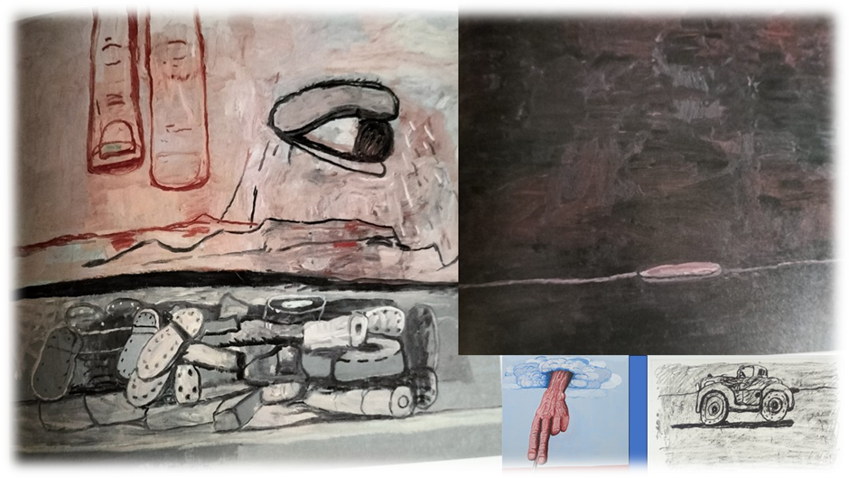
But look again at some of the insets in my collage, even shadows can be lines, so that they might be drawn by oil leaking from an old car. Nesin spends a lot of time on the brilliant painting, that I am yearning to see in the flesh (and will report back upon) On Edge of 1978. The line may be related to the near fleshly slug-like protuberance on it – is on the viewer’s right above that picture – or it may not. It is all the artifice of a painterly moment perhaps and semi-abstract, except that nothing in it is spontaneous as in Pollock’s action painting. It is Nesin says a characteristically polysemic painting – meaning any and all of a number of things/ These include an abstract evocation of a state of mind (that is edgily nervous) or suggesting things to do with pits and undergrounds or underwater – a man-hole cover disc on a tarred road, an iconic head above dark waters.
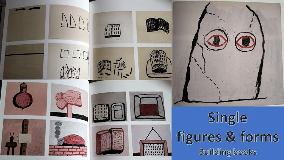
We tend, when we think of Gusto, to think of his simple iconic figures and forms of the late post-abstract period, such as those from the catalogue below. Single drawings that brought Guston back to figuration. We see some older forms from the pre-abstract period, like hoods and masks but they too become polysemic, just as the cyclops man is. Below we see the transition so interestingly described by Mark Godfrey in the catalogue from hood, with its old racist association, to Golem – a Jewish mythical creation in which creation and destruction are conjoint on the cusp of life and death. Likewise the books that might also be city apartment blocks, posts and easels that become animate, and so on.
But these simple forms are not simple to understand in the contexts of use in complex paintings as we have seen and will again. However, this exhibition clearly wants us to re-evaluate too the early Guston, painter of realist and hyper-realist (even surrealist) forms: the painter of masses of figurative forms that predate the themes of pile, scatter, line disruption and so on. I think I want to look out for this at the exhibition. But as a sample see Gladiators below. It is a picture of children playing but in a confined space – that of their dog’s bed – so that their dynamic play fight becomes a pile on from which the dog wisely intervenes only from the edge. The whole is, as Cooper shows, an early knot motif where the fabrics and limbs are tied together tightly to create the heap, and out of which shadows turn into void symbols and dark black holes. Lines are there to create shifting edges of colour but they are destabilised. Sheets form hood covers and all faces are masked. The bed looks as though it may be teetering on a staircase top and the whole is unstable. It is rumbustious, but I sense the same principle where form gives way to feeling and idea in design in the artist’s early self-portrait, where the hand appears to duplicate and became the face’s sculptor or hand brushing artificer. The hand disembodies even so that the face and figure are sacrificed to overall design. That last point is a long shot but it is one I will try out.
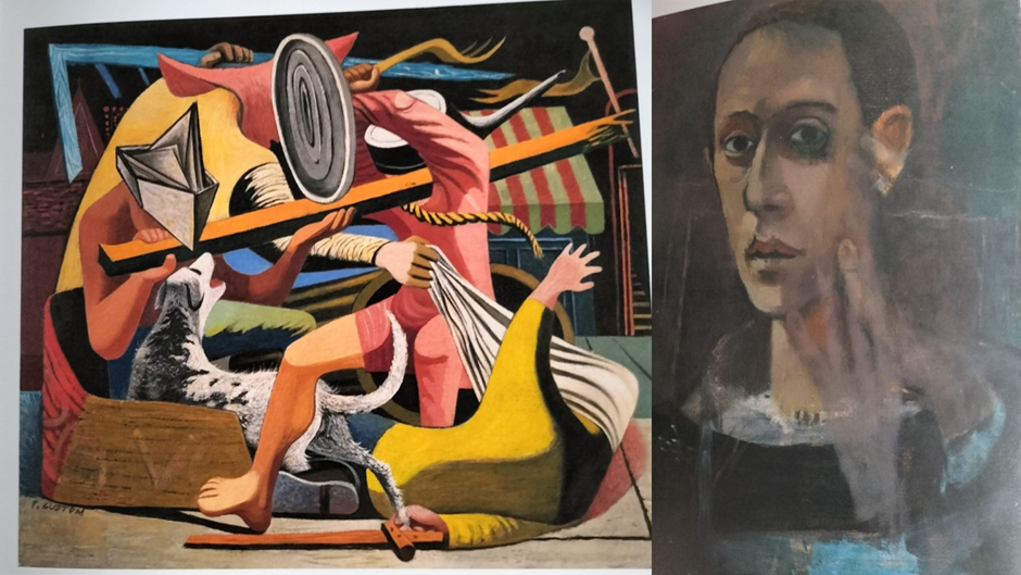
As in Picasso, which both paintings recall, bodies and space become subjected to design features that are formal (disegno) and colourist both. In my view this is not a long step to the investigation of wholes made up of scatter and piles of simple forms, nor does it make dramatic and silly the period of Abstract Expressionism that intervened. For instance the abstract Summer has a lot in common (below right) to my eye has a lot in common with Gladiators. Both have a pile structure and a scatter background. Both create voids – black in one, white in the other, And though both use irregular markings they suggest determinate lines that are partly covered over. I will test this when I go to London.
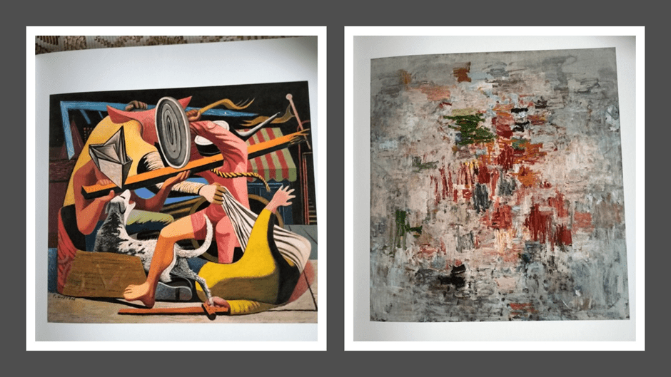
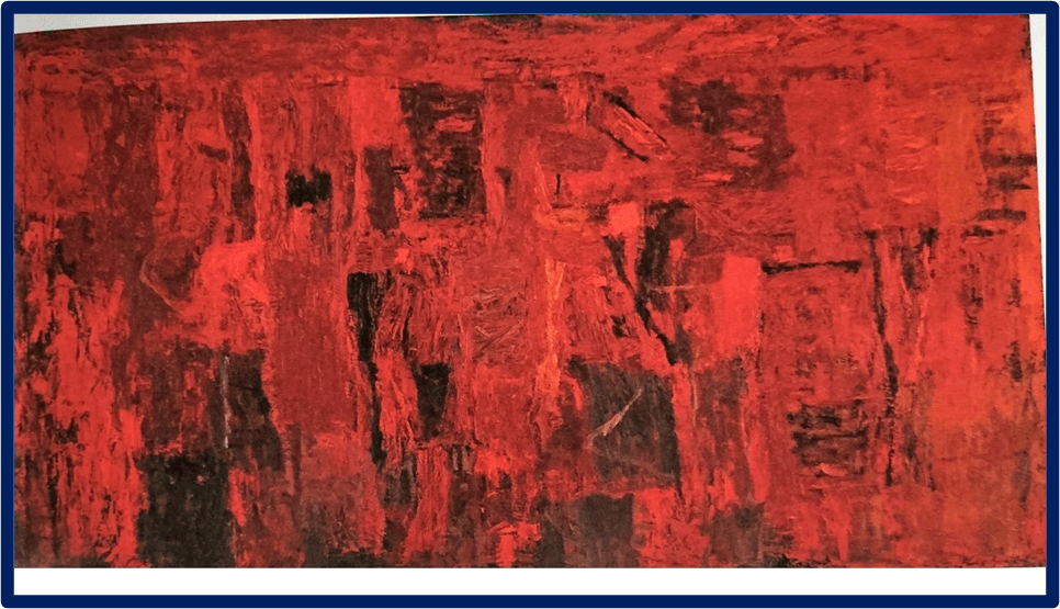
And even paintings nearer to de Kooning and Pollock differ because they have a sense of colour painted over lost form underneath that appears emergent. Again you need to test this in flesh, especially in the fabulous Red Painting (below).
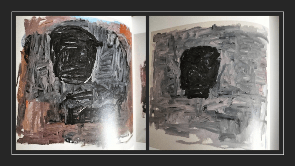
The return to figuration from abstraction anyway is about the emergence of a form, and sometimes crowded multiple form,s from underneath as Tacita Dean’s reading of the painting on the right below (Head) suggests, just as pink flesh tones are submerged under grey and blacks. She says of Guston’s Head 1 (1965) that it constantly reappears and morphs in the later paintings, even the most cartoon like, as it was there before in the hyper-realist work; ‘an immutable solidity, a physical mass that takes up space … surveying the borders of the painted world while paying meager (sic.) attention to his viewer’. [9]
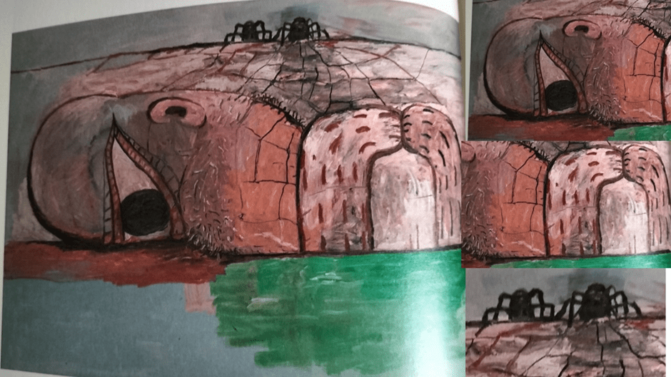
Of course, to lovers of Guston, nothing usurps the late great paintings and so I will end with some favourites I cannot wait to see. First, the greatest of the Cyclops-lying-awake pictures (Web 1975). I want to save my fire on this and on the others until I have seen the exhibition and create a sequel to this blog, so likewise the one that follows, Moon (1979). They haunt me even as reproductions and clearly I favour those pictures that unearth something deeper in me and Guston.
The scatter, pile, smoke, layers around lines and voids in Moon elide with the theme of the painter painting, and again I want to leave saying about this till later, having seen the originals, including the great and earlier The Studio (1969), about which William Kentridge is so useful with his reference to Max Beckman’s self-portrait.
And of course, let’s have a go in that second blog based on viewing originals at saying what I feel about both hoods and Cyclops as motifs for Guston in that later piece.
To tell truth I can’t wait to go now but November 21st seems a long way away. See ya, Philip Guston.
If you see me there, talk. I think dialogue over painting is so precious.
All my love
Steve
[1] William Kentridge (2020: 107) ‘The Studio, 1969’ in Harry Cooper, Mark Godfrey, Alison de Lima Greene & Kate Nesin (eds.) (2020) Philip Guston Washington, USA, Publishing Office, National Gallery of Art, Washington, p. 107.
[2] Harry Cooper (2020: 1f.) ’Guston, Then: Telling Tales’ in Harry Cooper et.al. op.cit (in various sections throughout the book)
[3] Ibid: 4
[4] Ibid: 127
[5] Robert Storr (2020: 180 ) Philip Guston: A Life Spent Painting London, Laurence King Ltd.
[6] Harry Cooper op.cit: 2
[7] Compare my reading to Cooper’s rather conservative one in ibid: 7
[8] Kate Nesin (2020: 209 ‘On Edge and At Sea’ )in ibid (207 – 217).
[9] Tacita Dean (2020: 81) ‘Guston Head’ in ibid: 81.

Nice post
LikeLike