Looking for Bliss in Masculine Objects: A blog on an Exhibition at Bishop Auckland Town Hall named Quest for the Perfect Shirt by the Newcastle artist Richard Bliss.

The catalogue and the artist, Richard Bliss. A wonderful man to chat with: but what will he do with what you say?
Me and my husband, Geoff, were lucky to have visited Bishop Auckland Town Hall today. We were not even aware of the current exhibitions and to find one so beautiful and relevant was a treat. And then there was the presence of the artist, who tells me he lives in Newcastle, and who works preparing his exhibits at a table in the corner of the Gallery on Wednesdays only. Was that lucky too – that this was a Wednesday. Richard is as nice as he looks in the collaged photographs above. He even asked when I requested permission to make these photographs (notice the Ansel Adams terminology there – YOU DON’T TAKE A PHOTOGRAPH, YOU MAKE IT) he asked if I wanted to snap as he worked or in pose.
Never being one to look a gift-horse in the mouth I asked for both as you see above. However, another element of the conversation entailed his reasons for attending the Gallery since this was not usual in my experience previously. He said that he enjoyed talking with visitors to his work and getting feedback from them but also, from the stories they told him. He instanced the works Geoff and I had taken an interest in (in the collage below) numbers – from the free catalogue pictured above – 37: How do I prove I’m gay 1, and 38: How do I prove I’m gay 2. These were he said based on a life-story shared with him by an asylum-seeker visiting the exhibition, who had been asked this very question by Immigration Control. In the catalogue and introductory plague he also says that each shirt-artwork was in response to ‘a single conversation, or group discussions, about the public and private creation of masculinity’ or more accurately in Bliss’ terms the the full range of ‘many masculinities’.

Of course, before I even thought of asking more or thinking more about those works, I registered that Richard might use anything I say to make a later new shirt-work but, on the other hand and perhaps a worse blow to my ego, he MIGHT NOT. LOL. However laying self aside, I think we need to think a bit about what Bliss’s public statements about the purpose of his QUEST FOR THE PERFECT SHIRT artworks are about in general, before looking at the specific examples that deal with queer themes. And we should start with the plague facing us as we enter, the words of which are also reproduced at the end of the free catalogue.
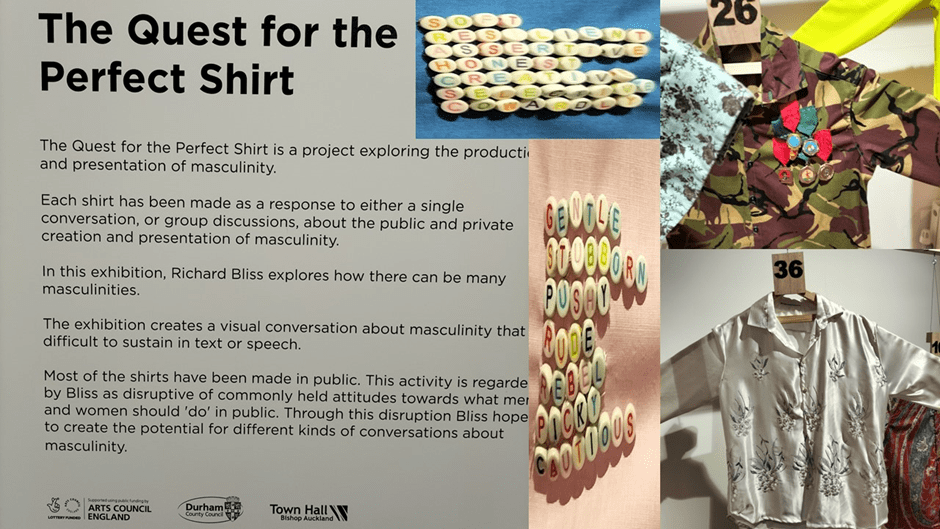
In my collage above I illustrate the words with what I see as some key exempla of the overall theme of masculinity, though again, I will look later at these as specific works. What Bliss allows here to be said of his art in this exhibition is that it represents ‘a project exploring the production and presentation of masculinity’. I think the artistic world feels comfortable now, as it once did not with the idea of artistic labour as a means of production of concepts, even performative concepts as stubbornly and wrongly locked in biological discourse as ‘masculinity’. We even accept I think that production is also a matter of presentation as well as conceptual representation, for to conceive production in the sense of theatrical production and presentation of what is produced is as deeply woven into the word as its parentage in economics.
We have Erving Goffman’s The Presentation of Everyday Life to thank for this I think as much as much as that great feminist thinker, Judith Butler. Butler is certainly present however for Bliss’ stated aim of ensuring that by breaking down barriers between public and private, male and female, and, straight and gay (and all the options within the range of those binaries his work is ‘disruptive of commonly held attitudes towards what men and women should ‘do’ in public’. In short this is about gender performance in ‘visual conversation’, which is how he invites you to see the work, and different kinds of conversation in the gallery’. And even whilst Geoff and I were present Bliss had conversation with very many people, so approachable was his manner and the feel of the gallery arrangement. Such a thing is rare in Bishop Auckland.
However, there is a remnant of Marx and perhaps even of William Morris in Richard Bliss’ use of the word ‘production’ I think, as well. For art is visibly produced as an ur-commodity in his exhibition (by him). The gallery has the look of both a clothes factory or retail shirt shop in some abstracted way as well, even if a muddled and eccentrically organised one, organised in what looks to be a clean but rather apparently haphazard manner. I say ‘apparently’ here, because Bliss told me, that he puts great store in his arrangement of pieces and that this in itself often sparks conversation between artist, work and observer (or group of observers).
I think I would have guessed the latter anyway from the brilliant effect in both Geoff and me of finding out that the numbered catalogue you are offered on entry does not work as other art catalogues in other galleries do, for the items in the exhibition are only patchily, and then only in a maximum run of three numbers, organised sequentially using that number coding. This effect is amplified because the first three items as you enter are sequential (and we can come to those too later) but thereafter you despair of which direction you should take to find numbers 4 and 5 and so on. From the beginning then the viewer’s expectation of a sequentially ordered show is disrupted. Both Geoff and I set off in different directions in search of 4, before resigning ourselves to follow the largely random appearance of the items that were either hanging from mock clothes’ rails around the edges of the gallery or from a light metal gantry in the middle of the room into which one could not enter other than visually, even though the haptic nature of the art seems, as such work cannot help but do, to invite touch and the realisation of feel against the skin.
Let’s start discussion though not at the entrance or portal to this experience (which is an experience that you know very early on in the first time you feel it that you must AND will repeat but not, probably, to repeated effect) but in media res, both conceptually and in terms of the gallery organisation and multiplicity of pathways around it. Item 23 (see collage for details)is named Women are…Men are…. The invitation to examine that binary is reproduced in the dual fabric colour of the shirt (pink to the viewer’s left, blue to the right, the colour though with lapels tongues pink all around it but with blue edges (and perhaps under the collar – but on this visit I dared not lift it so strong are our gallery conventions).
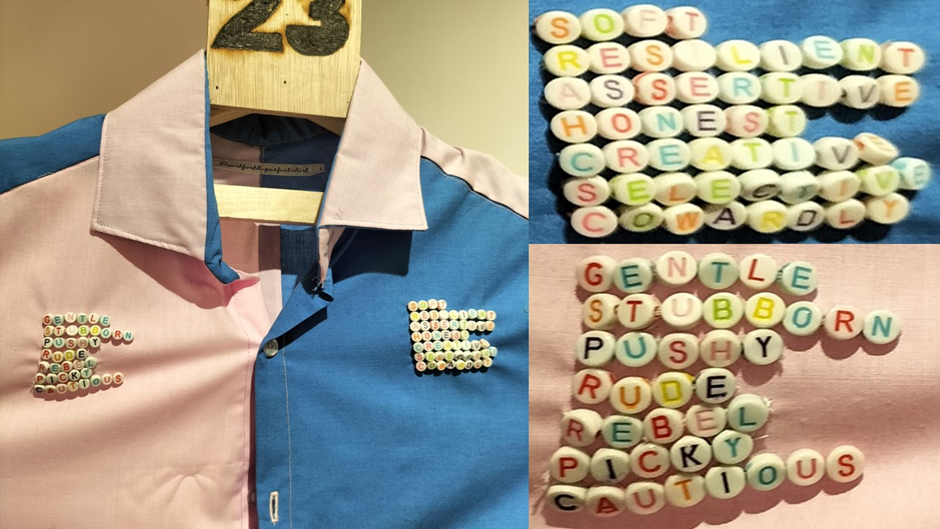
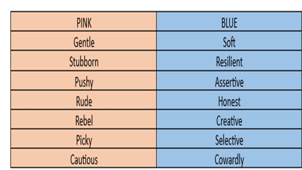
Some of the shirt artworks are easier to read than others and this is a case in point, although we should beware I think of trying to read it only through the binary oppositions it utlises from the coded world of conventions. Just because we are taught that pink is a girl’s colour and blue the same for boys, we might guess the invitation to read these words as gendered applications of words to described the same behaviour in boys and girls. Thus if a boy is assertive, is the same behaviour seen as pushy in a girl. does not mean that the duality in this shirt should be read simply in this way. consider, for instance, the list of seven words on each side of the shirt. How are we to read them. Let make it easy to compare all the words in an encoded table. Clearly a behaviour seen as positive in a boy is seen as negative in a girl in the last example. Conversely being gentle might be considered positive in a girl, though calling a boy ‘soft’ is negative. The point seems to be that simple: behaviours are gender coded by language. As a result this work is fun but not illuminating in a way that surprises, without, of course, doubting its conclusions.
It is much less easy to read other works so straightforwardly and perhaps that is the point they make. For instance, I was intrigued by two shirts, set out counter-sequentially that address the experience of being Jewish and presumably came from one or more conversations that Bliss had.
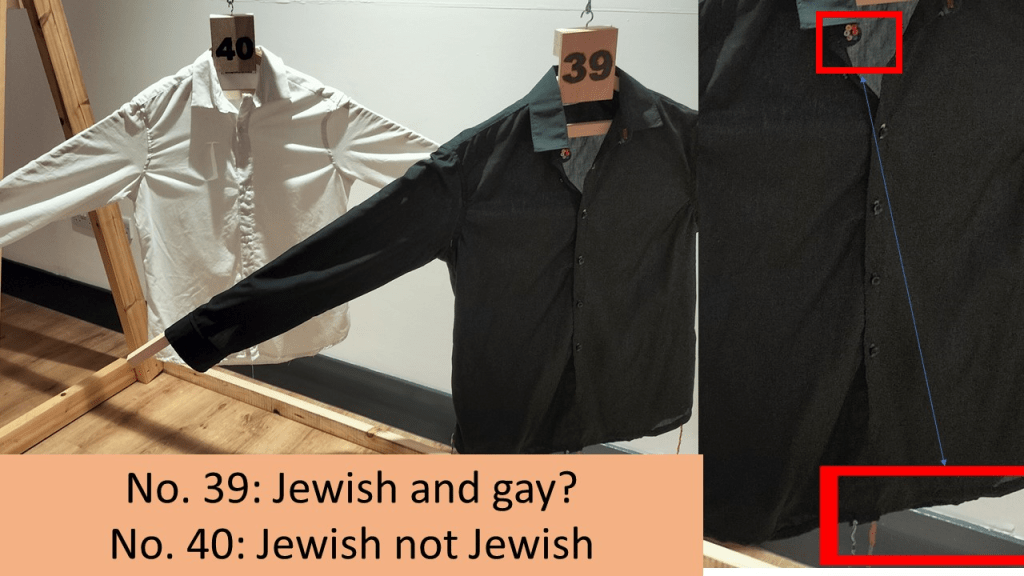
They are works I need to look at again and perhaps with close attention to detail. Both, being simply either black or white overall have reduced difference between any wearer of either. Number 39 however seems too to have evaded the difference that Jewishness makes, and, as far as I saw evaded identity markers other than those conventional for a man in formal wear – the idea often associated with a white shirt. In comparison then the black shirt might indicate the wish in the wearer to show their racial difference from a norm in a country where Jews are a minority and otherwise marginalised, such as Britain. However, the whole shirt does embrace the fact inevitably that Black can be read as a code for the politicised difference between white and non-white ‘racial’ and ethnic markers.
The specific Jewish elements in number 40 though are conveyed by signs that are difficult to read (and precisely invite the closer handling of it a visitor to an ‘art gallery’ resists because of the DO NOT TOUCH rules with which such places are associated. The signs of Jewish identity are there in the form of tassels that resemble the traditional tzitzit worn on male torso covering garments as part of Jewish law (the Torah) but these tzitzit are clearly coloured to indicate gay identity (in the use of rainbow coloured strands of which they are composed and the coded buttons I could not read – marked out by a red box and pointer arrow in the large detail above). They are both difficult to read and minimal in size and perhaps arcane in their symbolism, although I cannot vouch for that in terms of the meaning of the Jewish symbolism, and inextricably linked in ways that need awareness of both cultures. These works are neither simple nor make simple points about intersections of identity, ad that, at the moment without further loo, is as much as I have to say about them.
Our items refer specifically to the clothing associated with gay and queer men, some based on both in-jokes in the community and stereotypes – between which there is often an important link, in which signs used to denigrate queer men become all the more proudly worn. That seems to be the point about items number 12 and 13 shown in the collage that follows:

Sequins have been adopted as the sign of the work of Ashish Gupta (the link is to a BBC Culture article on the show represented in the picture below.) After talking about their association to the shimmer of water and of the scales of real and mythic sea creatures, the BBC point out that:
For Gupta, there are different, but no less enthralling, implications. Sequins might suggest the natural world, but they are also an emblem of bright lights and bustling urban spaces. “I’ve always been very attracted to nightlife and big cities,” he explains. “If you belong to minority… For example, if you’re a gay man… Big cities provide a haven and a safe place for a lot of people. You don’t have to hide anymore. You can be who you want, find your people. In a way, sequins are a funny metaphor for that. There’s no hiding when you’re wearing sequins. It’s a metaphoric and literal coming out.”[1]
Sequins also appear on item 36, named Butch Bride, a clear and present contradiction of words ascribed to gender roles. Is this sequinned beauty – recycled polyester satin, though with the look of silk, a pastiche of a female wedding-dress for a man or a piece for a woman who prefers to cross gender boundaries. When I go again I will look more closely at the organic symbols sewn into this piece, for though with floral (conventionally feminine) decoration, there is something phallic in their suggestion. A rather different kind of multivalence is in item 26 called Not with them, since though the shirt itself is casual ad loose on anybody wearing it, especially in the underarms, it is defiant in its masculine coloration (that recalls army camouflage wear like that sold once in Army and Navy Stores) that is designed to wipe out any trace of suggested femininity, a point also made by the medals. But if these are meant to be masculine insignia, why do they feel so ‘feminine’ in their colour patterning and arrangement. The play though with words like feminine and masculine is anyway self-undermining when we come to speak of this art.
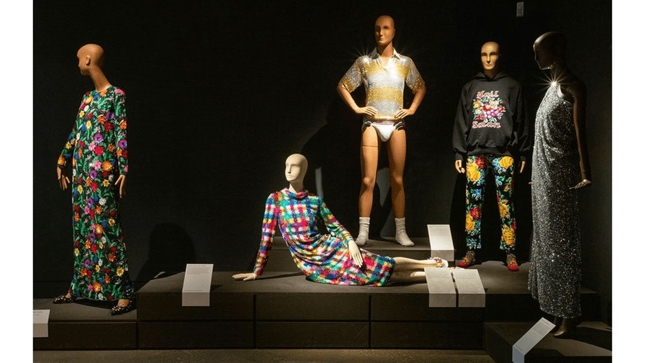
The new London exhibition of Ashish Gupta’s work showcases an array of his dazzling, besequinned outfits (Credit: Nicola Tree for William Morris Gallery)1
Sequins are a symbol attached in this way not only to glamour aimed at by drag queens but visible queer celebrity, even when it was not always acknowledged in the case of Liberace and parts of the career of Elton John, although for John glitzy sequin wear was towards the end of his career (and who knows perhaps although officially over, it may restart) and associated with the visibility of classification of queer sexuality. Thus for Bliss, the white shirt with one sequin ONLY near the wearer’s right nipple area is still called One sequin too many, because of the association of sequins to such visibility. That however that one sequin is too many both records the fear of visibility and coming out associated with some presentations of masculinity and the fact that it represents a ‘coming out’ of a sorts but one nearly invisible – for though this one silver sequin glistens, its effect is lost and still near invisible. There is a beautiful nuance though in the desire for both revelation and closure in its symbolism.
No 12 is a shirt covered with an array of the pink glitter of sequins, taking the feminine associations of pink to the feminised and flaunting it with a shine and yet, in being a shirt after affirming a version of masculinity that is insisted upon as valid. Hence the title: It takes a real man to wear sequins to the supermarket. Even here is nuance, for the meaning of being a ‘real man’ is an admission that this is an act of tough resistance and affirms the toughness of ‘real men’/ Wherever we turn then, where there is nuance, there is also contradiction and this is where gender binaries so often take us because they are a conceptual fallacy.

If we return to items 37 and 38 both know as ‘How do I prove I’m gay’ but number 1 and 2 respectively of hat name, their strategy is different. Both were created regarding the dilemma of gay migrant refugees (a plight all the worse since the decision of Suella Braverman to make halting allowing gay people at threat of death in their own countries right to asylum status) who if migrants because they are gay must prove that tey are. It is as if each shirt announces different strategies both aimed at undermining concepts of binary gender and sexuality.
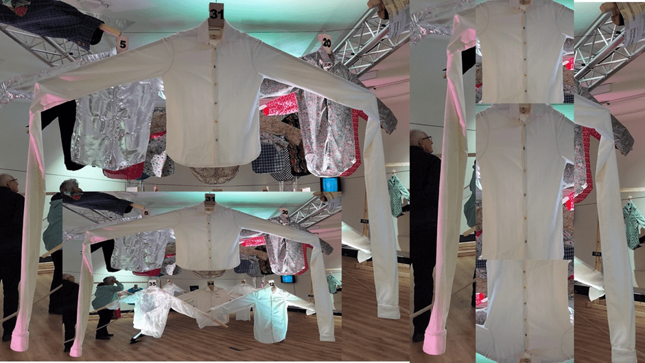
Masculinity will always bring up contradictions of vulnerability and aggression and the shift of these states from outer and inner person. Outer armour does precisely that but it emerges in every shirt where inner character and outer self-presentation plays a part. The piece (number 31) called Social Distance may reference Covid regulations but it points to a dilemma of the norms associated with conventional masculinity, in which people and their emotions are kept at a distance from the person, presumably through the agency of the long arms betokened by the trailing shirt sleeves hanging to wards the floor and say four times the length of the shirt body. But even these feel nuanced to me. The area covering the torso seems made smaller by the arms and vulnerable, the arms might wrap that torso around several times. However those ungainly arms seem sufficient to hug and draw into the body implied by the shirt more people that is ever the norm. There is something comforting extra social about the man inferred perhaps. There may be a contradiction even in the title in that this shirt is not about keeping persons at a distance from the body but about a figure that goes the extra social distance to draw more people into him in amity. At least I had those thoughts. Then I may be a wishful thinker.
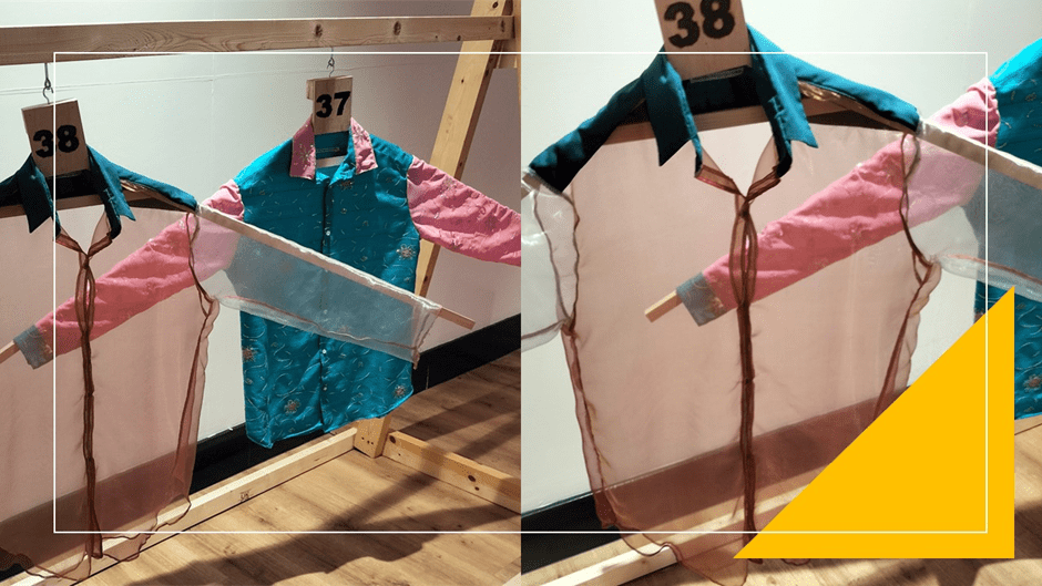
While item 37 plays with the combination of colours once thought masculine and feminine, 38 uses a transparent pink mesh for its main body that both sexualises the shirt and makes it seem a flimsy covering for vulnerability. Is 38 meant too to indicate that one must, as if it were an attempt to attract the gaze of the immigration officer if he is male, to show oneself ready to have sex with any man? Is being gay about sexual come towards other men? Or is it just a wearing of visible but opaque signalling of heteronormative identity boundaries? Is it just a form of sexual practice that is or a political statement. This is a cruel dilemma to put anyone in for queer people are neither responsible for heterosexism nor for the stereotypes of the sexualised female and feminine man characteristic in both sexism and homophobia.
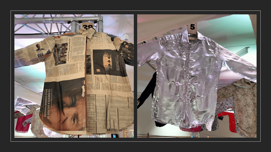
Item 29 called What really matters needs careful re-examination, made as it is to mimic a shirt from newspaper that is cut and pasted or sewn together , A more careful look would examine how the newsprint, imagery and sales material relates to the shirt function it mimics. Even the intention here though is unclear. Is this about the ‘matter’ which makes up our lives (even the substances we wear and must do so everyday and the sense that what matters in daily newspapers is transitory and forgettable, If so does it also question what is transitory in fashion and self-presentation in men. Item 5, Outer armour, plays with another idea about clothes, that it is a masking and defensive item. The metallic reflective fabric makes the person who would wear this shirt invisible to others who see only distorted images of themselves in its sheen not the man underneath. And it may be an aggressive masculine stance displayed here – the man as warrior.
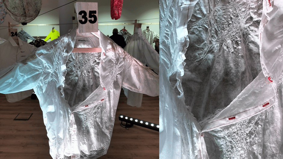
Though I liked many other individual examples I loved and feared the effect of the shirt (numbered 35 and called Dementia) which recalled to me the stories of people who care for those with dementia and those with dementia themselves. It is a beautiful piece which deliberately apes the error involved in both self-dressing and being dressed by one’s carer- spouse or child. The buttons are fastened (or so it seems) at the wrong place and hence the hang of the shirt is asymmetrical, a kind of beautiful gauzy mess. The use of resin mimes spills of food and drinks that wrinkle and stain cloth but spills so aestheticised that the colour is absent and the sense of stain absented, the crinkled material so fixed by resin that it mimes the vulnerability and pride of older skin whilst making it beautiful to the eye. . The red thread in the lapels had a quite tragic effect on me as if a stigmata of the flesh become one of the cloth. So much more can be said or felt here.
I will end this piece however, as haphazardly as it starts, with two sequences from the exhibition. I have mentioned that the first items are in sequence and we see them in the picture below, Three white very plain shirts are tacked to the wll in sequence, each identical (to my eye at least) and spread out in cruciform as if on a body either hanging in an older ritual of sacrifice OR in preparation to grasp you as a lover. The only difference is in the progression of the titles in sequence which tell a story about a separation after argument perbhaps. They are:
Item 1: I made mistakes, can we move on?
Item 2: I made mistakes let’s move on?
Item 3: I made mistakes, I have moved on?
They are extremely moving in context. See them below:
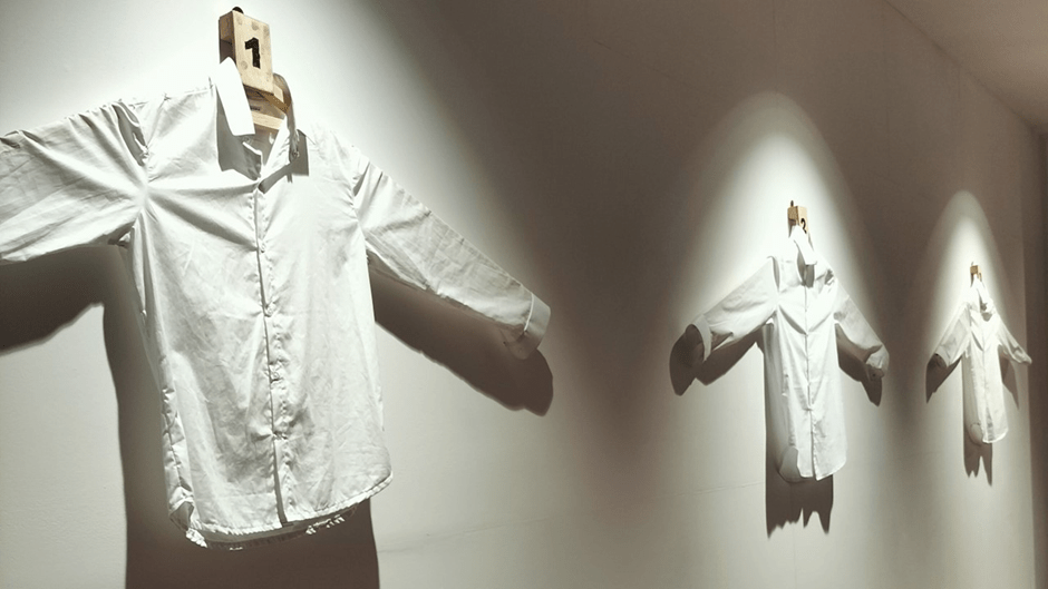
People in the break up of relationships may seem totally vulnerable or aggressively sorted out. These shirts suggest that we may never see the outer difference in presentation of three very different stances in relation to emotional stress or coping. All we have is the individual talking to himself and seeking to appear to cope. In a sense, he becomes empty and invisible in each stance since each stage lit moment of the narrative is washed of colour and personality and hard to read – even the meaning of the stretched tension at their upper arms and across the chest. I found it quite beautiful as I passed out of the exhibition and stared at the sequence again.
Another sequence is found at the other end of the room but hanging on a fake clothes rail. Again there are statements but these aren’t in sequence. They seem alternative attitudes to interaction and sharing of information, which might be political and social or personal and emotional. The titles are:
Item 7: I’ll tell you the questions to ask me.
Item 8: I’ll tell you everything you need to know.
Item 9: I’ll tell you what I want you to know.
Each of these statements appears to take a divergent view of interactive communication. Whilst 7 and 9 use different means of controlling what is exchanged with differing limitations on the process and outcome of communication. If 8 appears to be the reverse of both of these positions it need not be. First, it may be a lie or mask of intention and second it may be that it is a ruse since the person knows the right questions to discover what has before been hidden will not get asked. At least in 7, he MAY offer more useful questions to uncover the information wanted more fully. But now look at the shirts representing these statements.

They are identical in gesture – each fully open armed, apparently confirming that nothing will be hidden and a kind of openness. Item 8 appears to hold centre stage and ‘stands’ in the foreground and this may fit with the sense that this is most open offer of information. On the other hand this very placing is theatrical indicating someone in charge of all the ‘tricks’ of communication. We are asked I think in examining these artworks just to observe the problem posed by men offering information but receive no answers about how we might and whether we should trust that man who has something to communicate to us that we, for some reason, need to know.
I hope I convey the joy of this exhibition which is even a richer experience in speaking to the artist. As I look at the catalogue, I remember pieces I wish I had looked at longer and taken a record of them by photograph. But that will mean I have to go again. I will not do this to bore you with my views and therefore will not blog again on this exhibition but to show I really recommend the experience. Please experience it.
All love
Steve
[1] https://www.bbc.com/culture/article/20230825-why-sequins-are-so-exhilarating-to-wear

One thought on “Looking for Bliss in Masculine Objects: A blog on an Exhibition at Bishop Auckland Town Hall named ‘Quest for the Perfect Shirt’ by Richard Bliss.”