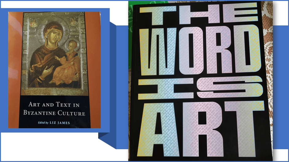
This blog reflects on the fate of ‘the Word’ (text and books) as an element of ‘Art’ in post-religious subcultures or cultures where religion is displaced from having a central authority over authenticity of the the non-material, spiritual or conceptual forms we venerate. It follows up thoughts from my earlier blog (at this link) based on reading Michael Petry (2018) The Word is Art: Text and The Written Word in Contemporary Art London, Thames & Hudson.
Of course, this blog, like the last one on ‘the Word’, is dedicated to what I learn from the friendship of Heppy: great linguist and teacher and caring bloke (a great thing to know of someone you have never met in the flesh).[1]
I have always been interested in words and how they relate to visual art but have been rather unhappy with anything that that baleful ‘discipline’, the history of art, has ever done to make that relationship understandable. For instance, let’s take the volume on Byzantine Art pictured above in the background to Michael Petry’s book The Word is Art: Text and The Written Word in Contemporary Art. It is an impressively scholarly book that aims to understand how text (words in a discursive but visual form because they are inscribed on the text or near it as a companion to the text) relates to art. The obvious question to me was how these scholars were defining ‘art’ in contradistinction to ‘text’. After all, as a relative latecomer to the study of painted or otherwise manufactured images that seemed to be the subject of art in its own right, my introduction to the arts was through literary texts. But literary texts, ‘scribed’ ‘ (we are in medieval times) or printed, were also manufactured images, visible marks on a blank page, canvas or other surface, sometimes coloured as pictures were.
And in concrete poetry words and letters in lines are used to draw pictures too on the page, sometimes, as in the example by Tom Leonard below with drawn accompaniment. Easter Wings by George Herbert, in the seventeenth century, uses the shaping of the words across two pages of his volume to visualise the Angel announcing the Resurrection. In another poem he makes the delineation of lines of the poem look like an altar in the Church. In another poem I found to balance the Christian bias in Herbert, a last quarter crescent moon highlights the temporal experience of awaiting Ramadan – the quiet expectation to the rhythmic and returning moments of loud joy, normalised at the poem’s end.

The point is that art integrates across text and image here. For numerous purposes in which all elements contribute, even when conflictual elements are present, as in the invocation of madness in relation to the role of teachers and teaching and the conventions of language. But it is time to be fair to art history, for these questions are raised in the Liz James’ introduction to her book, the problems of terminology remain. The book begins:
Art and text, the interface between images and words, is one of the oldest issues in art history. Are works of art and writings different but parallel forms of expression. Are they intertwined and interdependent? Can art ever stand alone and apart from text or is it always enmeshed in the meanings expressed in the written and oral that makes it perpetually exposed to subjective interpretation[2]
This certainly uses some of the right words to help us think issues out: contrasting, as it does, a difference between ‘art’ And ‘text’ that makes ‘text’ and ‘art’ seem in some way independent of each other as opposed to being possible ‘interdependants’. However, the appearance of a satisfactory discussion here disguises the fact that it is sustained, if it is, by a false binary that in the act of naming two things (art and text) refuses their co-variance and potential to formal similarities, at least in context. It is not just that one, art, may be ‘enmeshed’ in the meanings’ of the other, ‘text’ which, we can only presume it would not have otherwise have been in James’ view, it is also that the origin of contested meanings in texts are seen in this passage to lie in the exposure of texts ‘to subjective interpretations’, which presumably ‘art’ otherwise is not. As an argument, this is a mess and Liz James must know that, for the relation of purely visual art and meanings and indeed ‘subjective interpretation’, is surely present whether or not text is also present, as a part of the art itself. Indeed in another part of her introduction she makes the point that text acting as a ‘label’ for figures in the visual art reduces the unknown in identifying an image, because it ‘identifies it for us’.[3] Of course, immediately after saying this she shows us an example where this is not obviously the function of one label in the narthex panel of the west door of Hagia Sophia in Istanbul, although the problems are not of the order of Magritte’s The Treachery of Images because text played a different function in Byzantine culture, or so she claims. According to Henry Maguire, she says:
Ekphraseis were not simply ‘rhetorical descriptions of works of art’. Rather, rhetoric was designed to make images live in the mind’s eye and to convey perceptions of works of art and perceptions of the meanings of such works.[4]
It is as if the whole issue were being reduced so that ‘text’ is understood only, or largely, in its function as the medium of ekphrasis (James uses the term ‘ekphraseis’ for which I find no other authority), even if ekphrasis is interpreted differently in Byzantine culture. Even that latter point I query for the Maguire interpretation, as James describes it above, could clearly stand just as well for Spenser or Alexander Pope in their use of it in epic poetry. In the end I wonder if art history isn’t, by virtue of its desire to stand independent of other disciplines, making its own internal complications even more complicated, and unnecessarily so. For even where text is not functioning as a concrete poem, it is a visual phenomenon with features that can be analysed purely visually. Let’s take an example from an essay in Liz James’ book:

Psalm 90, the Theodore Psalter. London, British Library, Add. 19.352, fol. 122v. Eleventh century. My photographs )from James (ed) op.cit: 96.
In my collage above I imagine ‘the text’ to express a kind of identity crisis. It says: ‘In what sense am I text and not ‘Art?’’ And in truth it would be easy to see the manner of work of the scribe here as that of an artist, even where no images are used, as they often are in the margins of the Theodore Psalter. For text is laid out in patterns, including patterned variants of script type (or font if you prefer) and character type that is not merely a difference between upper- or lower-case Greek characters. The Greek itself, with its accented characters has a visual beauty that stands somewhat independent of meaning (my New Testament Greek is anyway not up to its interpretation as meaning). There is meaning even in the cursive flow of script. Though the shaping of the text is not mimetic (as in Easter Wings), it has beauty and direction and an aesthetic visual aspect. Now I cannot say I quite follow the argument the writer, Charles Barber, of the essay that references this folio page, makes. That is possibly because, I think, he assumes translation knowledge of the Greek greater than I have. However, it is certain that he does not address the appearance of text – the visual art of its inscription – as a feature of his argument; seeing instead this page as significant because it does not contain embodied images (as others he uses do) taking the reader away from any representation of ‘visible witness’ to the speech in the poem.[5] Well, maybe, but this would suggest that only embodied figures are art, a view not shared by Muslims contemporary to the Psalter nor Byzantine artists who often brought together the patterned non-representational art of Islam and Judaism in their own cathedrals – Hagia Sophia in Trebizond, for instance, of which more later.
And if we look at a piece of iconic art represented in James book, another issue can be raised in which there are analogies to what we have already seen. In the collage below of an icon, the pieces of text are outlined in red in the version on your left. However, the point I wished to make by doing so, is that these pieces of text are as patterned as other work on the revetements of the icon and, though the ones at the left that act as labels of the icon’s meaning are represented as scripts (in silver with ambient gold) they like the narrative text at the base are woven into the patterns of the rest, and with the narrative scenes of Christ’s Passion in the outer revetements.
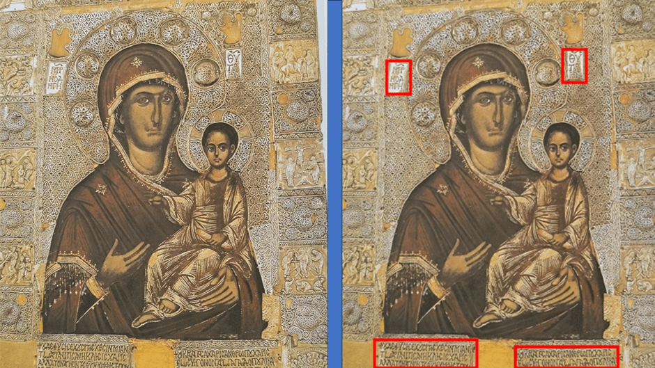
My photograph (one with appearances of text outlined in red – on left) of a Gilded-silver revetted icon of the Virgin. Monastery of Vatopedia.[6] Mount Athos. Early fourteenth century. (Metropolitan Museum of Art with permission of the Holy & Great Monastery Vatopedia)
The script has the same flow as the non-iconic design elements, including those in the haloes of the Virgin and Mother. There is, of course, a need to cope with the meaning of the Greek text beaten into these precious metals, but it not meaning distant from the appearance of the text – its sense of circulating flow, sequence and pattern. In my view it is the text, figures and designs, as well as the composition of the whole that is the Art here and, hence, the question of the relation of text and image becomes otiose. Does it help to invoke ekphrasis here? I don’t think it does.
I want to end my consideration of words in Byzantine art with an example from the Cathedral of Hagia Sophia (or Holy Truth) in Trebizond, for it fascinates me. The collage below represents the work known to us in the literature as The Proclamation of the Word of God in The Apocalypse Vault in the central bay of the narthex of the church.
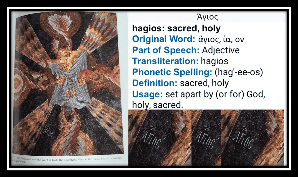
There is only one WORD in this artwork, which might constitute its text, the ward ΆΓΙΌϚ (hagios).[7] But that word is central to the meaning of the images both abstract and representational. The ‘Word’ (representing Christ and the Holy Spirit) is the tetramorph at the centre of the piece representing the unity deriving from the 4 books of the Gospels (each represented by a bejewelled book cover) held by a symbol of the each of the 4 evangelist-writer of each Gospel represented as traditional animals icons, for instance, and as differently patterned Pentecostal flames. The flames disperse outwards between the patterned and very beautiful distribution fans coming from the Word and nearly-parallel to those flames. Anthony Eastmond says the imagery (drawn from Ezekiel and Revelations) fits with both the function of the narthex as a place of preliminary instruction for pilgrims and predicts the Last Judgement.[8] None of this however explains all of the intensity of this piece of art nor the way in which it uses the word ‘Holy’ as its only textual component and then not in a central position and certainly not as an ekphrasis. It operates as a kind of threat of the awe of the vision with its apocalyptic meanings (the spoken word perhaps of a viewer awed by what they see) – awarding a sense of the terror of Christ’s Second Coming in Judgement as well as the glory (for the winning side) emblazoned on the banner like emblems here. What I want to stress though is how the irregular placement of the word is justified by the combination of other art to explicate and deepen its meaning, which is coming from visual symbols and effects that are not just symbolic or allegoric and reflect back on the meaning of the word subjectively and not vice-versa. For the word makes one feel the FLESH of which it, as well as you as observer, are made.
But’s let pause with a look at the Trebizond image in somewhat larger form before we leave it, for it is beautiful.

So I think I have made my point that we should not over emphasise the difference in the use of Words in earlier art history from that of the present-day, as James does, insisting that we today, using Foucault’s commentary on Magritte (hardly exemplary in either case of modernity per se) as evidence, that we ‘belong in a world where text rules: if it is written, it must be true’.[9] How one comes up with such a conclusion is beyond me and I think even Petry’s simple prose is a better alternative than this to our own world than Liz James’ sojourn in the past as enshrined in the academy. Petry too, a practicing artist rather than an academic instead sees the WORD and the BOOK (the latter is the icon of the word in the Trebizond example above) functioning in contemporary art as analogous to its use in the age of the hegemonic Western monotheistic religions – ‘Judaism, Christianity or Islam’ – whereas his book, he says is expounding ‘a different kind of belief system – a belief in the power of art’.[10]
Petry’s book never quite elaborates the analogy between art and religion and I do not think it is a convincing argument, if it is even intended as such, as it might be in terms say of the aesthetic movement of the late nineteenth-century but only for its own adherents, such as Walter Pater, Charles Ricketts and Oscar Wilde. And the book does not work that way though it does argue its case about text in art simply and with competence, whilst going beyond evoking ekphrasis as the rationale of the associations between text and other visual imagery. It uses in this respect, in particular, Cubism, wherein (in cases like those of Juan Gris and Pablo Picasso), it is ‘more than a sign, a symbol or a signifier’, adding that ’it had an importance equal to that of the painted or drawn object’. This is both more measured and more accurate than the generalisation Liz James draws about text in modernity based on one case example alone from one highly original post-structuralist commentator on one surrealist painting, René Magritte’s The Treachery of Images (1929).
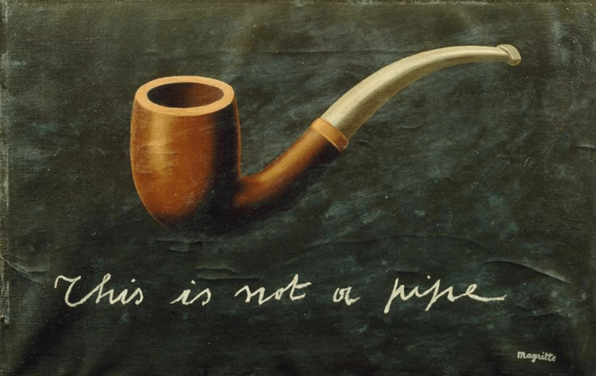
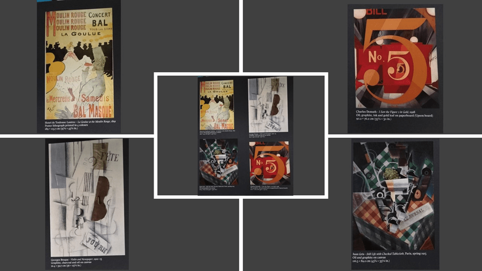
Petry’s is a case generalisable enough to apply to very different uses of text in Futurism, Surrealism, where he modestly and correctly says of Liz James’ chosen example, that ‘Ceci n’est pas une pipe’ (above is a version using English text) is not an arrogant affirmation of text over image but a statement that photorealistic mimicry was as abstract an idea as anything else in the art’, even the use of words and sentences of text. For visible text is a visible object in everyday life as a result of the relative plentifulness and the materials for printing reproduction and contemporary, perhaps, from Cubism on, merely represents that fact of a highly literate society in which commodification, even of what we call ‘news’, occurs as much through labelling, logos and ekphrasis printed on products as on mass production of things. See, for instance, below Petry’s page showing text in examples of different forms of this in different kinds of early twentieth-century contemporary art, which instances the ubiquity of text as inscription, advertising poster, leaflet, newsprint and journals, alphanumeric signifiers of identity, labels, direction signs and location indicators, even the publication of personal names of ‘stars’ and venues.[11]
And Petry basically continues to categorise the integral use of text as art rather than to make a statement about that meant to be definitive and authoritative. Hence it is a text open to developments in practice, which continue to occur, and to dialogue and cross-boundary learning between them. And I like that very much. Thus his chapter use headings that either look at a workable category for discussing interesting instances of words in and as art, which might refer to an artistic genre (such as ‘Installation’, The Conceptual Word, ‘The Drawn Word’, or ‘Social Comment’) but which are not limiting and in each case hypothetical rather than given boundaries. They have room for very individual usages in text and visual art such as William Burroughs’ ‘cut-up’ method, Derek Jarman’s sexual-political activism and banner art, as well as the work of Cy Twombly with unintelligible and unreadable cursive text (alongside readable drawn words).
Other chapters reference the use of the medium or technology of making or plastic characteristics (Three-Dimensional Words, Light, New Media – including projected light, Books). There might have been more on body art and earthwork art (each either deep-cut or drawn), though there are examples of each. It is all very fruitful for the non-institutionalised student and maker of art, though perhaps anathema to the academy – I remember one Open University Tutor announcing on my MA course and, in an online tutorial, ex cathedra, ‘Do not write about text as conceptual art – your dissertation will not pass’. Though we need of course to see possible downsides in these trends – many of which are rather dated I have found that neon light word art can look not only dowdy when used on municipal buildings, as in my own home city Durham in the photograph below. Perhaps, during daylight hours, whatever the hopefulness and challenge of the words, it also takes on the dimension of an ubi sunt (Where are the flowers of spring … etc) poem.
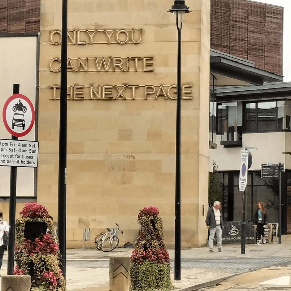
My photograph of Durham – the Municipal Library and Gala Theatre – taken on 19th September 2023.
However let’s turn from the dogma of the academy (thankfully) to produced art still open to dialogue. In doing so, I thought it best to conclude here by looking at two examples of text as art. These examples are not chosen because they are particularly favourites of mine but because they illustrate some key points probably already raised above. For instance, above I tried to show that all text must be shaped and that shaping is both determinant of aesthetic (or simply visual) appeal. But having chosen a Greek example above, I did not look properly (because I felt incompetent to do so) how the determinations of shape in text interact with meaning in the creation of balances of concordance and discordance. This is often central in concrete poetry and often in inscriptions. Below, for instance, is my collage of Christopher Wood’s large enamel print-drawn on aluminium work, Untitled (2000, 108 x 72”).[12]
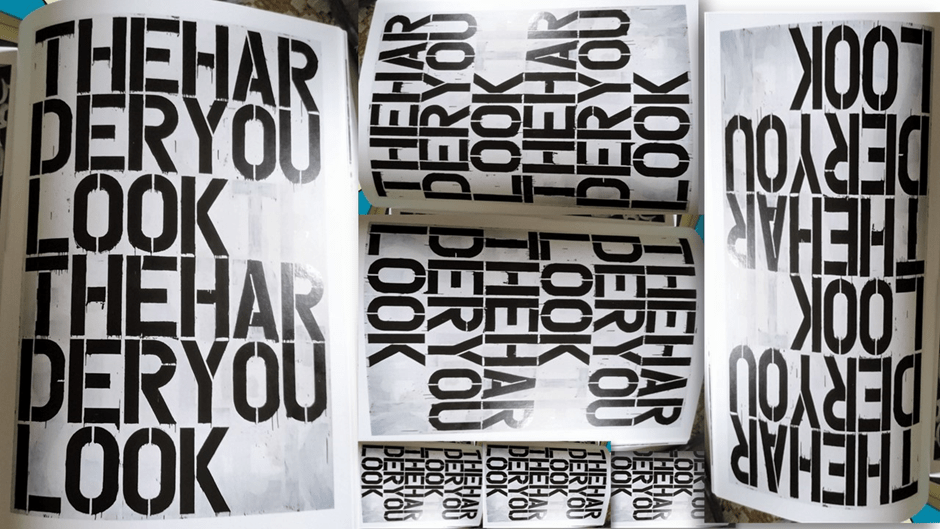
I collaged a photograph of the original (left) with repetition and inversion and other turns of the image to help us to look at text as visually shaped material, although no reproduction could allow for the haptic effects here – of the feel of being invited to touch the material as we look at it, invited by the dried evidence of the once-running paint from the characters in the image. Just as in the Theodore Psalter text, in being shaped has a purely visual relationship to the determination of the meaning of this artwork. The text shape here emphasizes the rhythmic pattern to the eye of free space that comes after the third line, containing the word ‘LOOK’. But, if you look, and look ‘hard’ rather than casually, even on the reproduction in the book, you can see that these ‘blank’ spaces actually contain letters in black that have been painted over and that these letters are the ghosts of the same text as the that in dark black enamel paint. The full text of the painted over repeated words starts in the space after the first instance of LOOK and ends in the last instance of that word (this is much harder to see in my photograph). The lack of spaces between words (and word breaks like HAR/DER) already means that one must look carefully to attain even basic meaning.
Even my ekphrasis here however points to a dissonance or concordance between image and text(s). For to see this work I insist we must ‘look hard’ (where ‘look’ signifies the observer’s ‘gaze’ and ‘hard’ signifies looking intently and purposely and not merely casually), but that is an action the text itself begins to describe and work into a kind of statement, for if the first three lines are not JUST repeated in the same visible form, they intend towards significance: saying something like: ‘The more you look or gaze hard at me the more you will look or gaze hard’. Now there is a repetitive statement of the obvious here (looking hard = looking hard) but it is one intrinsic to the relationship of any art work and its observer.
However, the word ‘hard’ also signifies a state of being opposed to that which is ‘soft’ and it makes conscious the fact that this art is the product of hard or hardened materials. Enamel paint was once fluid and soft, hence why it runs) and this too is part of the visible art. But as a term for the look of person, where look now signifies a person’s appearance to another’s gaze not their gaze, it signifies a person thought to be (to use other metaphors) cold and unresponsive. In this sense another meaning arises, if you gaze coldly/hardly you will appear cold/hard, or even the reverse of that sentence. This is how much more complex concrete poetry can work too, exploiting the visual and creating tension between it and the spoken and printed signification of text. It is a kind of meta-art this; wherein the co-productive role of the viewer becomes as prominent in the ‘making’ of the art as the ‘artist’.
My final example is a very rich one and it uses its setting as part of its meaning so much that any transposition of the supposed artwork will entirely change that meaning and significance; imagine it, for instance, on a window sill overlooking a motorway or a busy high street or a crowded pedestrian walkway. In each case change of venue and even the circumstances of the circumambient timing and accidental or scheduled events will change the salience of the art-and-text object’s internal interactions of meaning. This piece entitled COLLIDE (2014) by Fiona Shaw, made of timber frame, with OSB, enamel and steel (85” x 51” x 31.5” approx.) currently in the office of Clifford Chance at Canary Wharf and overlooking shipping lanes in the Thames and the air lanes of London’s airports in the sky.

Petry says of this work, that a ‘crushed piece of steel at its base made viewers imagine boats or planes crashing onto the building or one another’.[13] All of that signification, of course, feeds off how the elements of the work, including its text work, in relation to the visible setting. Located inside a museum it might cause an observer to imagine tourists bumping into each other in a busy space, or perhaps, if in a reflective mood, imagine the collision between normative expectations of museum art and what they were getting here. It is not that, I am saying here, that such art can mean ‘anything’ you want it to, but that its range of meanings are contextual across possibilities suggested by all kinds of contexts.
And we saw that to be true of art in thirteenth-century Trebizond too. I find that fruitful to say the least, for it means that the materials of art are clearly seen to be what they are, and not only to include materials that can be sculpted or use to paint or draw on or with but also cognitions and feelings, associations of context and text, the stuff inside as well as outside persons. And thus not because we play conceptual games with art (which is what that Open University tutor feared) but that the word and image are together made to mean in becoming flesh, part of the stimuli to visceral response in a viewer. It is not that I would say we cannot benefit from seeing art in historical context of a given period, but that we should be very careful about how we interpret how people in any period thought and felt, especially if we want to insist they saw and felt differently from us. Such tricks the academy have long used to make even the great poetry of Shakespeare, or some of the most wondrous pieces of Byzantine art, seem irrelevant.
Take a look at Petry. You won’t find great insight but you will find stimulus for making your own connections – partly because he writes in a way that offers his topic up to his reader rather than limiting it, as you find throughout Liz James’ book.
All love
Steve
[1] https://livesteven.com/2023/09/14/my-favourite-word-is-not-word-because-the-word-on-its-own-is-not-everything-but-it-keeps-pretending-it-is/
[2] Liz James (2007:1) ‘Art and Text in Byzantium’ in Liz James (ed.) Art and Text in Byzantine Culture Cambridge, Cambridge University Press, 1 – 12.
[3] Ibid: 7
[4] Ibid: 4
[5] Charles Barber (2007: 97) ‘In The Presence of the Text: A Note on Writing, Speaking and Performing in the Theodore Psalter’ in James (Ed.) op.cit.
[6] A precious metal revetments on a Medieval painted Icons was common practice in Byzantine iconology, and indicated the piety of the image’s sponsor and gratitude for divine protection. The icon with such features is described as ‘revetted’. See: https://www.academia.edu/21680762/Precious_Metal_Revetments_on_Georgian_Medieval_Painted_Icons_Some_Observations_on_a_Devotional_Practice
[7] The characters on the vault ceiling are Coptic not Classical Greek as in the collage.
[8] Anthony Eastmond (2004: 121f.) Art and Identity in Thirteenth-Century Byzantium: Hagia Sophia and the Empire of Trebizond Aldershot, Ashgate Publishing ltd.
[9] Liz James, op.cit: 6f.
[10] Michael Petry (2018:8) The Word is Art: Text and The Written Word in Contemporary Art London, Thames & Hudson.
[11] Ibid: 9f.
[12] Ibid: 240f.
[13] Ibid:81
