In 2018 in an introduction to the ‘fraught European history of polychromy’, Luke Syson identifies within that history a ‘long condemnation of not just the application of colored (sic.) paints to the surface of carved or modeled (sic.) statuary – to use the strict definition of “polychrome” – but also those sculptures that use colored media to imitate flesh and skin’.[1] This blog reflects on the examples of polychrome sculptures currently in the Spanish Gallery in Bishop Auckland: from Reflections and Discussions in my free time on some of the Works of Art, as part of a personal learning project related to the Golden Age of Spanish Painting (No.6).
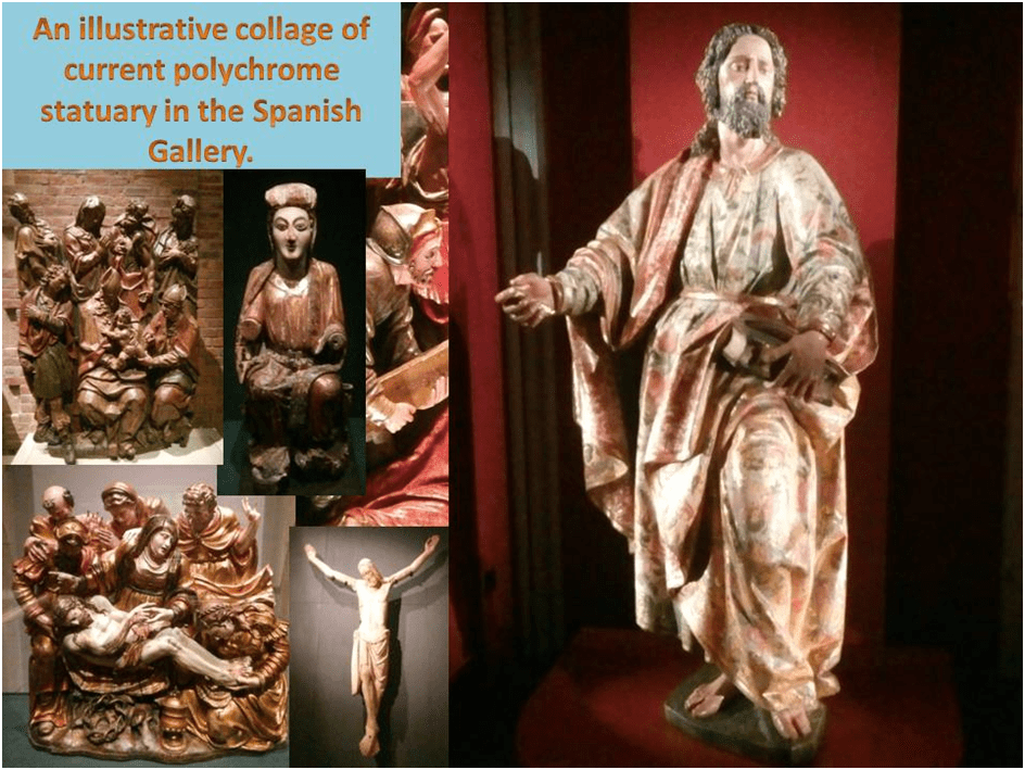
This blog examines examples of polychrome sculpture inside the Spanish Gallery that span a huge history and range of variation. It is not therefore implied that when talking about polychrome sculpture we are identifying one genre of art or even one medium of expression. The tradition of painting sculpture in sumptuous multiple colours is itself a changing one and we will not see the same features in even late medieval polychrome sculpture as in those of the Golden Age and later. It is best therefore to be armed against generalisations about the methods and practices involved in polychrome sculpture making, even its collaborative nature, for even the range of collaborative practice (of which we will become aware as we proceed) varies not only historically but within the career of any one artist. This will be stressed for instance in speaking especially of Alonso Berruguete, whose practices in this respect were open to many contingencies based on the wishes of types of patron or commission as well as the cultural opportunities local even to the geographical domains in which he worked as well as training. Yet it is difficult to see this when, as in his case, we can know his work only through two very different pieces (one in facsimile).
Generalisations about style too are difficult to make given both the duration of time covered and the different pace of both historical period and geographical (and cultural-historical) boundaries that influence stylistic change markers in history across these very different cultures by scholars. Thus, for instance C.D. Dickerson III and Mark McDonald find it necessary to define very basic words in their wonderful book’s title (it is on Berruguete) cautiously before outset without even acknowledging the term Italy is, during this period as problematic as the term Spain. Moreover the term Hispano-Flemish (as found in the following quotation) is not thinkable in terms of style alone, being dependent on cultural links necessitated by Habsburg dynasty rule of both areas.
The term Spain is used to describe the kingdoms of León and Castile in the center (sic.), extending north and incorporating present-day Andalusia in the south; Aragon to the east; and parts of Navarre in the northeast. Renaissance is used to describe a period of time rather than an artistic style, and the dates are different for Spain and Italy. Renaissance Spain usually refers generally to the sixteenth century, while Renaissance Italy also includes the fifteenth. … The terms Gothic and Hispano-Flemish describe the dominant styles operative in Spain before the Renaissance.[2]
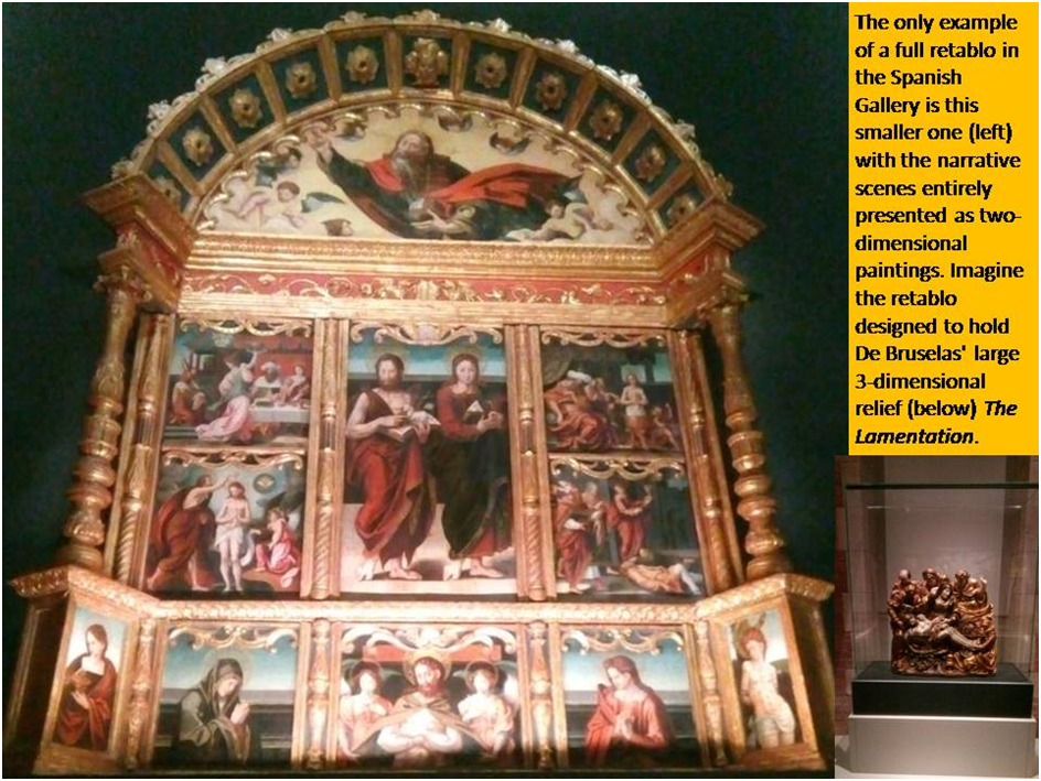
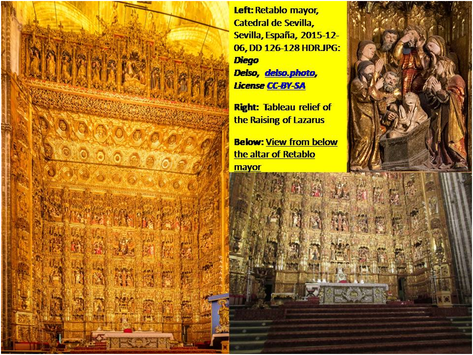
Another problem is considering what unit is covered by the term ‘work of art’. As we shall see much of the art we see in the Spanish Gallery can be considered as a fragment of what could be considered as mere parts of original whole works now fragmented and dispersed. For many of them derive from hugely ambitious functional works from the interior architecture of symbolic church decoration that were part of its liturgy and ritual. For instance, retablo mayor or high altarpieces are of major importance in Castile and the Spanish dependencies in South America. Even in Spain these have fallen prey to contingent destruction (especially in the Spanish Civil War) and change of fashion in religious architecture and decor. These ‘multi-storied’ works contain tableaux narratives within an overarching architectural and organisational framework, yet in the Spanish Gallery we shall see only single tableaux except for one retablo (a small one) containing painted scenes only rather than relief sculptural features or housing free-standing sculptures, both possible alternatives.
Is then Berruguete’s Circumcision of Christ (which we find in the Spanish Gallery) a whole work of art or only part of a whole work? We might also expect to wonder what effect on our understanding and appreciation has the answer to that reasonable question.
Indeed, the very first pieces of polychrome sculpture we should consider are from thirteenth century Catalonia and have little resemblance to later types in the Gallery. The works represented are most often not mainly decorative or instructional like the art that might have surrounded them (in Catalonia at least), they acting as a centrepiece. These centrepieces are devotional images used to represent the deity, or more strictly ideation about the deity rather figures in a story. They are therefore very self-consciously stylised according to prescribed ideas, although that, of course allowed for variation, never attempting a representation of a realistic scene or drama of interaction between the figures – quite differently from the multistoried nature of the altar background. There is also a small sculpture known as Sedes Sapientiae (the Seat of Wisdom) which represents Mary – the ‘seat’ of her knees which once bore a full-grown adult effigy of Christ.[3]
Such art is often described, by Palol and Hirmer in 1967 for instance (describing the figure on the left in the collage below), as hieratic to describe both its sacerdotal and artistically highly stylised character. The latter authors’ example of a Sedes Sapientiae is in fact considerably less stylised than that one in the Spanish Gallery on the right (indeed their example has some of the more realistic features of later Gothic art).
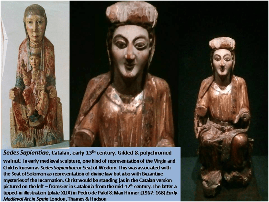
Derived from Europe-wide Romanesque artistic traditions, these were inherited from the Byzantine Empire and, in Spain, perhaps had a more Oriental look – particularly the huge discerningly spiritual eyes – than in the rest of Europe, because of the influence of the proximity of Arabian-derived influence and craft masters.[4] This may explain the relative difference, perhaps a degree of stylistic independence, of Spanish variants of the Romanesque which are rarely as classical as in central Europe, according to Guidol, and are (as he describes them) ‘infused with a rather strange expressionism, apparently derived from popular art, in which human and religious sentiment prevails over purely aesthetic emotions and considerations of form’.[5] The example we have seen, for instance is motherly as well as queenly, and comment on the caption imagines her predictive vision of the fate of her divine child.
The Corpus, or Body of Christ, that is found near to this much smaller piece is more evidently emotional, although the body is now separated from the Cross on which it hung and certain of its parts (such as the Crown of thorns) are missing. Both works now are represented by fragments of themselves as well as being, in all likelihood taken from something that can be considered a larger work of which they are themselves only a part, but this one is immensely powerful. The Spanish Gallery has a continual cycling slide show showing reconstructions of the figure as it may have appeared as originally carved in wood and painted, and then as repainted with additional gilding, including the flows of blood from the stigmata. It was the tradition of painting wood such as here that is the origin of more elaborate later Spanish polychrome sculpture. The richness of the colouring (and gilding) can still be seen on the Sedes Sapientiae but is confirmed by pigment analysis in the Corpus also.
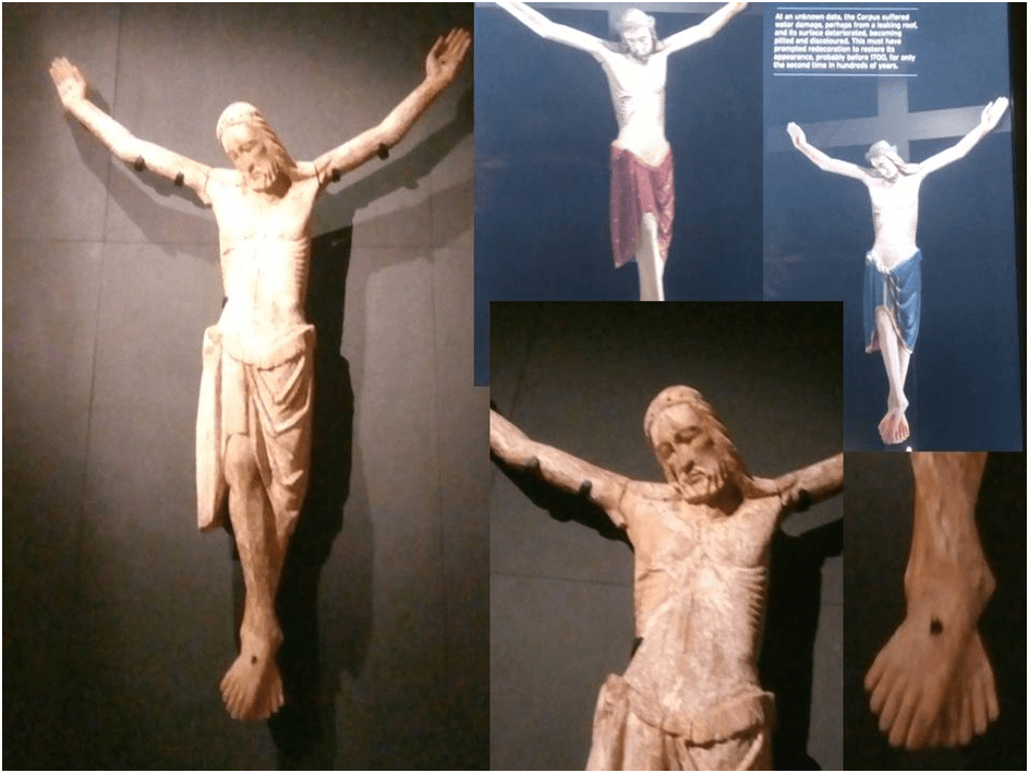
The body is in tune with ideas that are at once, in both pieces of art, ‘solemn, majestic, and hieratic’ where any story they might tell is ‘subordinated’ to ideas expressed simply. The splayed feet of the Corpus do not resemble real feet and the expression on Christ’s face look down in priestly alliance with the church congregation rather than recreate the scene at Golgotha. Mary is the Church – monumental not, in the end, a real woman and mother. Colour would have been used in conformity with these ideas – of the sacral, regal, and other priestly associations. We are a long way from the bruised and veined bodies recreated in later art, although El Greco returned to some of the stylisations we shall see here, although far from in simple reproduction.[6]
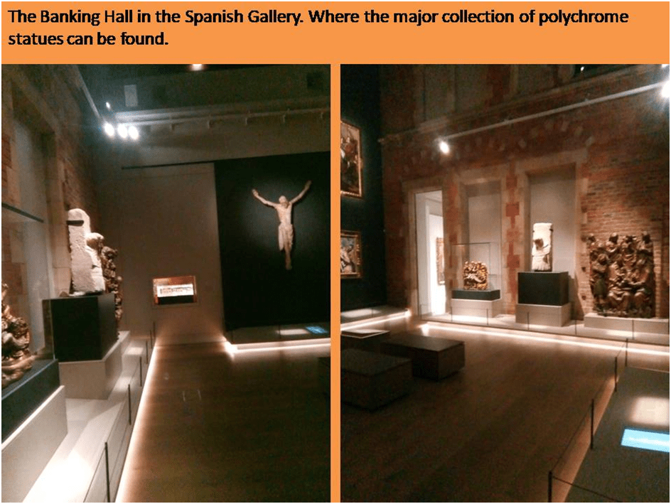
These pieces are in the Main Banking Hall of the Spanish Gallery but other work therein is separated in form, function and character and is later. All three pieces standing adjacent to the West Wall can be described as from Renaissance Spain (the sixteenth century only). Only one work is from the seventeenth-century Baroque polychrome tradition and is not fully seen by visitors, but once seen never forgotten, until they exit the Hall Bernabé de Gaviria’s Saint Bartholomew, a sculptor known, it would appear, only in Granada. But for now to stay with the three sixteenth-century West Wall pieces. One of these is by Arnao de Bruselas and has a companion piece in the third floor gallery amongst the Castilian art, considered by Jonathan Ruffer, I believe, to be a lesser but more typical and beautiful piece. These are all relief tableaux from a retablo. The other two pieces downstairs are respectively by, first, Pietro Torrigiani, and the far more innovative sculptor and painter, Alonso Berruguete, the Spanish Master. Torrigiani was in fact an Italian commissioned to work in Spain but as well known in England where he was commissioned by Henry VIII. He was a student of the work of Michelangelo (and indeed punched the master on the nose to Vasari’s dismay). Berruguete is responsible for the finest (in my opinion) works in the Hall, The Circumcision of Christ – finer, in my poor eyes than the huge work, considered his masterpiece (in full-size facsimile only) on the fourth floor, The Tomb of Cardinal Tavera.
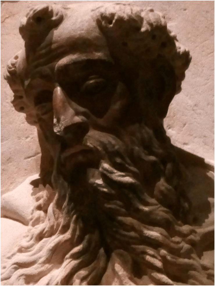
I will start with Torrigiani’s stone Saint Augustine, where anyway the attribution is questioned and based only on the seller’s assertion. I do not find myself much moved by this piece, nor, in its present state, is it the very convincing of anything other than technical skill in the folds of the clothing pulled in very realistically (but without Baroque excess or Mannerist illusion) by a belt with an amazing buckle, and the fall of facial hair. The latter feels to me too symmetrical to be other than idealized and, because so symmetrical, lacks a sense of motion to my eyes but we know it to have been painted in colour (some colouration persists in the face) but it is less attractive to my eye than other pieces around it. It seems beautiful but conventional (even in its gesture and attitude to onlookers) and easily passed by – although I admit I may need to look at it longer.
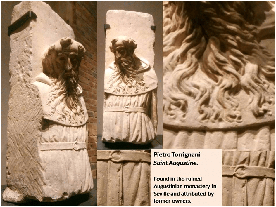
Indeed I began to try to do so as I was writing and where it seemed to begin to engage me again, as I began to study it today, is in the parts of the work in which an unworn surface remains of its face, In these places some sign of the original polychrome is visible. For when we look closely, the eyes appear to be more actively ‘seeing’, in human and empathetic terms, as they gaze down at the returning eyes of spectators (whom I presume were below the elevation of the stone relief-carving). The facial colouring would have emphasised those eyes and the orifice of the eyes may even had the capability of storing a glass prosthesis (so to speak). Look for instance at the heaviness of the eyelids and how they bear down the gaze of the saint but in a fully incarnate (indeed fleshed-out) empathy with heavy flesh bunching above them. But these thoughts are entirely speculative of course. Look for yourself at this telegraphically close-up photograph and decide:
Where I begin to regain confidence is in the belief that the works by Arnao de Bruselas in the Gallery require and command every viewer’s full attention. Here the attitude is less classical than Gothic, or perhaps more accurately Hispano-Flemish (Arnao was born in Habsburg Brussels though a Spaniard). His retablo pieces, perfectly bounded in a single frame are, of course, also part of an ordered narrative on their respective retablos. They contain drama but it is not the concentrated and focused drama of the apparent ‘tableaux vivants’ of Caravaggio, which, as described by Xavier Bray, used ‘strong contrasts of light and shade … giving the faithful a sense of direct access to the scene depicted’. For these tableaux have the busy look of a much less focused popular drama, like that of a medieval mystery play, where the spectators’ gaze is, far from being concentrated, pulled in every varying directions as the eye saccades across its colourful surfaces and the relief of its three-dimensional space. Let’s start with the one considered more ‘typical’ by Ruffer, the scene of Christ stumbling on The Road to Calvary as he bears the burden of the Cross.
It is a matter of judgement whether a totally focused scene with a controlled perspective and lighting is more ‘dramatic’ than the poly-foci of a polychrome relief but in many ways I have to admit that I prefer the latter because it gives room for continual surprise. For instance, as new elements of the character of participants is noticed by a viewer and the sense of variegated, complex and not quite controlled meaning is given to the ‘life’ of the work that will not be found in the tradition coming more directly from Caravaggio’s aesthetic realism.
Whilst Xavier Bray must be right to insist that polychrome three-dimensional and relief sculpture was as important for promoting the life-like dimensionality of painting by Zurbarán and Ribera as Caravaggio’s well-known and well-publicised practice in Spain, he must underestimate the effect relatively on a painter of busy multi-focal scenes like El Greco (if there is anyone quite like El Greco). This is what leads me to my preference again (which I think differs from that of Jonathan Ruffer) for The Road to Calvary over the admittedly more aesthetically beautiful The Lamentation. Despite the fact that these tableaux were often inaccessible to close vision on their retablos, they clearly demand it. My first collage of The Road to Calvary relief, then, is primarily to show that the perspective and angle of vision matters enormously to how and what is seen in this work (if single work it can be called). For instance the perspective in the photograph on the left above emphasises the shape and motion of his feet as Christ collapses under the weight of the Cross but begins o be raised given the assistance, enforced assistance but here full of something like empathy and compassion (as we see in the detail in the second collage) of Simon the Cyrene. Indeed, the overall drama of this piece is dramatically conveyed by constant comparisons in the work itself of limbs and objects that either defy gravity and are raised laterally up or which fall (or are pushed) laterally downwards.
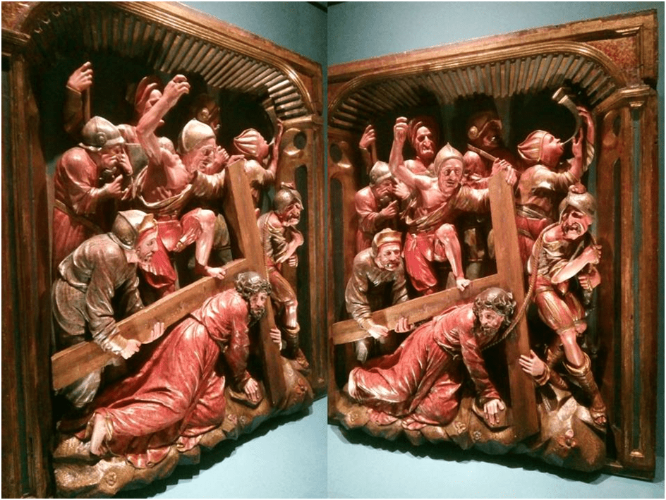
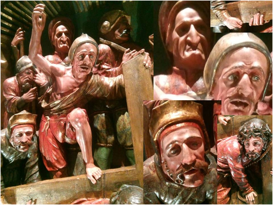
But as we look more closely details catch the eye as those eyes saccade over its surfaces and cavities. This process creates multiple levels and foci of interest just as might happen in watching a medieval mystery play where ‘bit parts’ (and representations of common people) often steal a scene. For as moving as the main drama is between the cruelty of the Roman soldiers and the induced compassion for the suffering of Christ in Simon, we cannot but notice that the cruellest of the soldiers – who presses his foot on the cross to make it harder to lift – is drawn with character in a way that allows us to see him more in the round. For instance his nose is clearly carved to show it has been broken during his soldiery. If we get nearer still we see even the broken teeth in his mouth. But this character is, when we look closer redeemed from being the ultimate in cruel treatment by the stern face of the official behind him, which brings us back to the fact that weak individual humans, especially of a lowly class and status, may not have primary responsibility for evil. And there is much to be said too in this piece about varied types of masculine appearance and attitude – two of the Roman soldiers have heavily emphasised codpieces, whilst Simon is learning to love a suffering peer male in Christ for which these hard and over-sexually centred men do not show the capability.
Much as I love this piece, I also love The Lamentation in the Great Hall, though only by recognising difference between the pieces which seems to me almost to come from different functions as artistic and religious objects. Relatively The Lamentation is a tableau with a more insistent single focus on the sorrow of the Virgin Mother than of a full cast of widely differentiated types. It gleams not with colour, as The Road to Calvary, but with heavy gilding and what drama there is in it (and there is a lot but of a much more subdued kind than in our last example) it is in the hands of the actors, which capture our attention in their concentration in crowded gaps and spaces between bodies. It is lovely but in a different way.
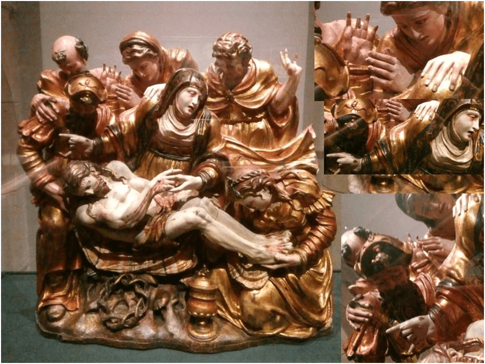
The gold jewels and symbolic artefacts scattered around here tempt me to see its difference from The Road of Calvary as constituting a different kind of image. Alfonso Rodríguez G. De Ceballos in 2009, for instance, distinguished between religious images as either public or private one; as based in narrative and the induction of empathy (such that the audience is viscerally ‘moved’, on the one hand) or based in acts of private devotion on the other (a distinction that would, he says become more crucial in the Counter-Reformation). The names he gives them he takes from Panofsky as ‘the scenic historical image’ and the ‘cultic representational image’.[7] Of course both images by de Bruselas are of the former type in the widest sense but the Lamentation is nearer to the induction of private devotional contemplation than The Road to Calvary, at least in my opinion. The image of Christ and Mother recalling the function of icons such as the Romanesque examples we looked at above. This extended Pieta also celebrates religious mysteries such as of Mary as the container of the uncontainable.
This is an appropriate point to move onto a tableau by Berruguete which is, I believe, a perfect blend of a narrative scene and devotional thought and feeling, in part through a complex iconography associated with the story of Christ’s circumcision. Such integrations seem part and parcel of Renaissance thought and in Berruguete that comes through a very careful use of innovative design (disegno) effects which balance symmetries of form of a whole tableau with inner formal tensions, thus making drama and narrative (and indeed tension between internal forms and figures) part of a whole aesthetic effect. Yet I have to admit that personally I had to view the piece many times before its absolute mastery was clear to me or its debt to the art of Michelangelo. Sometimes good critical commentary can begin to describe these effects more precisely. Thus Manuel Arias Martínez comments about the art of the retablo tableaux in very appropriate ways for my purposes by showing how the artist displaces interest in narrative drama with tensions internal to an artwork that is, though he does not state this here, maintaining a taut wholeness of symmetrical form nevertheless. He says that, ‘If Berruguete’s were interested in achieving perfect narrative legibility’ he’ would place his figures with that purpose in mind but that instead his work aims for and successfully conveys ‘pitched emotions of the moment thro’ a figural style that, in its emphasis on asymmetry & instability, evoked its own kind of tension’.[8] Here I notice that perfect descriptive moment in Martínez’s prose. He describes a kind of aesthetic tension where both asymmetry and instability in the interplay of the work’s interior parts against a stable and symmetrical containing framework. I can try to illustrate that by comparing two realisations of the Circumcision narrative by Berruguete – one from a drawing which began to imagine the dramatic moment of the Christ Child’s flesh being cut and the reaction of various onlookers and agents and his finished piece in the Spanish Gallery.
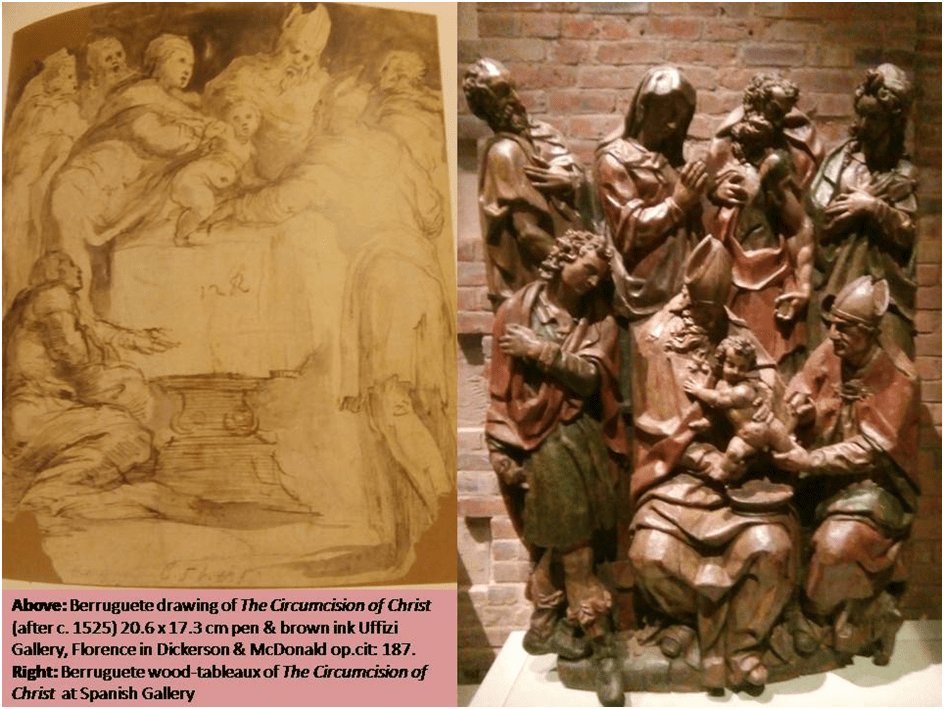
In the drawing the characters of the drama are placed around an altar but the drama is focused on the central figures around the event of the Circumcision – the officiating priests and the earthly parents of the divine child, with various spectators at a distance. Narrative scenic drama thus predominates, whilst in the wooden tableaux there is much more organisation of the characters into a visual form that contains the drama in one unit rather than dispersing it against a wider use of deep space. So that even the sharing of a square space is a cause of differentiation between these two different expressions of one event with the same figures. Of course within the sculpture there is tension but the tension is more a matter of emotion intuited from contrasting gesture and bodily attitude. I see gestural tension, expressive of extreme contrasts of emotion, meaning and action in the pattern of hands across the whole piece as both physically and emotionally contained within one overall form which is the work itself, as I try to show in the figure below.
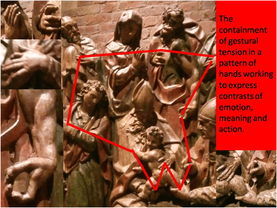
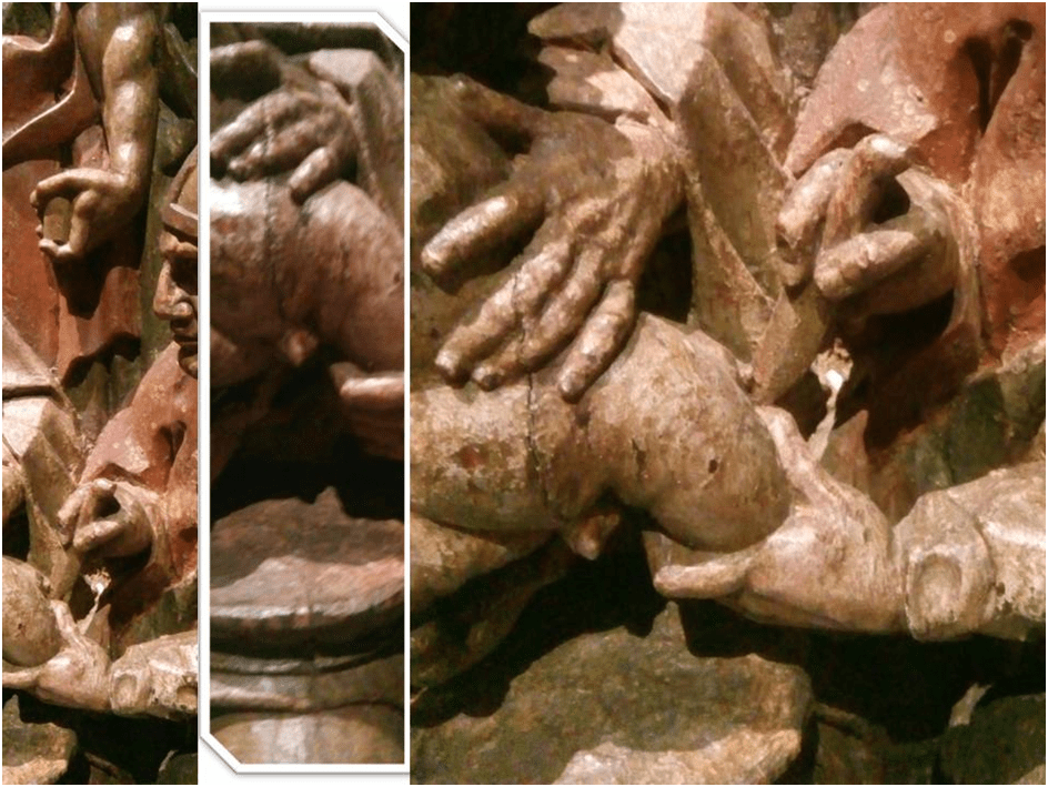
This is not I think just a matter of the fact that the medium must flatten out the representation of the characters in one rather narrow piece of wood material but of placing emotion in a framework that makes the art devotional in a way that overrides its narrative drama. And in doing so the resistance to the violence of the scene, as the child is forcibly contained in ecclesiastical hands for his flesh to be cut is less in the sculpture than in the drawing but is there as you may see, even in the emphasised strength and force of the hands that suppress the child’s fearful resistance. This is mirrored in the fact that Joseph appears to bear, as well perhaps as tools of his craft as a carver himself a lamb for sacrifice, although this feature may be somewhat lost. The lamb is placed in direct line (our eyes are guided by Joseph’s muscular arm) above the Christ child. Both are somewhat similarly powerfully (violently?) held, with a tender nuance of course in the High Priest, at least, if not his assistant, held before the knife. But if we look again at this central detail of the circumcision as an interaction between bodies, we will see that the sacrificial lamb and knife held by Joseph are mirrored by other elements of the scene’s iconography. In effect, the purpose of the iconography is to sacralise the devotional aspects of the piece. For the Christ’s child’s small penis hangs over a well carved paten – a plate-like implement used to carry the host in Catholic Christian Churches.
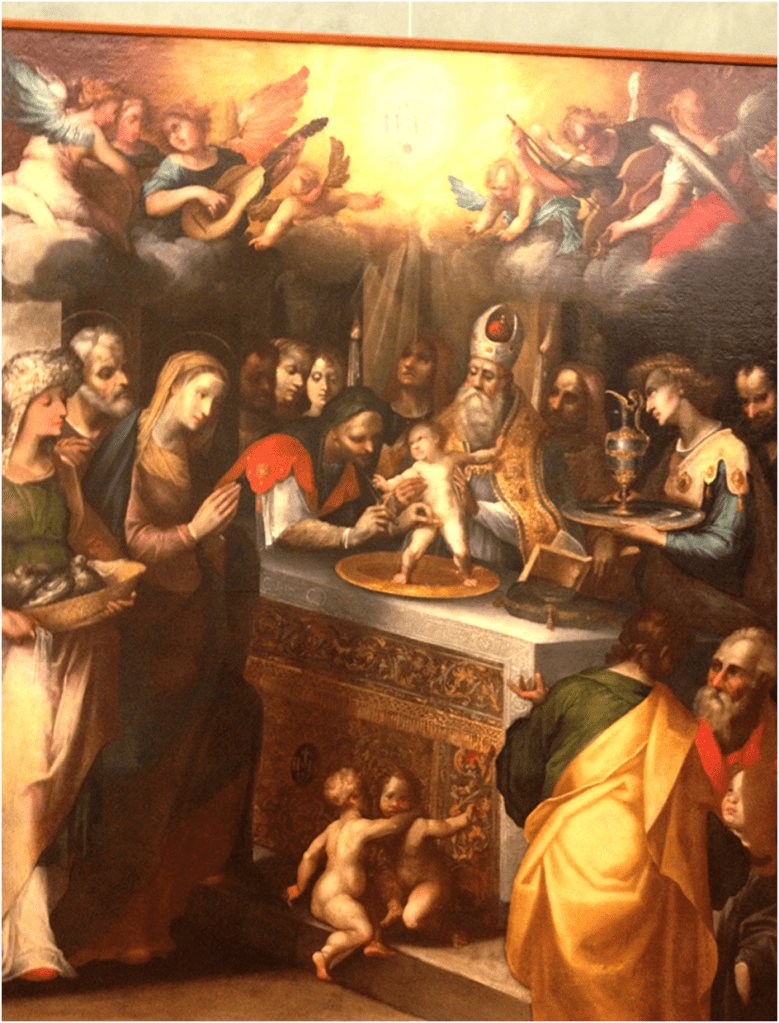
There is it would seem a complex iconographic significance of the circumcision in the visual art of the sixteenth and seventeenth century Europe that links it to the rite of the sharing of the sacrificed body of Christ in the sacrament of the Eucharist, that is explored briefly at this link. This short piece for instance shows a clear use of a paten by Gaspare Bazzano (1565-1630) in his painting The Circumcision.
This rendering of a dramatic narrative into a devotional object celebrating a key Christian ritual is part and parcel i would argue of the manner in which the multiplicity evoked of storytelling and dramatic potential in Arnao de Bruselas The Road to Calvary is minimised here. This piece becomes epiphanic rather than a story, a moment where more private emotional devotion takes over the vulgar play of the feeling of being a spectator at a historic event and moved merely by the common humanity of the people portrayed. Our attention is on the ritual that shows God’s love to us and for us and places his sacrifice in a ritual but also aesthetic box. However, before I leave this it probably behoves me to explain a little more what in the drama leads me to this conclusion. In part it is because, although the Holy Family are as central in this depiction as in the drawing above by the same artist, they are much more contextualised in ritual rather than ambivalence about the event and the pain felt by their child, as I think can be seen in the detail of the collage below.
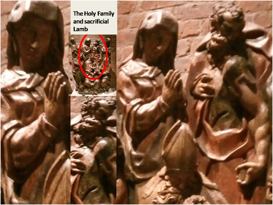
Moreover, the source of stories about the circumcision for the sixteenth and seventeenth century may well also provide a context for the sacral nature of the event, for it is traced in the webpage I have already referred to the apocryphal Gospel of the Pseudo-Matthew, which describes the circumcision in its Chapter 15 (available at this link). However the details I cite in the collage below there from are also in the canonical Gospel of St. Luke Chapter 2, verses 25 to 38. For these background characters in Berruguete’s drawing became part of the manner of framing the matter of the sculpture – its outer edges from which they lean devotionally into the interior and exterior space. For I take this figures to be Symeon and Anna from those sources.

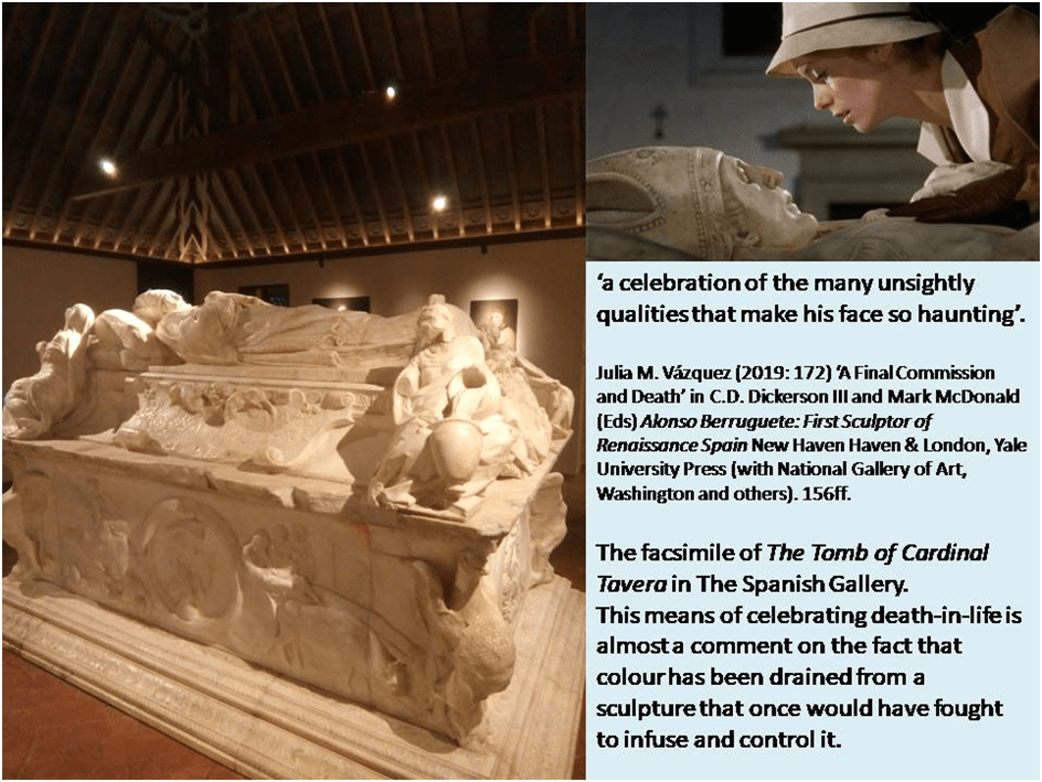
However we cannot leave this piece without drawing attention to the polychromy and not least because Berruguete unlike other masters of the seventeenth century and from the example of Pacheco, drawn from the possibly self-interested beliefs about the specialisation needed for each craft of the guilds representing sculptors and painters respectively were skills rarely used together in one piece by one person, although this may derive from the largely Italian sources of his early training, for in Spain Berruguete was known as a painter of images rather than carver thereof, at least until the recovery of his reputation as an essentially Spanish master much later in history, 1900 according to Manuel Arias Martínez.[9] However, because we must return to Berruguete at the end of this piece largely because his masterpiece (in facsimile only in the Spanish Gallery but full-size and very beautiful) was not a polychrome but marble monochrome sculpture, The Tomb of Cardinal Tavera, and this fact requires some reflection before leaving the subject.
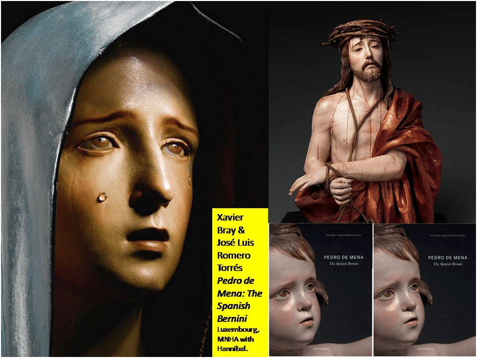
However, like everyone else, one leaves the Main Banking Hall of the Spanish Gallery without expectation that there is more in this so-far surfeit of polychrome art. But at the exit is the only example of seventeenth-century Baroque polychrome sculpture, the time of its greatest expansion as an art independent of traditions in other parts of Europe at the time. Internationally one name dominates this period, that of Pedro de Mena y Medrano. And whilst there is a beginning literature on the latter, you are hard pressed to find material on another Master of Granada origin, Bernabé de Gaviria (1577 – 1622). The Saint Bartholomew in the Spanish Gallery surely bears comparison to de Mena, though de Mena’s preference for figures in their early youth makes such comparison difficult (certainly not worth trying here).
Pedro de Mena may have created polychrome statuary images in their (apparent) spring of youth (even as babies) for another reason but, of course, I am speculating here. In Spain, as is described in great detail and in many aspects in the National Gallery’s book, edited by Xavier Bray, The Sacred Made Real, Bray insists that the art of painting and the art of sculpting were conceived by many to be entirely separate and specialist crafts rather than merely techniques used by one artist. Nevertheless though they create artworks each considered to be one work wherein the ends pursue by each craft must aim towards this unified work of art.[10] Indeed this was actually the case in Ancient Greece, although this fact would be denied throughout eighteenth century Europe, except in Spain, in the interests of something we should recognise, according to Emerson Bowyer, as an ideology of ‘whiteness’ allied to a notion of ‘pure form’ (in Hegel for instance) so much so that Diderot and the Encyclopaedists were still denying its truth in 1751, that is now clearly perceivable as an adjunct of white racism.[11] Indeed Luke Syson names European art, again with the exception of Spain, ‘chromophobic’.[12] The standard in Spain was in contrast, let’s say, encouraged the notion that colour was essential to sculpture was set by the practice of many but not least Francisco Pacheco who also theorised in his 1649 Arte de la Pintura[13]. For him painting gave life to what in unpainted sculpture was dead and this gave rise to the very name of the art in its highest form, associated to the painting of nude bodies encarnación (incarnation). In short it was not a long leap from this title to the ascription to painted sculpture of life redeemed from dead material – to the link not only to the classical myth of Pygmalion but to the resurrection of the body promised in Christianity. No wonder then Pedro de Mena was thought to be a life-giving magician and it is largely, if not only, young flesh and the material flowing in and under flesh and released naturally or by puncture (such as tears, sweat and blood) that made his name.
De Gaviria presents us with an older Saint Bartholomew and though flesh is apparent in the figure’s face, neck, hands and feet (created by similar techniques to those described by Pacheco); it is not flesh that is the glory of this artwork but the saint’s polychrome clothing.
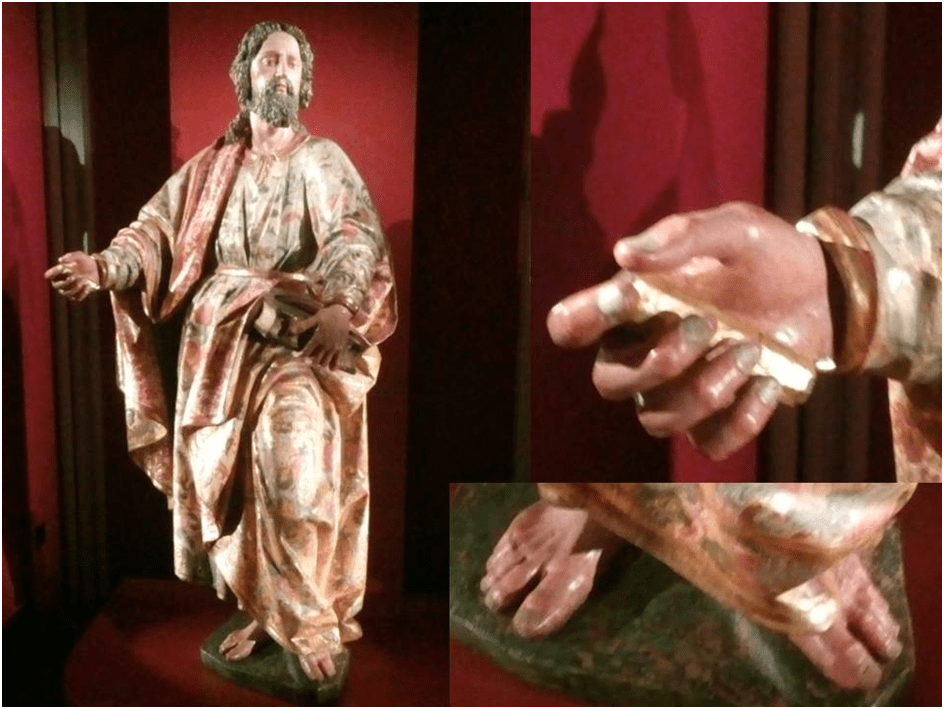
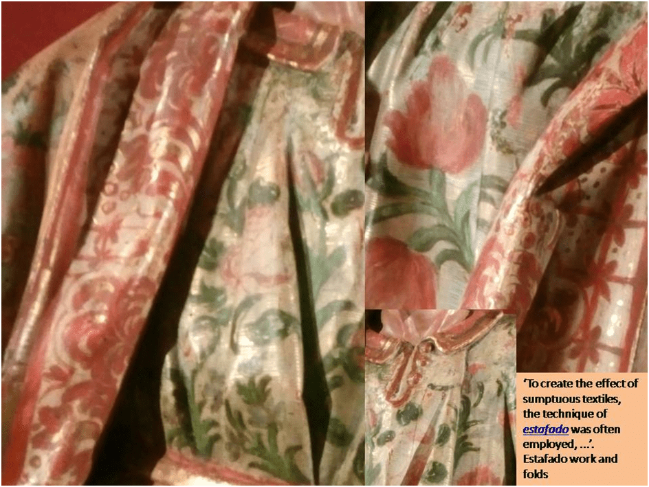
The reason for this is based in dictates of the Church that created a new kind of art that of carving the complex folds of vestments, especially highly ornamented vestments. The reason for this is that the church, and Pacheco, insisted on the clothing of figures to be carved to discourage the practice of dressing figures in real clothing ‘not in keeping with the modesty’ of Virgin saints. According to Syson this has a double effect. First it lowered the collaborative input into image-making, considered dangerously idolatrous, of an uneducated and naive (by the standards of educated churchmen and artists) laity. Second it gave artists more control and direction in the crafting of sculpture and its seamless union with a polychrome surface following every fold and undulation of carved clothing.[14] It is in the sumptuous integration of decoration with the illusion of its flow across folded and gathered cloth that artists like de Gaviria makes their extreme skill known. Indeed Daphne Barbour and Judy Ozone tell us that this technique had its own name to contrast with the skill used to create incarnated flesh tones: ‘To create the effect of sumptuous textiles, the technique of estafado was often employed …’[15] Art of a specialised kind may well begin in this process to take precedence over the religious and devotional function of the image but decide for yourself whether the saint or art most interests the artist in the following collage (though the question itself needs a more nuanced application I admit):
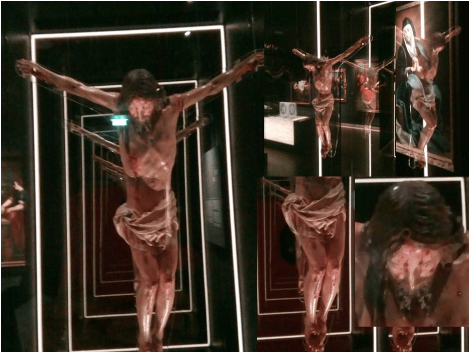
From these pieces we come finally to a work that truly requires more consideration that I can give it here, which is a small Crucified Christ by Luisa Roldán. That the work of a female sculptor was commissioned, made and survives is still a matter of interest for scholars though the degree to which this interest has been mined is not great. I found myself impatient with a newly published book on this great woman partly because it refused to take a feminist view of art that goes seriously beyond pointing to the greater resilience and self-confidence required by a woman to succeed – even now, let alone the seventeenth century. Of course Luisa’s work, like that of Artemisia Gentileschi, is impossible to conceive but for the special position of their respective fathers in promoting these women for the trade (for trade it was) but that fact alone is not enough. Even if we remember that Luisa’s sister was also a sculptor and did not succeed as Luisa did.
But of the contribution to the art of the fact of her womanhood the sole dedicated book on her remains silent, ending with an acknowledgement that ‘the role her gender played in her successes and struggles’ and indeed her subject-matter and her particular interpretation thereof remains unstudied.[16] The author of that book, Catherine Hall-Van Elsen, does however query without any real consideration attempts by other writers to address part of this conundrum in terms of what we must call I suppose a queering of sex/gender roles, particularly in her males who take on very feminine features by the standards of male contemporaries. I don’t think the one example in The Spanish Gallery will further this discussion. This is in part because of the showy design with which this small but beautiful and painfully moving piece is exhibited with many reflective mirrors and a depth effect through which the image is continually repeated (to infinity as it were) that keeps on throwing up barriers to a clear vision of the work of art itself. In this circumstance, I do not feel confident to comment. The orifices in the place of the usual stigmata are horribly large on the small figure and these are the means to attach the figure to a surface but i do not know if this is intentional – certainly they bleed, as if they were. This figure is exceptional in its terrifying effect nevertheless.
In particular I find the tension in the upper legs of Christ difficult to look at and I cannot but feel that some effect here is produced that is based on an understanding of a specifically gendered vulnerability, which might fit with the play with sex/gender seen, according to Hall-Van Elsen, in some commentaries but she does not discuss them. This piece, more than any other I have seen (and certainly more than the work of Pedro de Mena cited in this respect by Xavier Bray)[17] might evoke comparison with some modern explorations of queered male fragility in the wonderful work of Ron Mueck (open the link to see some wonderful examples from the National Gallery of Scotland). I sense the same tension frozen into an attitude of rigor mortis in this and Mueck.
When we see a Berruguete again in the Gallery it will be a facsimile of the heavy marble Tomb of Cardinal Tavera. It is difficult for us to read this piece without seeing the monochrome state of it as a comment on what we suppose to be Tavera’s own apparent emotional coldness and love of power, as if, as it were, the sculpture was polychrome but with its colour drained in order to make a point about what it means to live or not to live. Bun͂uel seemed to emphasise this in his film Tristana (1970) when Catherine Deneuve climbs onto his body and gazes in its half-open dying eyes as if sexually drawn by the horror she sees – sunken cheeks and heavy dying eyes.
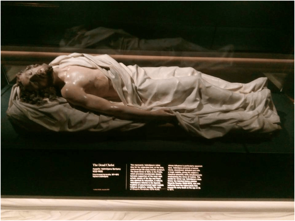
How conscious of any of this was Berruguete. Possibly not at all but that is certainly not the case in the revival of the form and I am fairly certain that Berruguete like Vallmitjana whose nineteenth-century ‘The Dead Christ’ (the smaller polychrome version is in The Spanish Gallery) uses the face of the dying artist Eduardo Rosales to show figures that are somehow troubling. This is because liminal beneath life and death, likeness and unlikeness to either model or subject, softness and hardness, special whether as artist (and/or redeemer) or just ordinary rather than one thing or another. (In Luisa Roldán’s case it may too be liminal between male and female). Such is Mueck’s Dead Dad for instance and such the young black teenager exposing a wound – an effect of racism – as an example of stigmata in his 2009 Youth. Polychrome statues have returned because they bear the distaste of popularity too that they have carried as a burden, newly troubling elites who are not used to being troubled or unentitled to set standards of acceptability for others. This is what Marina Warner seems to suggest when she says of the genre that:
The lifelike yet inanimate artifact confronts its spectators with the quiddity and mystery of life itself. Playing with the power of images, artists have dared to take us to this debatable land, and we still respond viscerally, with shudders and anxiety, tingling with amazement.[18]
My own response to these works fits into this response more than I have explored in this blog but that is not to say that the multiplicity of objects of interest in them that I indicate above is not also an issue. These works are so rich I think they hold a key to much in Spanish art and perhaps all art – and maybe a few other things too.
My next blog (no. 7 in this series) will be one on the art of portraiture as exemplified in the Spanish Gallery and Auckland Castle. Defining a portrait is not always straightforward and there is a crossover in Spain, as we shall see, between other genres such as history, religion and even mythology and their distinct iconographic traditions. Even sculpture as we have seen in the case of Cardinal Tavera begins to participate in the notion of life portraiture, even when the subject is dead. There is a facsimile portrait of the same by El Greco in the Spanish Gallery which we will examine. It is worth remembering that it is almost certainly El Greco who was responsible for placing Berruguete’s Tavera tomb – and just next to his Baptism of Christ. Hope I see someone there.
All the best
Steve
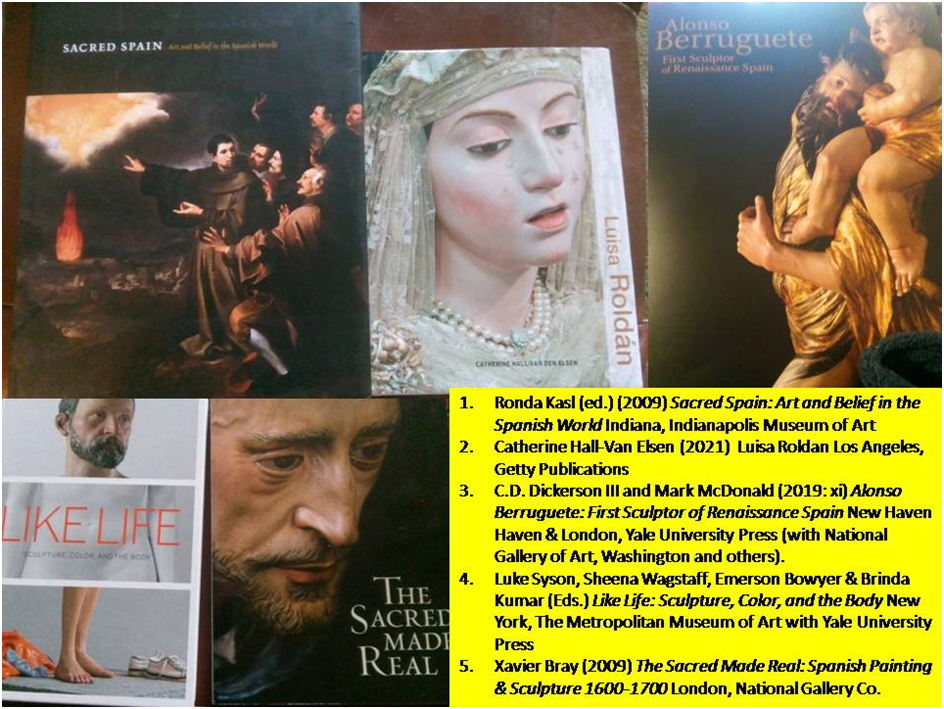
[1] Luke Syson (2018: 14f.) ‘Polychrome and its Discontents’ in Luke Syson, Sheena Wagstaff, Emerson Bowyer & Brinda Kumar (Eds.) Like Life: Sculpture, Color, and the Body New York, The Metropolitan Museum of Art with Yale University Press, 14 – 41.
[2] C.D. Dickerson III and Mark McDonald (2019: xi) Alonso Berruguete: First Sculptor of Renaissance Spain New Haven & London, Yale University Press (with National Gallery of Art, Washington and others).
[3] There is a good description of the type from Mullany’s Fine Art auction house available at: Sedes Sapientiae Enthroned Virgin and Child | Sculpture | Wood | Mullany Haute Epoque Fine Art (mullanyfineart.com). This describes ‘a group of early representations of the Virgin and Child known as the Enthroned Virgin and Child or Sedes Sapientiae (the ‘Seat of Wisdom’ or ‘Throne of Wisdom’). The Latin phrase likens the Mother of God in majesty to the Throne of Solomon, the Prophet King, referring to her exalted status as a vessel of the Incarnation carrying the Holy Child. The subject embodies a complex and core Christian doctrine of the Virgin’s role in the Incarnation (the moment in which Christ became flesh) and ultimately in the redemption of humankind. The Incarnation gave Mary a unique position as principal mediator between heaven and earth, and between God and humankind. The association of the Blessed Virgin with glory and teaching in this tradition was popularised in Catholic imagery from the mid 11th century’.
[4] José Guidol (1964: 64) The Arts Of Spain London Thames & Hudson
[5] Ibid: 62
[6] These features, especially the large eyes, can also it seems be found in more secular subjects of thirteenth century polychrome statue work, although such pieces – representations of royal patrons may also largely have been intended to place in church institutions, given the state hegemony over religion, as speculated in relation to a beautiful example of A Royal Figure (c. 1270 – 80) in a book by (once a good friend at university) Sam Fogg (2007: 52ff.) Art of the Middle Ages London, Paul Holberton Publishing.
[7] Alfonso Rodríguez G. De Ceballos (2009: 29)’ Image and Counter-Reformation in Spain and Spanish America’ in Ronda Kasl (ed.) (2009) Sacred Spain: Art and Belief in the Spanish World Indiana, Indianapolis Museum of Art, 15 – 36.
[8] Manuel Arias Martínez (2019: 93) ‘Master of the Retablo’ in C.D. Dickerson III and Mark McDonald (Eds.) op.cit: 86 – 113.
[9] Manuel Arias Martínez (2019: 182) ‘Charting a Critical Legacy between Myth and Reality’ in C.D. Dickerson III and Mark McDonald (Eds.) op.cit: 229 – 184.
[10] Xavier Bray (2009: 18f.) The Sacred Made Real: Spanish Painting & Sculpture 1600-1700 London, National Gallery Co.
[11] Emerson Bowyer (2018: 77f.) ‘The Presumption of White’ in Luke Syson et. al. Op.cit: 76 – 99
[12] Luke Syson (2018: 16) ‘Polychrome and Its Discontents: A History’ in ibid: 14 – 41.
[13] Xavier Bray 2009: op.cit: 19
[14] Luke Syson op.cit: 24
[15] Daphne Barbour and Judy Ozone (2019: 66) in Xavier Bray 2009 op.cit: 59 – 72.
[16] Catherine Hall-Van Elsen (2021: 130) Luisa Roldan Los Angeles, Getty Publications
[17] In Xavier Bray & José Luis Romero Torrés (2019: 25)
[18] Marina Warner (2018: 57) ‘No Dead Matter’ in Luke Syson et. al. (Eds.) op.cit: 42 – 57.

3 thoughts on “In 2018 in an introduction to the ‘fraught European history of polychromy’, Luke Syson identifies within that history a ‘long condemnation of not just the application of colored (sic.) paints to the surface of carved or modeled (sic.) statuary – to use the strict definition of “polychrome” – but also those sculptures that use colored media to imitate flesh and skin’.[1] This blog reflects on the examples of polychrome sculptures currently in the Spanish Gallery in Bishop Auckland: from Reflections and Discussions in my free time on some of the Works of Art, as part of a personal learning project related to the Golden Age of Spanish Painting (No.6).”