‘“But again, the text MIGHT be taken seriously. And yet again, the boats are so dignified that the total effect cannot be neo-dada … perhaps the whole thing is really a poem about fishing boats, in a kind of triple wrapping of semi-transparent disguise”’.[1] Reflecting on the City art Gallery, Edinburgh’s mounting of an innovative exhibition of the work of Ian Hamilton Finlay. How seriously should we take it?


You aren’t allowed to take photos in this exhibition because an easily available small catalogue exists and it is both cheap and beautiful (my friends, if I have any, are not meant to apply this label to me). In a way this is a great pity and only some of the photographs in the catalogue give an adequate idea of this since most of the artworks need seeing in their 3 dimensional presentations. This detracts from how very moving in situ some of these pieces are. The work, of course, always in some way refers back to a master concept first set out in Hamilton Finlay’s art garden at Little Sparta. It was originally of course known as Stonypath and is situated around a farmhouse bought by Hamilton in the Pentland Hills. And, since I have never visited this Mecca of modernism, although the project reminds one most of the work of Eric Gill, I had to rely on the literature available at the exhibition to allow me to see the significance of the Marine theme to the garden, or at least to the section known as ‘the Lochan Eck Garden’, which refers to its function as ‘the playful site of sailing – of hand-made model boats …’.[2]
The catalogue bears the image of the first work encountered Marine which plays games with representation and coding. Ostensibly a bowl of lemons bearing a lettered legend, ‘Marine’, Finlay originally thought of it as a ‘poem print’. For these art works are ostensibly, as with other art in Little Sparta ‘concrete poems, where words are inscribed or in relief on other resistant materials or made to appear thus, use illusions of solidity in the font. There is always a game being played with representation in these poems where objects disguise the identity of other concepts or objects and the material medium is sometimes (especially in the 3-dimensional pieces, called in to play a part in the contradictions of signification. Thus the catalogue on Marine:
This still life thus masks the identity of four particular ships, which are viewed as lemons lying in a (tidal?) bowl. They may be decoded as boats originating from the ports of K(ircald)Y (two boats), A(llo)A and P(eterhea)D.[3]
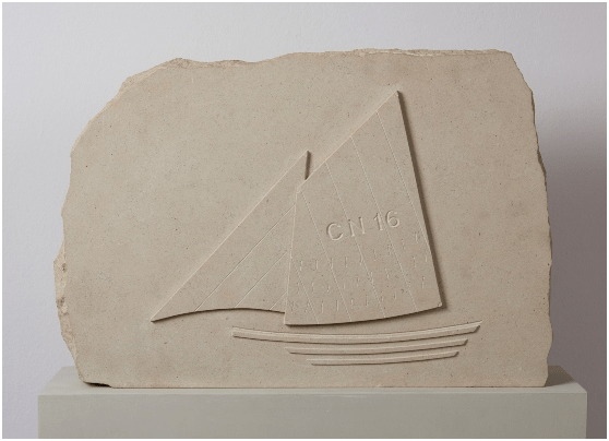
The limits and potentials of the signification are hinted at in the guessed attribution of a ‘(tidal?)’ quality to the bowl, which escapes me as a viewer. Where materials contribute it is often to make comment on the difference between its associations and those of the graphic work. Yet sometimes this seems insufficient to interest as in Sails CN16.
Of course I may miss the point. It’s clearer in the lovely wood dinghy of 1997, Wings, made with John Andrew. A small sailable dingy in wood has oars lying across it so that project on each sides, each with the carved inscription, ‘Wings’ (there is also a version in the Lochan in Little Sparta) and the idea is, cited by Bann, that the figure is ‘in a state of rest and equilibrium’ – ‘a tranquil elevation transcending the “harsh world of vessels and men”’.[4] Suddenly the boat, bird and angel associations come together and to gaze at it creates a lovely moment. This may be case with a favourite of mine Fisherman’s Cross which in its original versions, according To Bann, appeared at a show in Brighton in 1967 ‘in the form of a hexagonal wooden construction with attached lettering, and it later appeared as a stone carving’. The wooden and stone forms must have emphasised by their undisguised object status the idea of the ‘cross’ of Christ’s crucifixion. We know Finlay intended that contradictory association, since the cross neither is associated directly with ‘seas’ or of ‘ease’. Finlay’s own description shows that intention: ‘traditional images of sea (of life) and peace (ease, death) and paradox of ‘ease’ being at centre of cross, while ease is exactly what we do not associate with the Cross. In this exhibition this version of the work appears as a wall poem. I felt that seeing this in the catalogue detracted from the effect of approaching this printed wall space across a room. That space after all comprises of merely words on an octangluar grey background shape.
This is because the effect of the assonance between ‘seas’ and ‘ease’ seemed to be evoked by the necessity to read out (internally) those words, allowing their associations to grow in the viewer’s thoughts and feelings. The ‘cross’ in the artwork remains only as a disposition of the words into cross shape. Yet to me the idea of a cross, fails entirely in reproduction, which needs the placement on the wall to take this conceptual form. Here is my inaccurate version of the shape.
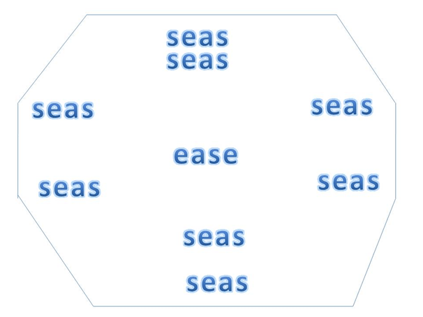
It is this work in particular then that any reproduction would detract from the effect that requires the notion of wall mounting, at the very least – there being no wooden or stone cross, to support it as a conceptual object. Maybe other people though do not find that. Other marine objects are transformed by words that appear in places where a boat’s given identity as a name might be recorded, such as in the set of seven Ships Bells.
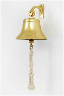
Ships Bells (2002) with John Andrew, 7 brass bells, 20.4x55x21.6 cm each. Each inscribed with poem: Available at: https://www.edinburghmuseums.org.uk/whats-on/marine-ian-hamilton-finlay (Photograph Antonia Reeve)
But I find these works of art fail to move me. I am moved though when the identities indicated (sometimes merely by colouration) introduces ideas of marine war and destruction, as in the Sub Specie Aeternitatis lithograph from 1980, which plays with meanings about what underlies (is ‘sub’) concepts of eternal types – here that thing being a deadly weapon. Again this occurs in the solid letter types forming free-standing sculptures in the colours of a camouflaged warship, U52 (a German navy submarine)and of the weapon launched at sea, Cruise both made in 1991. Likewise I find the ‘print –poems’ in the series starting with a lithograph called Rudder unmoving, giving little sense of what is being pointed to in the concept shape that Finlay associated with finding an orientation in life: steerage.

Maybe conceptual art of this kind is not for me – though I enjoyed the exhibition immensely. Where the idea of direction in life and its association with a race-like competition did speak to me was where the art referenced artists and art terminology in visual and literary art. Thus the wonderful woven tapestry Proem of 1998 which Finlay made with Ron Costley and the weavers David Cochrane and Douglas Grierson, told me a lot about the idea of promoting a setting out and a direction by juxtaposing a ship’s prow in a simple form, bearing the identity label BCK35 and thus proposing associatively to me, the forward and backward motion of a proem as it summarises where we are and where we are going in a literary artwork. A reproduction would not suffice, as the one in the catalogue does not because they require perception of the signs of warp and weft in the delicately fashioned but very strong tapestry. Likewise Three Sailboats, which comprises three model sail boats on separate plinths labelled with the names Juan Gris, Jean Cocteau and Erik Satie. Each plinth stands by a beach umbrella. This is rich in complex contradictory associations between the privileged lives of some artists and the notion of destructive, as well as the constructive, creativity of Cubism and Dadaism. But the effect in this case did not last long for me, as it did with Proem.
So if you can see this exhibition before 3rd October do, but not at the expense of going to Little Sparta or of art, like Karla Black’s, appearing at the Fruitmarket opposite the City Arts Gallery, that actually takes concepts of the object’s impermanence and illusory nature very seriously indeed and plays less games.
All the best
Steve
[1] Finlay speaking of his work (not in this exhibition) Ocean Stripe 5 cited by Stephen Bann in the essay accompanying the catalogue for Marine (2021).
[2] See Jessie Sheeler (with photographs by Robin Gillanders) [2015; 131ff.) Little Sparta: A guide the Gardens of Ian Hamilton Finlay Edinburgh, The University of Edinburgh & Birlinn Ltd.
[3] Stephen Bann (2021) essay in the catalogue for Marine
[4] Ibid.
