Touring J.M.W. Turner’s tour to the North: The Tate’s travelling Turner: Northern Exposure Seen in the Mercer Gallery, Harrogate on 12th March 2020. Reference to Hill, D. & Cox, D.L. (2019) Turner: Northern Exposure Berwick-upon-Tweed, Berwick Visual Arts in partnership with The Granary Gallery, Berwick-upon-Tweed, Tullie House Museum, Carlisle & Mercer Gallery, Harrogate.
This small exhibition of rarely seen studies, watercolours and prints, mainly owned by the Tate Gallery has toured a selection of the Northern areas which these treasures represent as views. But to say ‘represent’ is already to under-rate these works. They demonstrably master the use of brush or other marks, or restraint from marks, on paper such that shapes are formed that make sense only in relation to other shapes or overlapping densities of variant colours (or tonal variations of the same colour). Even unmarked spaces on paper surface become the stuff of interactions that create illusions of space, volume and sometimes time.
In order to look at this compare these two pieces from the exhibition. The first is of Richmond in Yorkshire seen from a distance from the Tees valley, the second, even starker is a sketch of Bamburgh Castle in Northumberland.
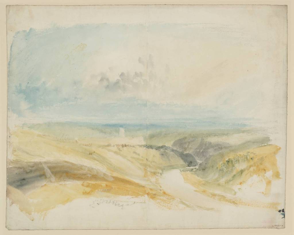
1824-6 Richmond, Yorkshire Watercolour on paper 391 × 489 mm Source: https://www.tate.org.uk/art/artworks/turner-richmond-yorkshire-d17204
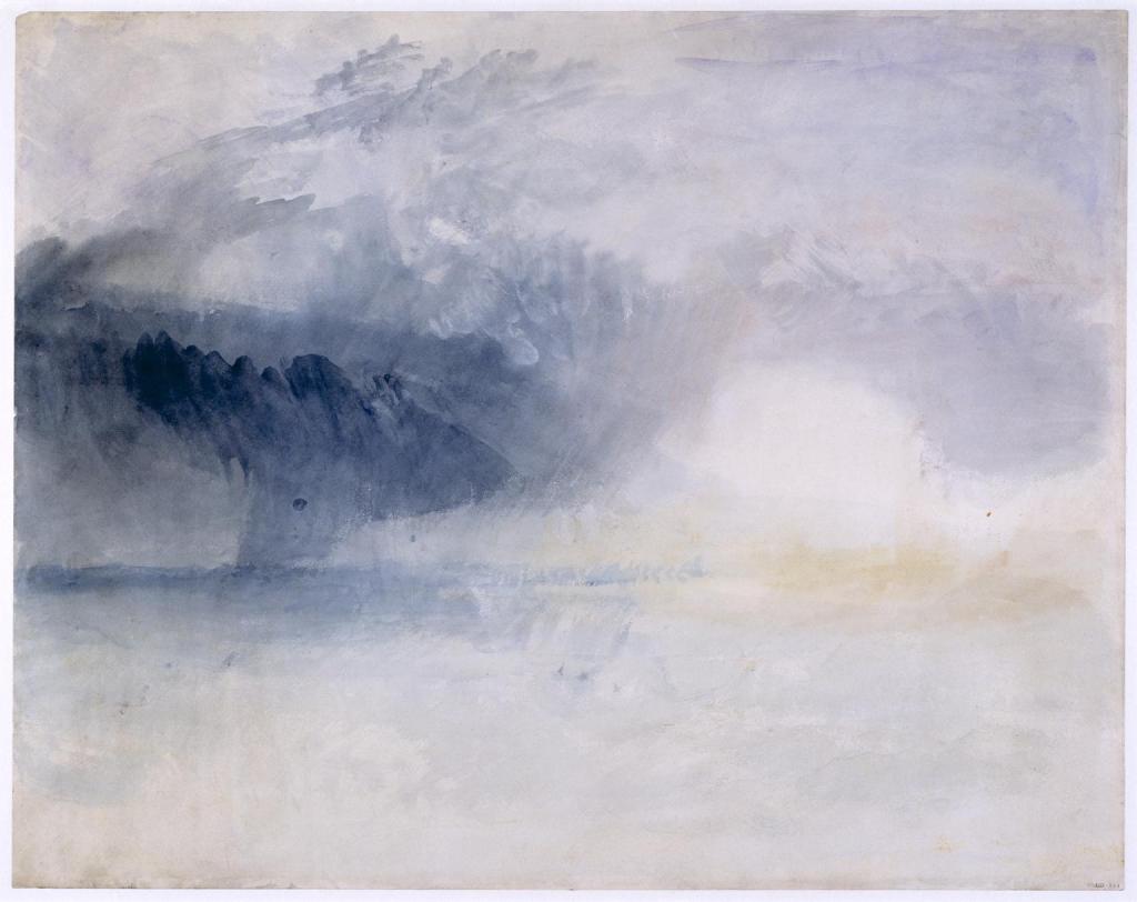
Bamburgh Castle, c. 1837, Watercolour on paper 487 x 612 mm. Source: https://www.tate.org.uk/art/artworks/turner-bamburgh-castle-northumberland-d25457
In both cases these watercolour sketches are unfinished in that they represent a development for ideas for a finished picture in which, say, the detail, of buildings in particular would be filled in at a later stage. One could say that the Bamburgh sketch (these preliminary sketches are, according to Hill & Cox (2019:27) often known as ‘colour-beginnings’),in particular focuses on achieving in watercolour the effect of on storm cloud encroaching on the coast and this coastal fortification. But the effect of the work is to focus on how colour patches and marks are produced by what kind of layering of paint on paint, definitive brushstrokes with contrasting density on washes of under-colour. In a sense they are about how material – paper and water-based paint of differing density, sometimes to the point of being described as gouache, are inter-related on paper to suggest fluid or solid volumes.
In both cases the concentration has been on more fluid volumes that suggest some motility. These are, for instance, gatherings of clouds at Bamburgh and the dense release of storm rains from some of these clouds. That release of energy is seen as a medium that obstructs light. Likewise, the motion of light and shade across a thinly grassed moor and river valley in the Richmond sketch. The river course is suggested in empty space alone.
But in both sketches human architectural entities are merely suggested by near empty space with very unclear boundaries. The space is more shaped in the Richmond picture than the Bamburgh one. However, in both there is still a suggestion of the still mass that Turner wants to convey, so poignant that any eye begins to conjure distinct details in the masses from the shape of these white patches. Perhaps even more radically these visual illusions are possible because these sketches are, in a sense, merely a pattern of rhymed or contrasting shapes – the dark cloud with the mass of Bamburgh suggesting even without the detail of a castle a fundamental conflict of shapes and their internal colours.
The shape that will become Richmond asserts itself as somewhere and something between great patches of variegated colour that are the earth and sky, just as likewise Bamburgh castle asserts itself between earth and sky. In the latter earth and sky are even more contrasted. The still relation of beach and sea at Bamburgh is contrasted with the dynamic war between different regions of sky above it.
Hence, looking at these I don’t yearn to see the finished watercolours (or oils). These paintings are sufficient – neither fully abstract nor fully representational or mimetic, they show how different bodily motions have variously applied paint-colours, at different pressures and flows, to suggest tensile relationships between variant shapes and forces that, in the end, is what landscape is.
For me that is painting’s strength. Because it shows those internal forces shift in relation to each other. Human architecture is somewhere within a clear space with very unclear and fuzzy boundaries and open entirely to imagination. Some interior minor marks in the Richmond space aid imagination but less so Bamburgh. But we shall see that Turner forgoes this in painting Dunstanburgh Castle in an earlier (1828) sketch.
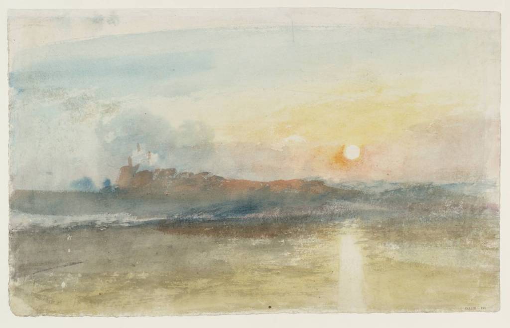
Dunstanburgh Castle c. 1828 Watercolour and gouache on paper, 273 x 435 mm. source: https://www.tate.org.uk/art/artworks/turner-dunstanburgh-castle-d25313
At this point Turner reserved white patches on the paper to contrast with mixed colour patches to suggest light. This is much more important in prints and book illustrations by him. This particular painting is driven by the very idea of dawn light and rising motion, down to the path of light it casts to still the motility of the sea.
Human architecture still has fuzzy edges and often irregular shapes. Here the castle is a deep ochre patch where its towers and limbs are suggested by irregular gouache patches that, looked at closely, do not resemble the solidity of human architecture at all, although they might its remnants in decay. They emerge from a long irregular shape that gains solidity only by rhyming in its tail with deflected sunlight from the sun above (where the ochre lightens on its top edge, and the ‘depth’ of its shadow in the sea. That shadow combines castle with the promontory of rock on which it stands and is overcome directly by shimmering foam on the sea’s surface.
The sketch rhymes spaces around a lateral line: contrasting two triangular shapes on either side of that line (left to right and vice-versa) to emphasise the sudden vertical stop effect strong morning light creates on earthly, if not sky-based, forms. It is about the painting hand and the varying tension of that hand – the flecked and washed painting of sky against the dense application of man-made forms. The latter modulates into the more fluid density of earth forms. It is no surprise then that Ruskin sees gods, mortality and human pretension at war in Turner’s work. It is even clearer if we see the abstract forms his sketches take.
There are greater pictures in this exhibition – the 1830 colour beginning of Norham Castle for instance (Hill & Cox 2019:34) – but I wanted to end with an early one I loved for a rather peculiarly personal reason. This in despite that Derwentwater, with the Falls of Lodore, c 1797-8, is more ‘finished’ and more representational.
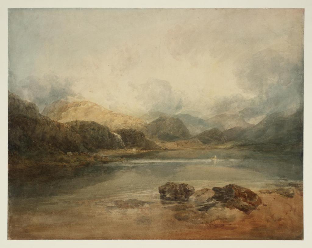
Derwentwater, with the Falls of Lodore, c 1797-8, Graphite & watercolour on paper, 493 x 632 mm. Source: https://www.tate.org.uk/art/artworks/turner-derwentwater-with-the-falls-of-lodore-d01102
I love this because years ago we stayed at a hotel that stands beneath a very receded Lodore Falls, which now tries hard except in very rainy conditions to be a force in the landscape – one that Southey rejoiced in. For instance. I didn’t notice the water falling in this picture at first, until I noticed that skein of bright white almost vertical light. That skein falls as if to emphasise the white painted man-made groin or jetty that buts into Derwentwater below in the picture space. Once seen, these fine details – mere suggestions of the brushstroke – seem to dominate the picture. They make everything else a coloured pattern of ‘setting’ for these strokes.
Of course we love the solidity of the rocks in the foreground and mountains in the background, where they are not bathed in the fluid of golden light. But these white lines make this picture move I think. They have reality as paint, rather than as represented water flow, set in a complex pattern of diverse paint colouring. For me they barely speak of a detail of landscape at all. But I know that this is far too subjective. Yet I want to let it stay.
But get along to your last chance to see these at the Mercer this spring until 18 April. There are so many more riches, yet relatively few pictures. The Mercer has supplemented them with wonderful artists who can be said to be deeply influenced by Turner. The surprise for me, in this context, was Atkinson Grimshaw. The delight was Katherine Holmes.
Steve
